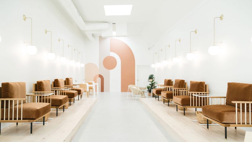
Katie Gebhardt opts for simplicity at Leo Nail Salon in San Diego
Plushy, velvety brown pedicure chairs, a graphic mural and planting are among the details that designer Katie Gebhardt has included in this nail salon in San Diego, in order to eschew the aesthetic typically associated with beauty shops.
The Leo Nail Salon occupies a narrow storefront in the heart of the city's trendy North Park neighbourhood. Locally based Gebhardt of Solstice Interiors designed the shop for a client who wanted a style that would be different from its competitors.
"Jina, the owner of Leo, found herself looking up 'cute nail salons' in San Diego and was repeatedly left feeling unsatisfied with the experience," Gebhardt told Dezeen.
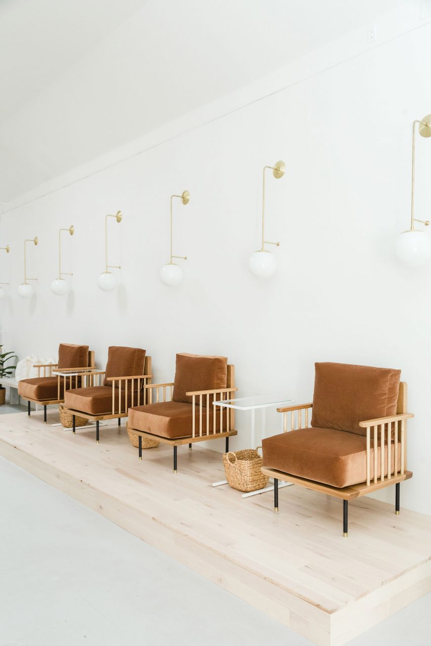
Among the main differences inside the salon are the pedicure stations, which offer a different take from the bulky chairs and built-in foot baths. Instead, Gebhard has designed a set of wood-framed armchairs chairs with velvety brown seats, accompanied by moveable wash basins.
These chairs – which were produced by local furniture company Moniker Design – are arranged in rows on a pair of pale wooden plinths that flank the sides of the shop. Globe-shaped, white lights are arranged in rows on the walls behind.
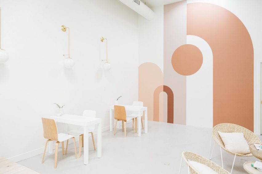
White floors and walls provide a neutral backdrop to the store, with a pink-hued mural decorating the rear wall. Janie Rochfort from local interiors studio Betty Larkin created the graphic from layers of circles and arch shapes in different hues.
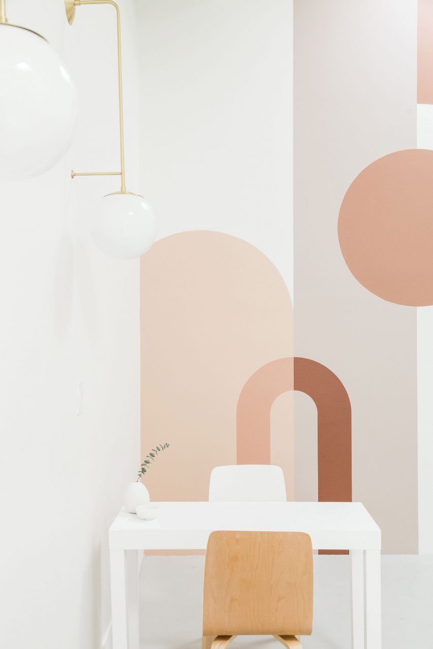
"We stuck with a primarily neutral and organic palette as we knew the main salon chairs were going to be our main statement, and the pop of colour with the mural in the back," said Gebhardt.
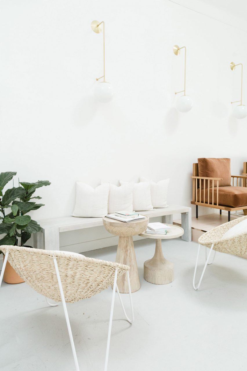
Other homey details include two white dining-style tables and chairs, which form the manicure area. Woven chairs, meanwhile, create a lounge-style setting for customers to wait while their nail varnish dries.
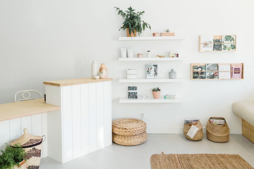
Softening the entire space are potted plants, books, rugs and woven baskets. Items are available for purchase and displayed on mounted shelves.
"Leo was built around this idea of self-care and carving out time to treat yourself to an experience and place you truly wanted to go back to," the designer said. "An escape, a place of calm, yet still cosy and giving you that at-home vibe."
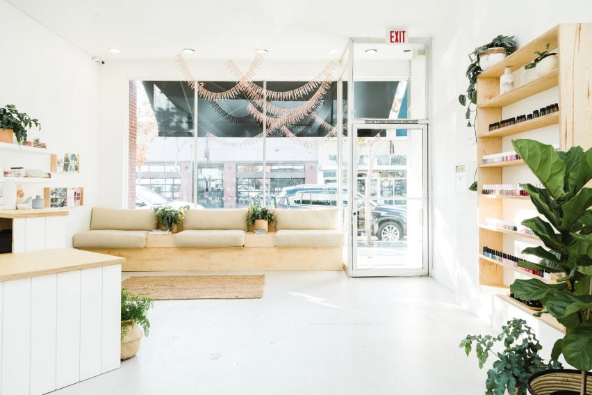
At the front of the nail salon is a counter and waiting area, and a built-in bench, which is placed in front of a large storefront window.
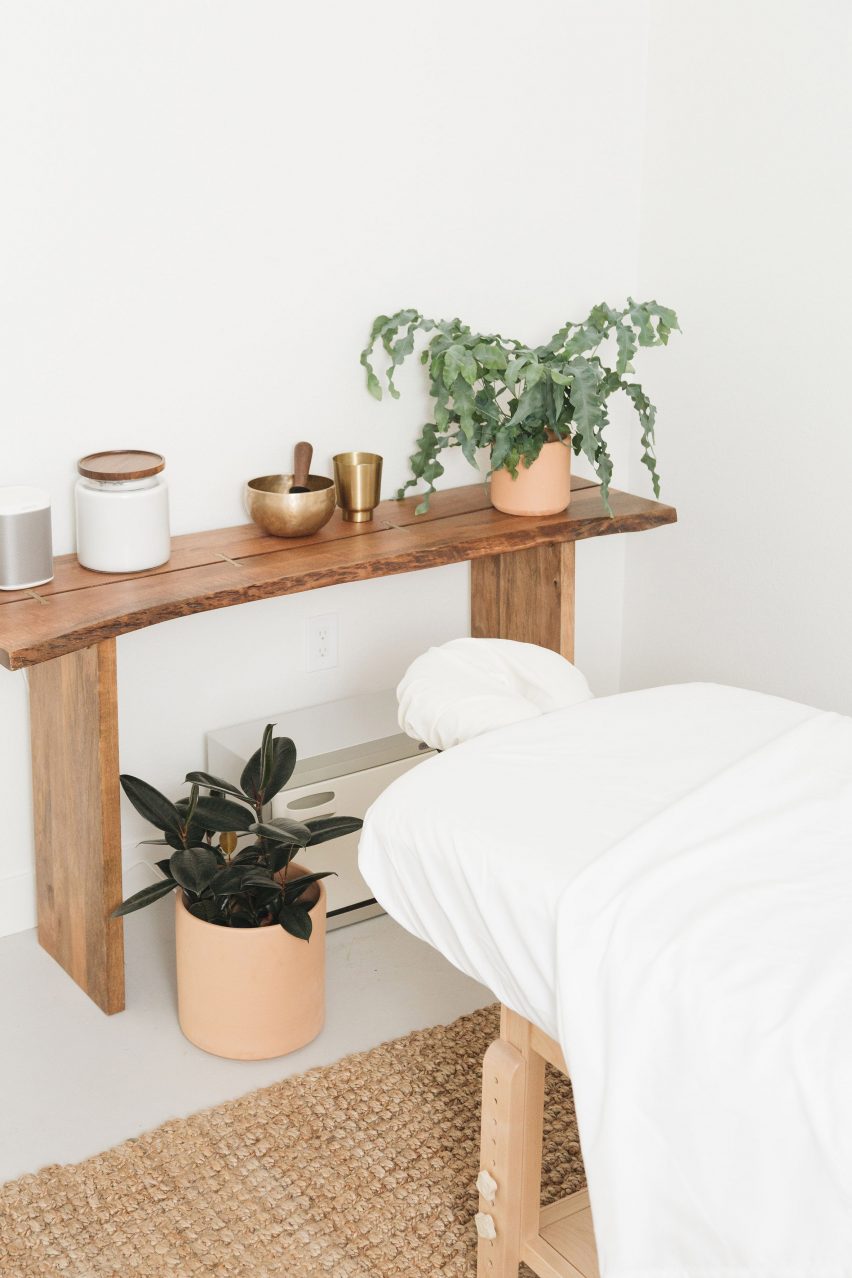
Gebhardt also added in a partition into the narrow shop to create a private area for treatments like massages located at the rear. "The space started out as one empty, giant long rectangle," the designer said. "We added two massage rooms and a dividing wall from the main salon and hallway."
Even further back are two private rooms and a storage room A bathroom is set at the end of the nail salon.
A similarly homey nail salon in Texas features comfy blue chairs as pedicure stations designed by Content Architecture.
Other beauty shops include J Byron-H's minimalist manicure bar in Los Angeles, the monochrome Mizu Spa by Stanley Saitowitz in San Francisco and the turquoise Infinity Spa in Bangkok by Space Popular.
Photography is by Amber Thrane of Dulcet Creative.