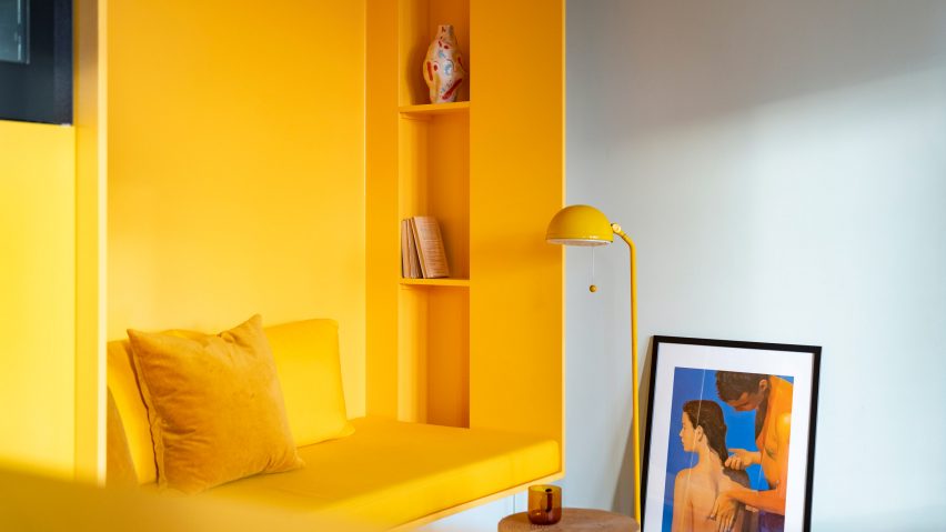
Storage walls define space within bright yellow apartment in Stockholm
Swedish studio Lookofsky Architecture has used bright yellow storage walls to maximise space in a renovated Stockholm apartment.
Belonging to a young couple, the 80-square-metre, one-bedroom 1920s apartment was last renovated in the 1970s. The owners invited Lookofsky Architecture to create a highly functional yet playful interior with plenty of storage space.
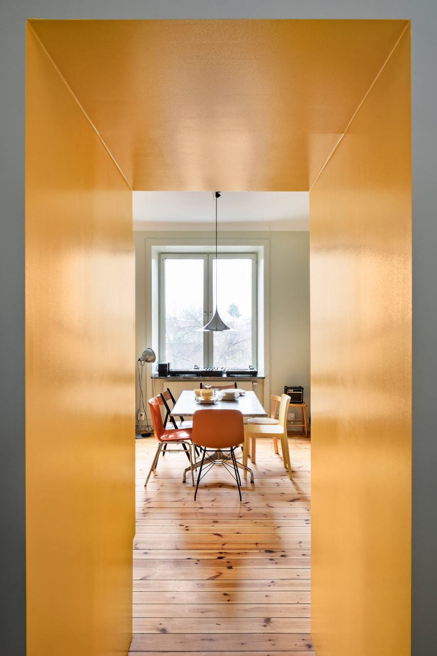
The resulting design, called Function Walls, incorporates several carefully thought-out storage walls and an eye-catching yellow colour scheme.
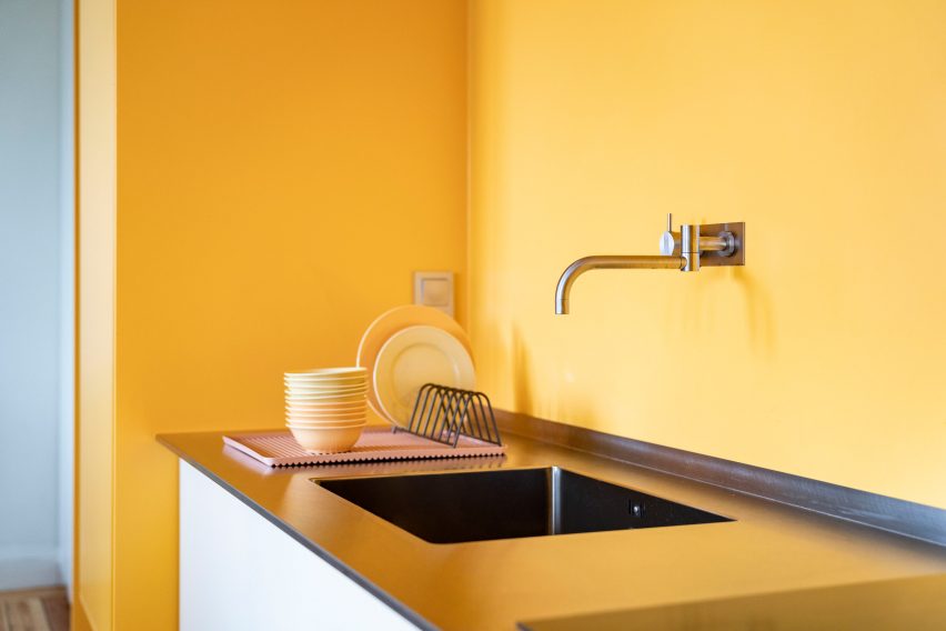
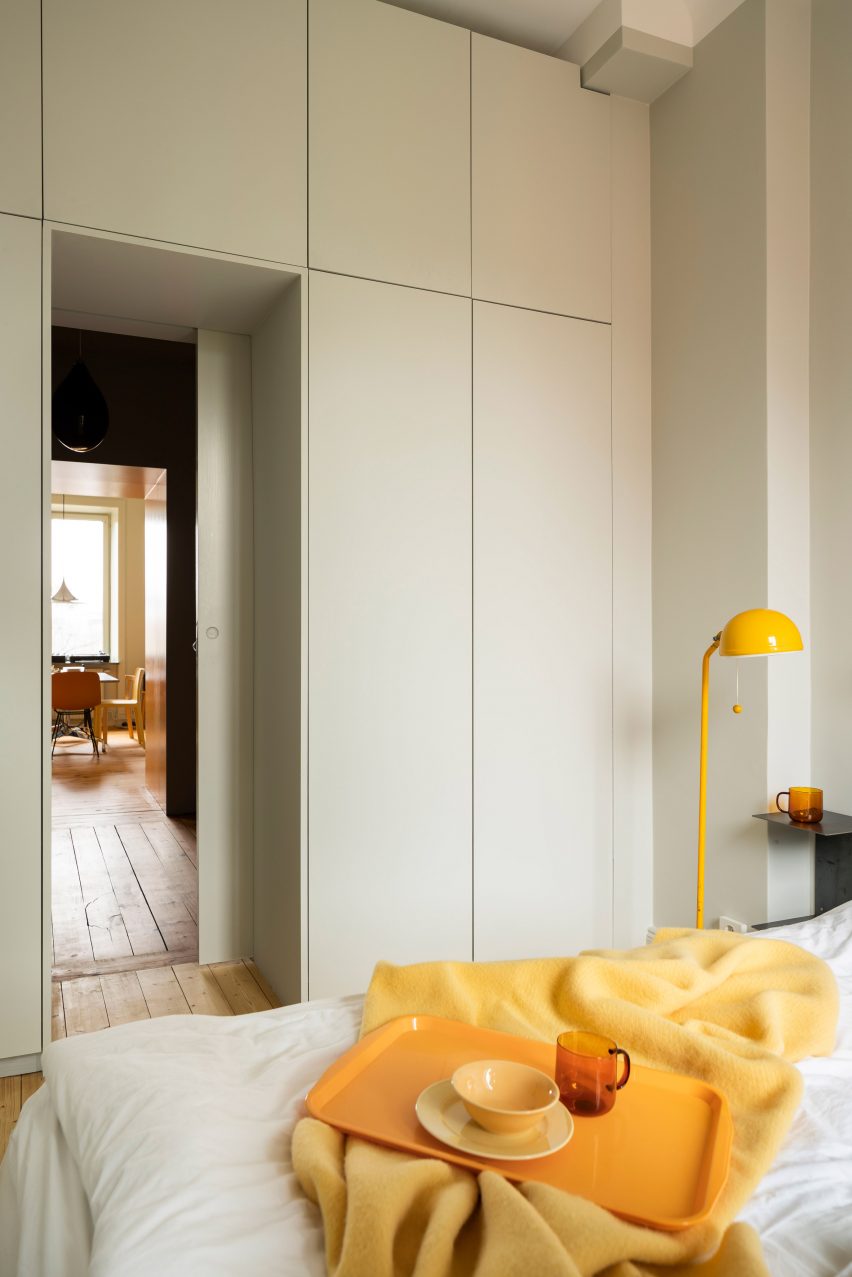
The storage walls include a seven-metre-long storage wall in the kitchen, a white wall of storage in the bedroom and a complex configuration of yellow cupboards in the space-restricted bathroom.
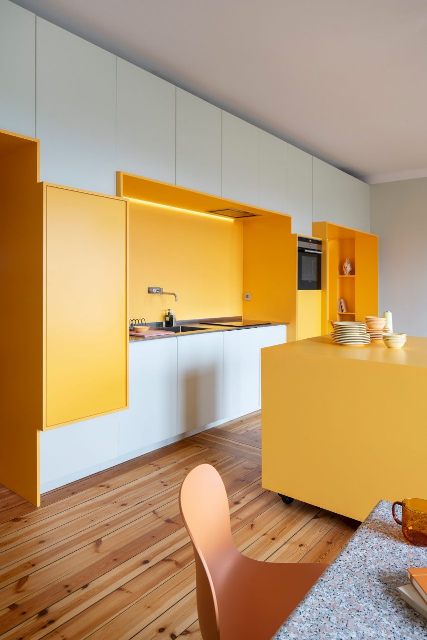
Lookofsky Architecture designed these walls to neatly contain all the apartment's storage needs and practical features, while also creating a sense of depth.
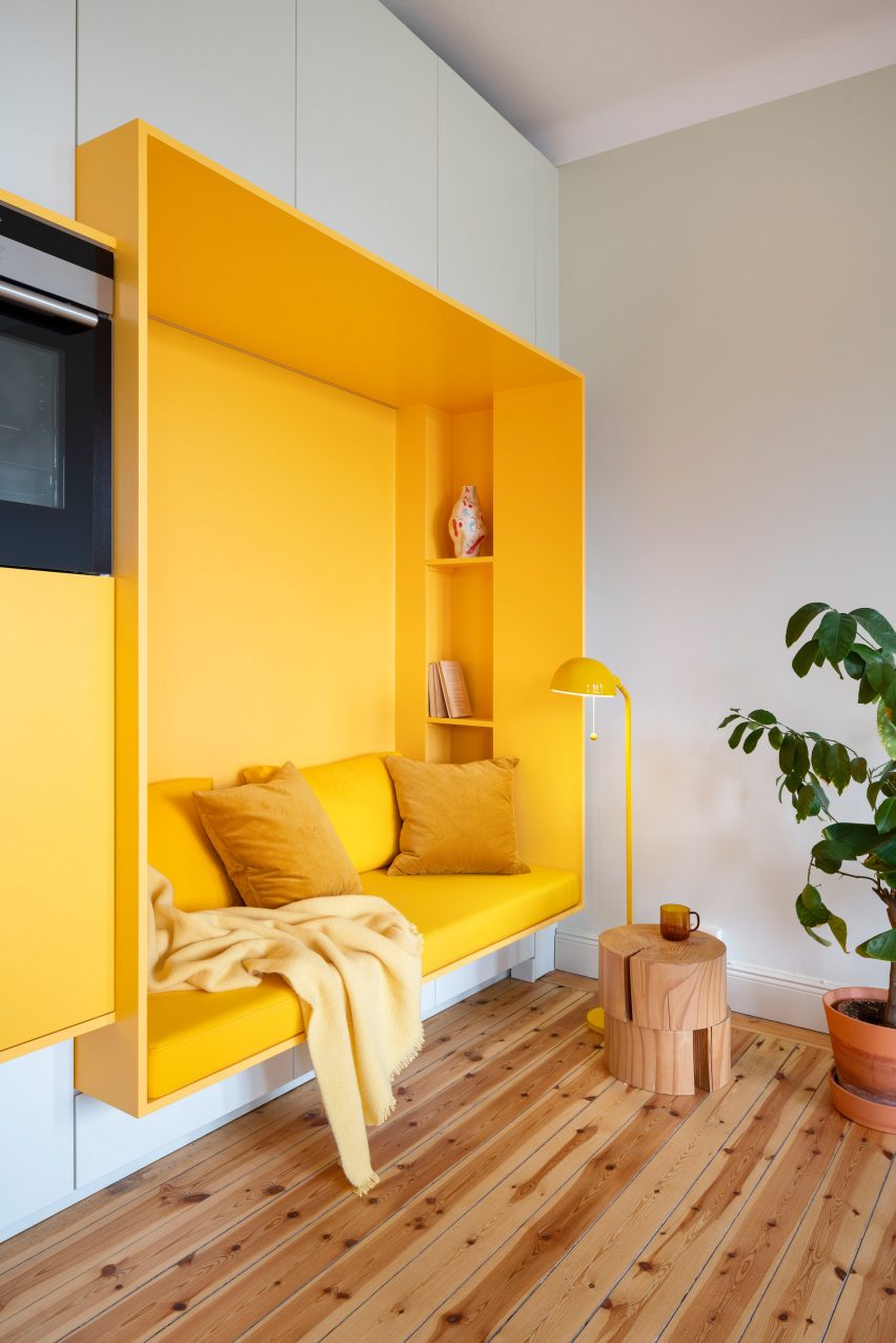
For instance, the cupboards in the open-plan living room and kitchen frame a bright yellow recessed seating area and kitchen countertop, while in the bathroom, they provide a frame for the sink and toilet. In the bedroom, the cupboards are organised around the door frame.
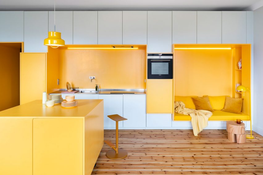
"The seven-metre-long kitchen wall, which is located in a large multifunctional room that was previously two smaller rooms, is broken up into a cluster of smaller subcomponents each containing their own separate function," the architect and studio founder David Lookofsky told Dezeen.
"By giving the components such as the oven and countertop their own articulated frame, the kitchen wall becomes a playful composition with depth and variation," he continued. "This gives new life to the space and sets the stage for social interactions and everyday life."
In the bathroom, the series of yellow storage cabinets are combined with a concrete sink and square grey tiles, which are installed across the floor and in the shower enclosure.
Due to its long and narrow shape, Lookofsky said that this was the most challenging part of the design.
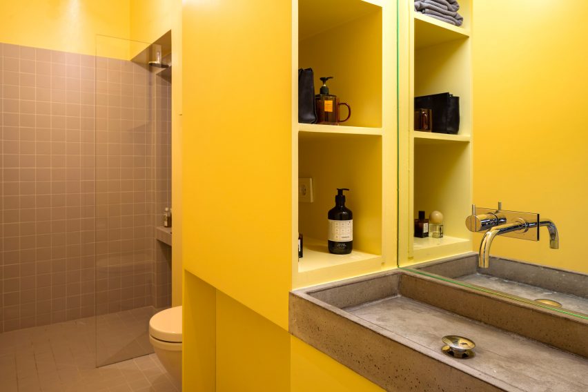
"We had to be quite careful with the placement of functions and the depths of the sink and the toilet," he explained.
"The idea for the function wall here was to conceal all of the many pipes, installations and storage in a continuous wall. We chose to treat it like a long cubist piece of furniture with depths, cabinets and functions."
Selected by the clients, the bold colour was deliberately used to move away from the typical shades of grey that are found in many Stockholm apartments.
"The client was keen on something more informal and playful," said Lookofsky. "So it was a natural part of the project that we were going to work with some sort of colourful palette from the start."
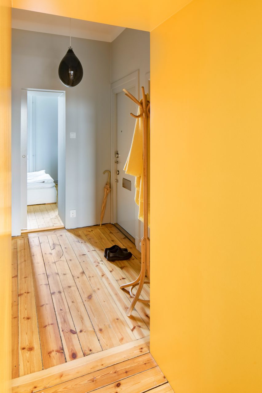
"We proposed using yellow contrasting a very subdued green in our first design sketches, in order to let the function boxes in the living room and kitchen stand out clearly as a form," he continued.
"From there on we did a lot of colour testing on site where the client finally chose between different types of yellow and green."
Much like Lookofsky Architecture, Cubículo Arquitectos created extra storage in a small Porto apartment by installing custom-built cupboards and shelves around its existing structural columns.
Photography by Mattias Hamrén. Styling by Hanna Tunemar.