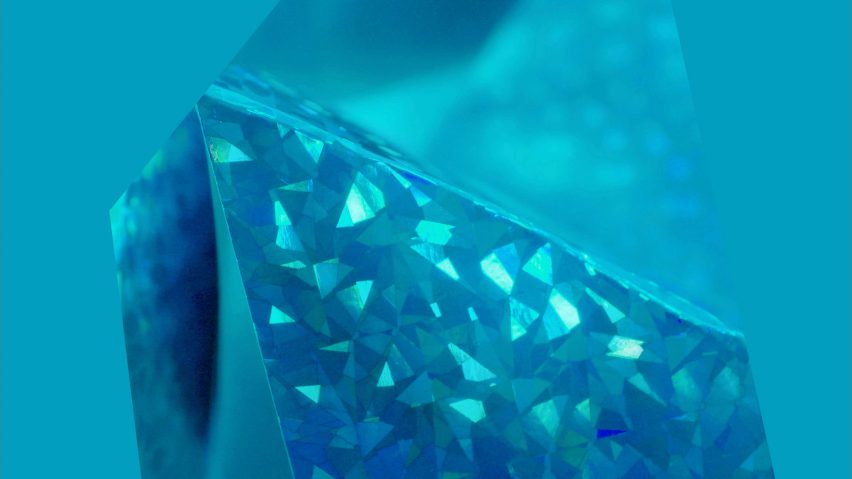
An electric shade of blue called AI Aqua will come to the fore in fashion, tech and interiors in 2021 according to trend forecasting service WGSN.
Announced this week, the colour is described by the brand as a "positive" hue, that is "both sporty and trend-forward".
When selecting a colour, WGSN's research method involves examining significant developments within various industries as well as socio-economic conditions.
The trend forecaster believes that colour trends have a trickle-down effect and that the current political climate and images seen on news broadcasters can influence the colours that society is drawn towards.
"Going forward, technology is only going to become a more integral part of our lives," WGSN's head of colour Jane Monnington Boddy told Dezeen. "The digital world will become faster, more efficient, and in turn we will become even more connected and aligned."
When selecting AI Aqua, the team looked in particular at the arrival of 5G, which is being rolled out to devices this year and is set to be widely available by 2021.
Monnington Boddy told Dezeen that the concepts around augmented reality and artificial intelligence will become more accessible thanks to the faster speeds provided by 5G.
"The things that were previously out of reach for many will now become possible, causing everything to change," she explained.
The team found that blue shades were popular for internet searches, and for the branding of tech companies.
"We also looked at the most popular colours that appear on the internet and blue came up as the most prolific. A study of the Internet's most heavily trafficked websites showed that there are nearly twice as many shades of blue as shades of yellow and red, and three times as much green," said Monnington Boddy.
"If you think of sites like Facebook and Twitter, which we interact with on a daily basis, they all use predominantly blue branding. If we are set to spend even more time within our devices we are going to have even more exposure to this colour."
WGSN predicts that, as fashion and lifestyle trends cross-pollinate more rapidly, the blue colour will have major commercial appeal and will be particularly popular for "designs that inhabit the space between active and fashion".
"Blue is a colour that has always been commercial in fashion – you always have to have blue in your palette," explained Monnington Boddy.
"When I was a designer in the 1990s, we always had to include blue because it sold, but it was never pin-pointed as a fashion colour. Whereas now, I think it's coming through as a statement colour – the tone of Aqua AI is a lot more digestible for most people."
Indeed, A.I Aqua follows on from another bright hue, Neo Mint, which is a pastel shade of green that the company selected as its colour for 2020.
Pantone's colour of 2019, Living Coral also falls into the brights category.
"These bright high-summer hues used to be restricted to seasonal palettes within the fashion industry, but we're now seeing them appearing across the year," said Monnington Boddy.
"Since Millennial Pink (a colour that became popular in 2016 and dominated Milan Design Week in 2017) I think people are much more accepting of colour now."
Another argument presented by Monnington Boddy is that the popularity of bright colours could be because global consumers are craving optimism in turbulent political times.
Data harvested by WGSN's retail analytics tool, WGSN Instock, reported that sales of yellow products rose by 18 per cent in the first half of 2018 in the UK.
"We've found that rather than replacing black – sales of which remain strong – these colours are actually taking some of the market share that was previously occupied by neutral and natural colours."
At the end of last year, when global colour institute Pantone announced Living Coral as its colour of the year for 2019, the decision was met with mixed reactions.
While the colour institute describes the peachy orange Living Coral tone as an "animating and life-affirming coral hue with a golden undertone that energises and enlivens with a softer edge", others said that the colour fails to highlight the ongoing destruction of coral reefs.
Writing for Dezeen, writer and presenter Michelle Ogundehin described the choice as "harking of naivety", while Australian design studio Jack and Huei said it was "tone-deaf, and downright irresponsible", proposing instead a shade called Bleached Coral as an alternative.

