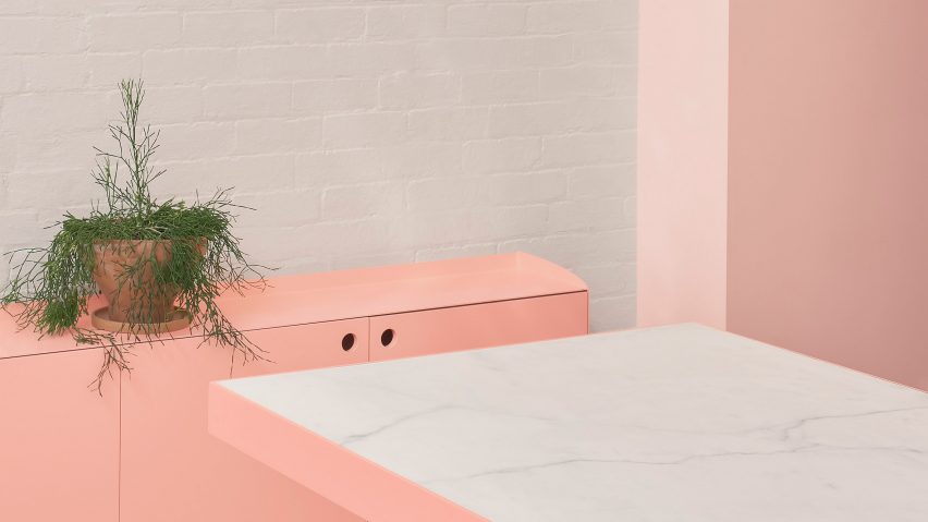
BoardGrove Architects uses gradated tones of peach throughout Melbourne office
Australian studio BoardGrove Architects uses three tones of peach to define different zones within this revamped shared studio space in Melbourne, Australia.
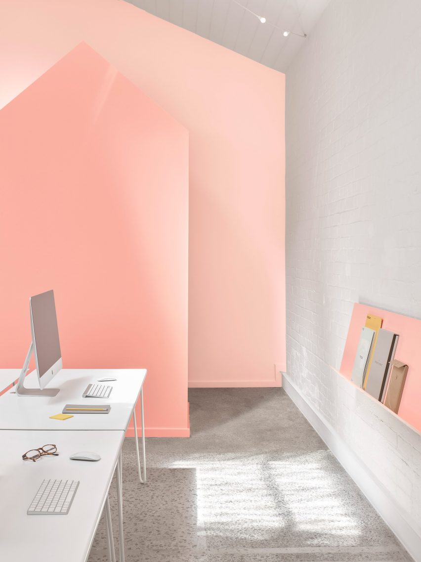
The clients – property developers, Angle, and branding business Earl St – asked local practice BoardGrove Architects to refresh its existing dark studio.
The architecture studio created two separate spaces: a front of house area for greeting and meeting guests, and a rear of house area for working.
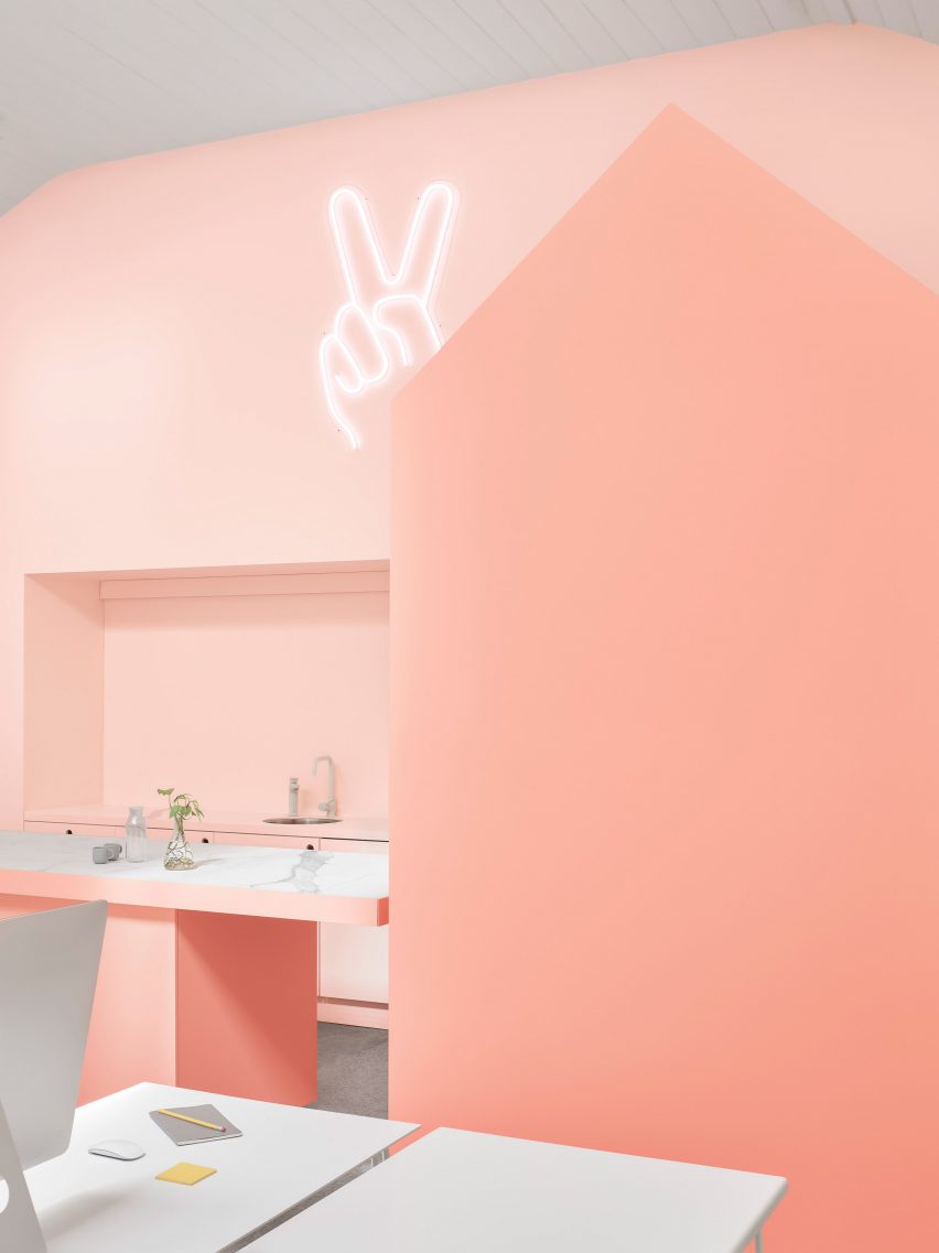
The practice painted the existing brick walls and timber ceiling white in order to make the space appear brighter and improve the sense of natural light.
The white also provides a backdrop for the new peach-toned insertions, which include shelving, storage, a glazed stable door screen, window seats, a kitchen and toilets.
The wall-mounted shelving and storage were designed to help display the colourful marketing collateral that the two businesses produce for developments. Circular holes that accommodate pot plants are cut into the storage and window seats.
"The colour of the new objects inserted within this white envelope were choreographed to gradate in colour from the street through to the rear of the workspace," explained the practice.
"Three peach tones are used, each defines one of the three parts of the studio – front of house, the working zone and the back of house areas."
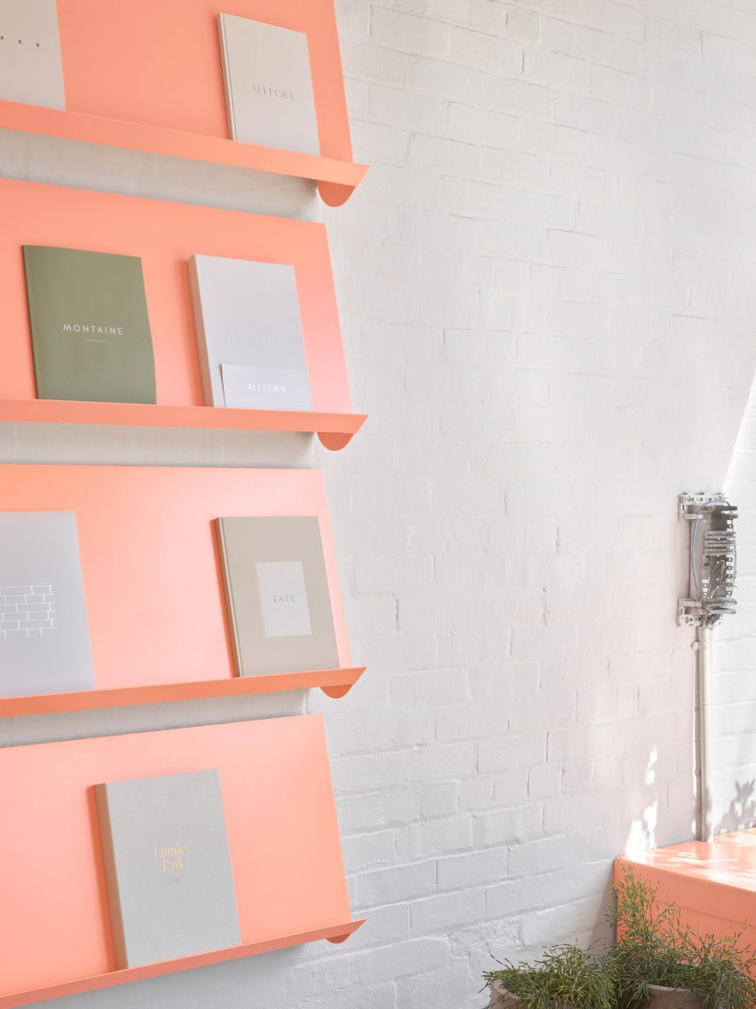
The tones of peach respond to the daylight available in each space, moving from a darker shade on entry where most of the natural light is present, to a very soft tone at the rear of the space.
The practice also repainted the space's existing furniture like the kitchen bench and front meeting table to match their surroundings, while white powder-coated steel desks were chosen to tie in with the white walls.
"Our decision to explore a palette of gradated colour through the depth of the space is a nod to the [Earl St] Instagram account, which is highly curated with a continuous gradation of colour from one image to the next," said the practice.
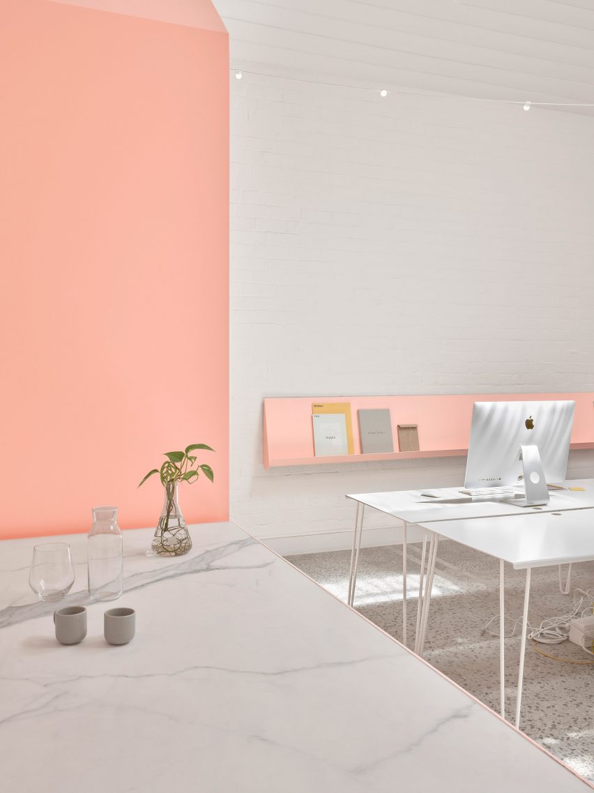
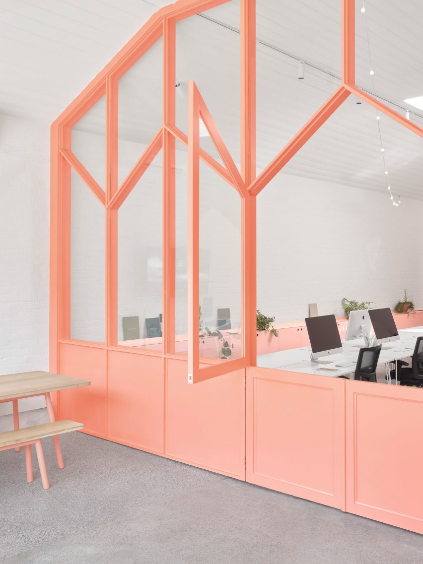
The front of house meeting area is separated from the work area by a timber stable door screen that has a solid lower half and a glazed upper half. This divide was placed at waist height in order to disguise the clutter that often collects below desks, giving the office a tidy appearance from the street.
A pitched volume in the back of house area conceals the food and beverage fridges, microwave, sandwich press and crockery storage for the kitchen.
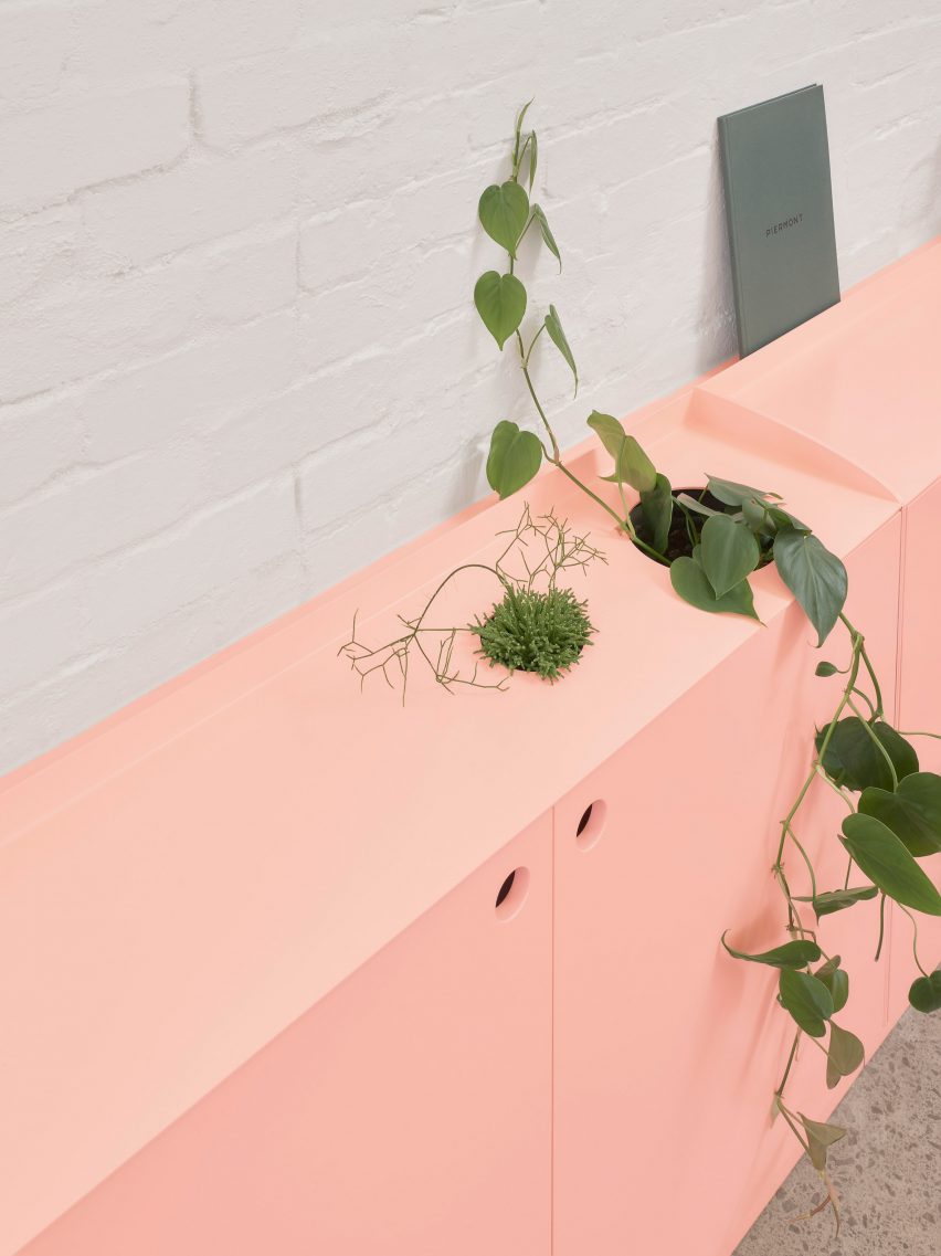
An existing porcelain topped island bench in the kitchen was re-painted in the light peach hue while a sink, dishwasher and under bench storage is recessed into the back wall.
Previous projects by Boardgrove Architects include a Melbourne apartment that is designed to look like a gallery and a pair of coffee tables made from opposing forms that appear to have been cut from the same piece of steel.
Photography is by Haydn Cattach.