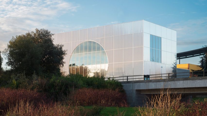
6a Architects has extended the MK Gallery in Milton Keynes with a rectangular steel box that pays homage to the English town's "iconic" masterplan.
Now open, the silver extension forms part 6a Architects' overhaul of the art gallery, which was built in 1999.
The renovation has doubled the size of the original building, with galleries laid out to form a visual axis that echos the town's gridded plan, designed by modernist architect Derek Walker in the 1960s.
"The main objective architecturally was to embed the new programme in a building which reflects, celebrates and updates the unique utopian ideals of the city into the 21st century," studio co-founder Tom Emerson told Dezeen.
"We wanted to make a building that was utterly Milton Keynesian. The prototypical building of Milton Keynes – from the shopping centre to the Milton Keynes Development Corporation-designed offices – is the steel frame shed and its variations."
The renovation is characterised by its rectangular extension wrapped in corrugated stainless steel, which is punctured by a large circular window to echo the landscaping of the adjacent park.
"The new MK Gallery is the final building on Midsummer Boulevard, the long axis that runs through the centre of the city from the railway station to Campbell Park" Emerson added.
"The facade which faces the park is a meeting point between the grid of the city and the circular geometries of the park."
Inside, using both old and new structures 6a Architects has created five galleries containing 500 square metres of exhibition space.
Doors and windows are positioned at either end of each gallery to create the linear axis, and maximise views of the landscape.
Flanking the galleries, 6a Architects has also introduced a sequence of public spaces, designed in collaboration with artists Gareth Jones, Nils Norman and graphic designer Mark El-khatib.
On the ground floor, this includes a cafe, learning studio and foyer complete with industrial finishes, teaming hanging globe lights and exposed ductwork with structural elements painted in bold primary colours.
Above these public spaces, a new auditorium, named the Sky Room, has 150 retractable seats and a pared-back finish that draws attention to views out over the park through the large circular window.
Elements of the original gallery have also been restored in the renovation, including the main entrance's sandstone and terracotta facade. It is complete with a large red neon heart – the first ever logotype for Milton Keynes designed by Minale Tattersfield.
The gallery will open with The Lie of the Land exhibition, which explores the history and story of Milton Keynes – the large new town in the county of Buckinghamshire designed by Walker.
With the aim of creating a city "greener than the surrounding countryside", Walker's design follows principles of utopian architecture, including those of the garden city movement.
6a Architects is a London-based studio founded by Tom Emerson and Stephanie Macdonald in 2001. Other recently completed projects by the practice include timber-clad student halls at the University of Cambridge's Churchill College and a concrete photography studio for Juergen Teller.
Photography is by 6a Architects unless stated.
Project credits:
Client: MK Gallery
Architect: 6a Architects
Project manager: Jackson Coles
Structural engineer: Momentum
Environmental engineer: Max Fordham LLP
Quantity surveyor: Gleeds
Landscape architect: jcla
Main contractor: Bowmer + Kirkland
Artists: Gareth Jones & Nils Norman

