"A totally senseless structure"
In this week's comments update, readers can't agree whether Thomas Heatherwick's Vessel at Hudson Yards will elevate New York to new heights.
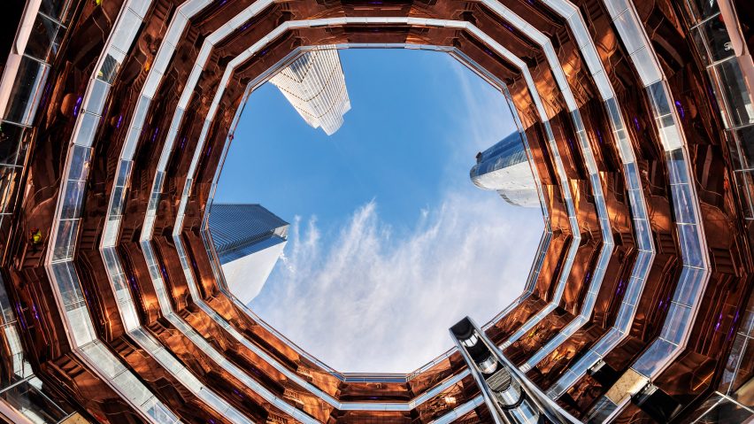
Hive of activity: readers are divided over Thomas Heatherwick's Vessel, a honeycomb-like sculpture the studio designed for Hudson Yards in New York.
"Gives me New York attitude and vibes," praised Justas Studio. One more reason to visit the city later this year!"
"Will I visit next time I’m in New York City? Of course I will," agreed Threefloatingorbs. "But will it change my impression positively, mostly likely not."
"Reminds me of an office trash can at some overly hip start-up space," added Obesa Adipose.
Malgorzata Boguslaw was also unimpressed: "Totally senseless structure. No wise person would climb up and down those stairs."
This reader was reminded of a particular fitness brand:
What do you think of the sculpture? Join the discussion ›

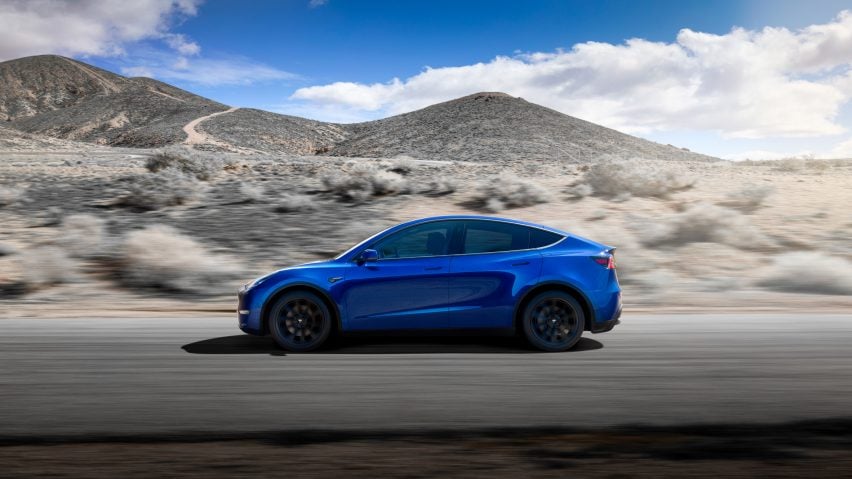
Roadworthy?: the latest and "safest" all-electric car to be released by Tesla, the Model Y crossover SUV, has received mixed reviews. The brand's owner Elon Musk has said the vehicle will go on sale next year.
"If the selling points continue to be nought to 60 speed and tight cornering they've missed the point going forward, it's a teenage mentality applied to car advertising," argued Idracula.
Spadestick was also less than complimentary: "Butt ugly".
"I'd be willing to bet that many hundreds of thousands will love it and already can't wait to slap down their hard-earned to get one," said Mattster, despite the criticism.
Tesla did manage to find a fan in Danny3xd: "Man I want one! Love my Prius but the nought to 60 is, wait for it... nowhere near as beautiful! Please don't repeat that. She's sensitive."
One commenter had a different agenda:
Do you think the new Tesla is "butt ugly?" Join the discussion ›

Dud note: commenters largely agree with Phineas Harper's view that the decision to build the London Centre for Music so close to an existing concert hall is unnecessary and extravagant.
"Brand-new, enormous cultural buildings that are 80 per cent circulation always make me a little suspicious," commented Architect. "They look a lot like exercises in international money laundering."
Andrew went on: "The benefits of £300 million being spent on properly affordable housing as opposed to one new concert hall would be transformative for the city."
"I completely agree with this article," said Alfredhitchcock. "The proposed concert hall is nothing more than a vanity project."
Chris was one of few readers who defended the project: "It's privately funded from what I believe? They are not building a school or hospital or a homeless centre, it's a concert hall and good on the city for doing so."
Ultimately though, this reader thinks it won't go ahead:
Do you agree with Harper? Join the discussion ›

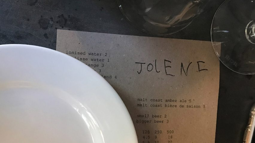
Child's play: a logo designed for north London restaurant Jolene by the six-year-old son of graphic designer Frith Kerr has polarised readers.
"Wow, that must have been the easiest fee ever – wonder how much they charged/ripped off the client for that?," asked Don Draper.
Ian Byrne replied: "If they are charging five quid for a bottle of beer, it seems a pity that they couldn't afford a proper designer."
"I could get my cat to paw print our next logo," added an inspired Spadestick.
Rob Swain defended the re-brand: "It tells you something about the business, there's a story in it – that's why it's good. Most designers never achieve this. It's clear they have confidence in who they are and what they are doing."
This commenter was also impressed:
Clever or silly? Join the discussion ›