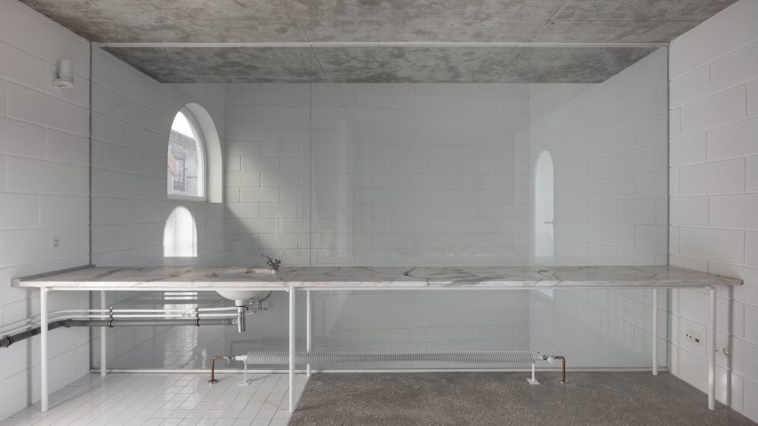
Staggered floors overlook four-storey void at architect's house in Lisbon
Architect Daniel Zamarbide worked with Leopold Banchini to design a pared-back Lisbon house with glass-walled rooms overlooking a full-height living space, as his own home.
Zamarbide and Banchini, who ran a studio together called Bureau A until 2017, collaborated on the design of the house that is tailored to suit his family's lifestyle.
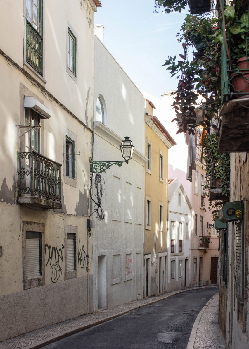
Zamarbide named project Dodge House in reference to American architect Irving Gill's Dodge House in California, which combined a modernist sensibility with elements borrowed from the architecture of the Spanish missions.
The property squeezes three bedrooms plus living spaces onto a footprint of less than 40 square metres in the Portuguese city's Mouraria neighbourhood.
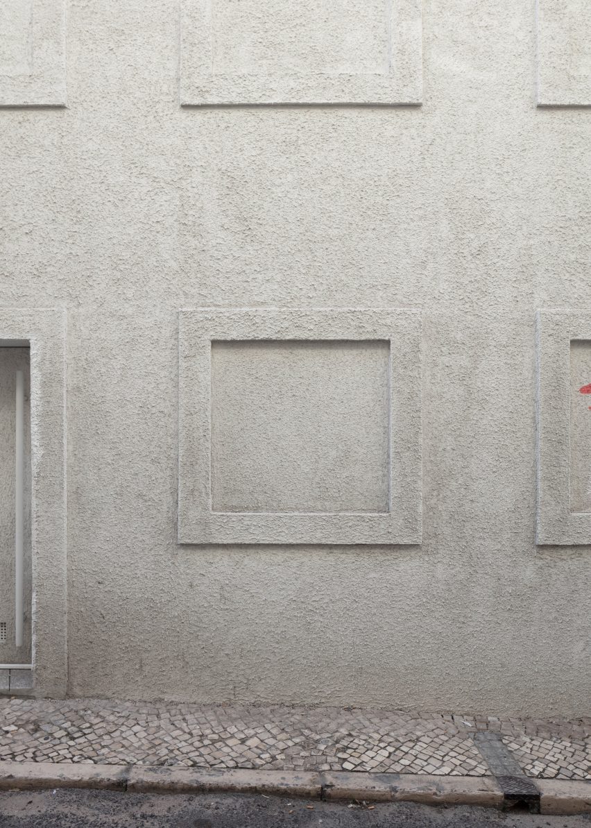
Although it is a new-build house, the architects replicated the facade of an abandoned property that previously occupied the site.
Dodge House's predominantly opaque facade evokes the shuttered openings of disused buildings that have become common in Portugal's major cities since the economic crisis that hit the country ten years ago.
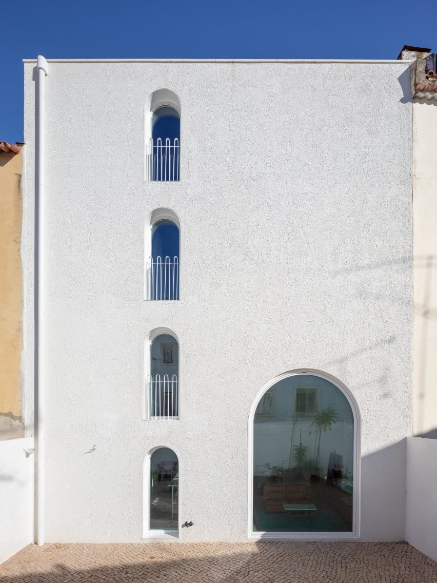
The derelict facade was the only remaining part of the existing building. By echoing the rhythm and window dimensions of the original house, the new addition maintains a sense of connection with its historic surroundings.
It's rear facade opens onto a cobbled courtyard and is designed as a calm and neutral intervention within the otherwise eclectic context of the surrounding urban fabric.
Zamarbide described this facade as a "white canvas" that is punctuated by arched windows framing views of the courtyard or, from the upper floors, the roofscape of the surrounding neighbourhood.
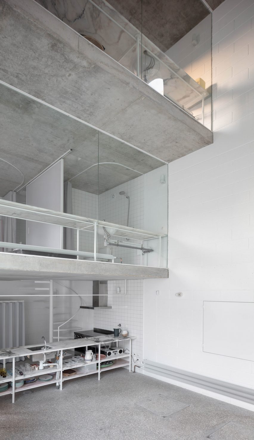
Internally, Dodge House features a stepped section with three upper floors that gradually increase in size. The resulting full-height void creates a visual connection between the ground-floor living area and the levels above.
"The house was designed and built around the idea of space, void and interior volume," Zamarbide told Dezeen. "This idea appeared in the design process as a symmetrical section that gives the same value to the void as to the occupied space."
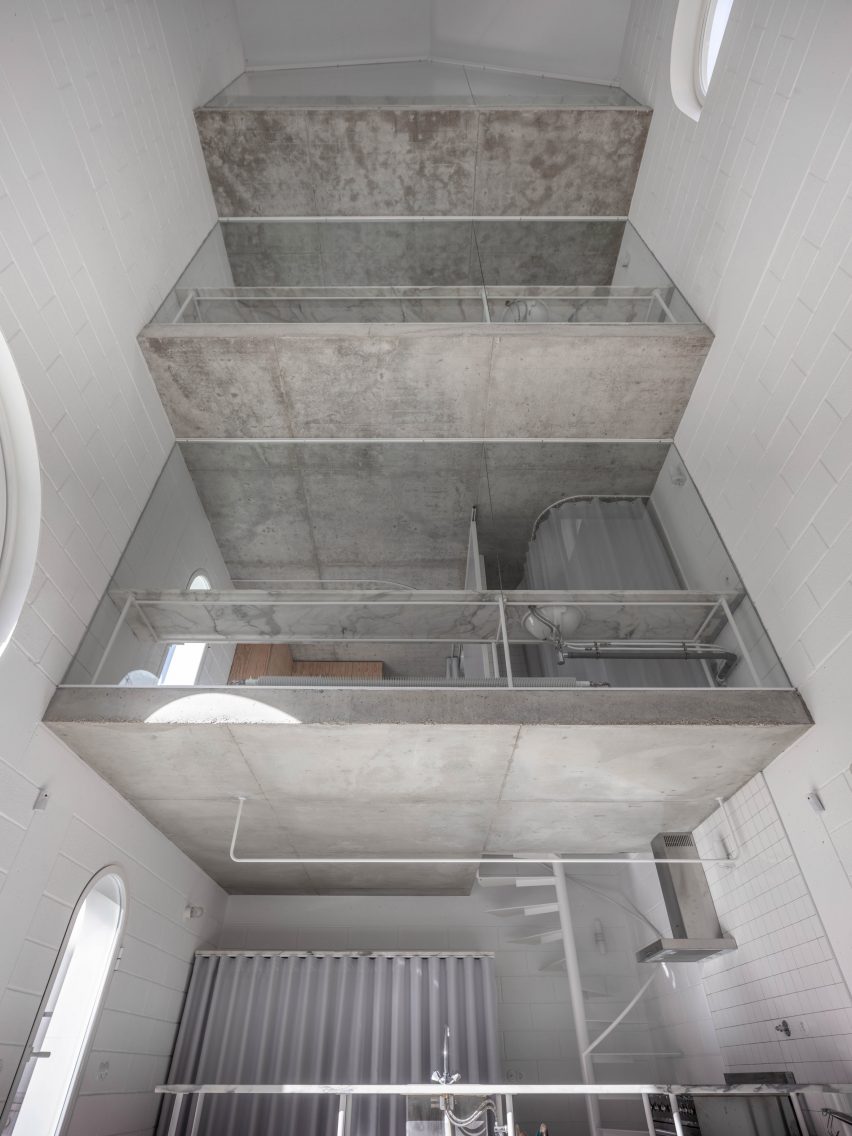
A modular plan has resulted in a sequence of spaces intended to function like hotel rooms by providing all the necessary amenities in a simple and self-contained format.
The plans of the first and second floors are the same, but the second floor occupies more space. The third floor is used as a study that receives natural light from the west in the evening.
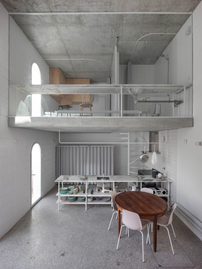
Cement block walls over a reinforced concrete frame are painted white to brighten the interior. Throughout the project, the architects used standard materials and construction materials to reduce the overall cost.
"All materials are bare, exposed, presented so we live with them," explained Zamarbide. "There is a bit of the idea of the living machine, but also how light travels throughout the space – a very important aspect for the interior."
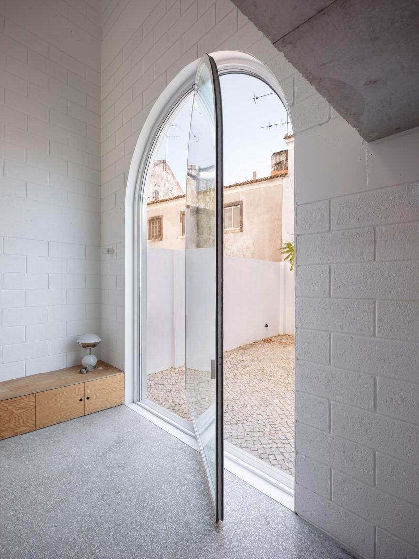
Custom-made metalwork and standard glass partitions combine with locally sourced tiles to create an interior that the architect claimed provides a simple and practical backdrop for family life.
Elements such as a white spiral staircase and the pivoting arched door connecting the living space with the courtyard introduce playful details to the pared-back spaces.
"The goal of the space is quite simple: to create an adequate, beautiful and practical living frame, a place for thinking and reflecting."
Banchini recently designed a concrete exhibition space in Bahrain with retractable glass walls that connect the new building to its historic neighbourhood.
Photography is by Dylan Perrenoud.