Creuna Norway creates simplified visual identity for the city of Oslo
Creative agency Creuna Norway has worked with citizens of Oslo to create a new visual identity for the city inspired by its buildings and history.
Comprising a simplified logo and a design system made up of basic geometric shapes inspired by Oslo's architecture, the design is intended to better communicate to the city's citizens what their municipality does, and how it works.
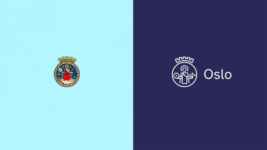
The revamped logo is a simplified line drawing of a highly detailed art deco-style logo designed in 1928, which shows the patron saint of Oslo, Saint Hallvard.
Dubbing the original logo along with the city's decades-old design manual, "outdated and complex", Creuna Norway reported that most of the city's some 200 departments and service organisations had long since stopped using the original. Instead they had mostly chosen to create their own, which had lead to a chaotic mix of different identities.
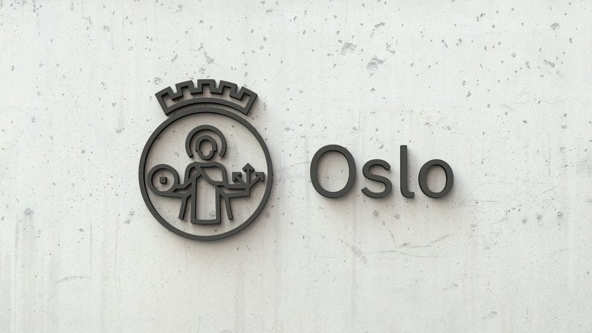
The Oslo agency wanted to celebrate the city's diversity and collaborative spirit in the new logo. With this in mind, they worked directly with employees, agencies and politicians, residents, contractors and other stakeholders, in order to inform the design process.
"The core idea was to design in sprints, learning from each one, then steadily expanding the breadth and depth of the design progress, as it went along," the agency explained. "Each left their mark and handed on the baton to others in the collective design effort."
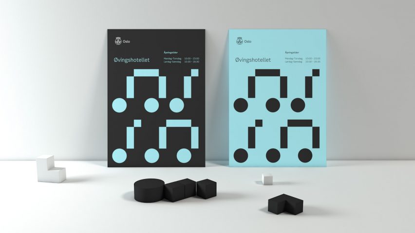
The result is a single logo with a modern design rooted in the city's history. The logo, which can be used by all municipal entities, works as part of a wider flexible design system that aims to be simple but not monotonous.
The package includes a digital design manual a digital design assistant that the design team created so that all 53,000 of the city's employees can make their own Oslo branded communication.
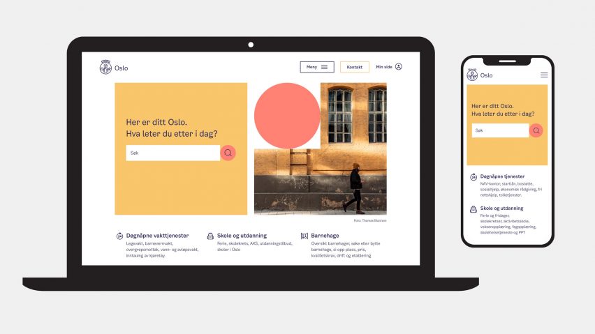
Due to the high level of flexibility in layout, colour, look and feel, Creuna Norway said that it's possible for Oslo's pop music centre for example, to build a visual identity that serves its mission well, using the exact same design tool kit used by the city's health services, tax authority, or planning and building department, and so on.
"Oslo can now implement a monolithic brand structure to provide authority and a cornerstone for the city's identity," it said.
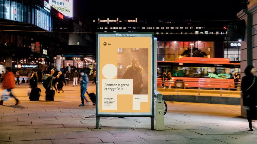
"The new visual identity is distinctive yet flexible and is a great tool to help the city and its residents continue to connect. Now it is much clearer to Oslo's citizens what their municipality actually does, and how it works," continued Creuna Norway.
"This improved transparency helps build closer bonds between the city and its residents: a fertile platform from which democracy itself can flourish."
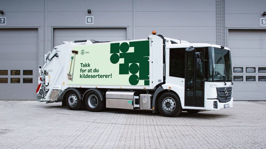
Creuna Norway hopes that the new branding will help the municipality's successes to be recognised by its citizens – something that has not happened in the past due to the unclear and fragmented visual identity of the city.
"These successes spanned many years and several city administrations across the entire political spectrum," it said. "The city was changing for the better: becoming more social, more inclusive and more sustainable. It was providing services and experiences that were loved by its residents."
"All of this was implemented by service organisations that citizens were happy with, without knowing that they were part of the municipal government. In fact, few residents fully understood how their city government worked."
Other logos and identities designed for cities include a campaign by Advertising agency 72andsunny that sought to highlight creative entrepreneurs in Los Angeles. The logo features a long space in between the letters L and A that users can customise.