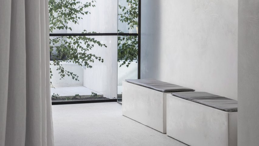
White plaster walls, concrete floors, and grey marble fixtures helped Australian practice Adam Kane Architects avoid an "overly feminine" aesthetic inside the Mariana Hardwick bridal boutique in Melbourne.
Decked out in cool tones and natural materials, the Mariana Hardwick boutique has been designed by Adam Kane Architects to be the antithesis to typical bridal retail spaces.
"We wanted to ensure the design wasn't just a stereotypically opulent, and sometimes overly feminine space which you often find in most bridal boutiques," said Adam Kane, founder of the practice.
"Instead, we sought a level of refinement that draws inspiration from European retail and even museums – places that have a more pared-back aesthetic."
The 1,400-square-metre store occupies the ground floor of a Victorian-era hotel in the south of Melbourne. It had sat vacant for several years before being let out to various tenants, leaving behind a rabbit warren of rooms, each with different fit-outs.
Kane and his team first set about removing any existing partition walls and past interventions to form a simple, open-plan interior where the wedding dresses could take centre stage.
Pared-back retail spaces like the David Chipperfield-designed Valentino store in New York – where almost every surface is made from grey terrazzo – were the main source of inspiration for the practice.
"We wanted to replicate the restraint and timelessness associated with these designs," Kane explained to Dezeen.
"As a result of our minimal design concept, each finish was highly considered to ensure the space didn't appear sterile or bland."
The remaining structural walls have been covered in polished white plaster, while pale concrete has been used for the floors and a couple of seating blocks.
Some of the store's fixtures like the chunky service counter and wash basin in the customer bathroom are also made from light grey marble – together with the other pale materials used, the practice hopes the space will evoke the "white-on-white layering of a gown's materiality".
Instead of cluttering the shop floor with all of the brand's wedding dresses, the practice has suspended just three black frames from the ceiling to present a range of pieces, akin to how a museum presents a selection of artefacts.
The centre of the store features a changing room that's closed off by an off-white linen curtain set on a circular track.
"A deliberate decision was made for the changing room to be a standout feature of the space, aiming to heighten the experience, rather than just a hidden part at the back," added Kane.
A wall at the rear of the store has also been swapped for a full-height panel of glazing, which looks through to a small white brick courtyard dotted with potted plants.
Adam Kane Architects was founded in 2015 and is based in Richmond, a suburb southeast of central Melbourne. Two years ago the practice added a gabled art studio to a home in Victoria, finishing it with a corrugated metal roof and cement walls.
Photography is by Tom Blachford.

