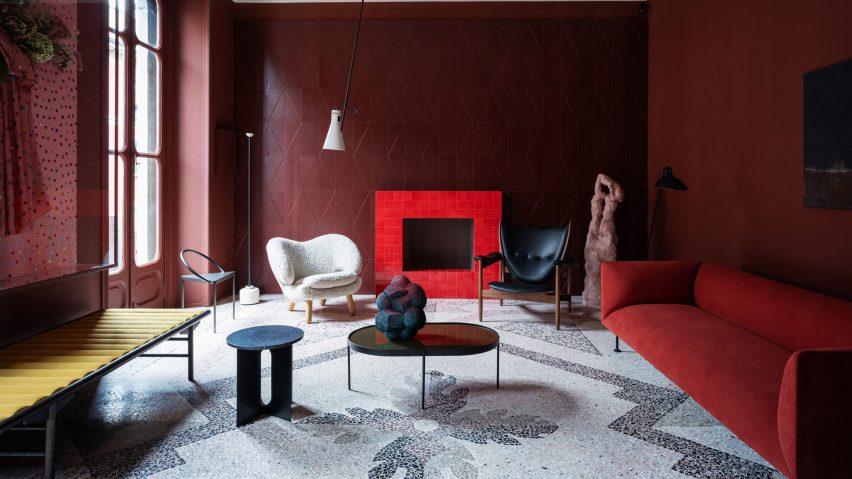
Design studio H+O has fitted out an apartment in Milan's Brera district, showing how tiles can be used to create bold contemporary interiors.
H+O, a collaboration between Italian architect and designer Elisa Ossino and Danish creative director Josephine Akvama Hoffmeyer of tile brand File Under Pop, unveiled the domestic interior during Milan design week.
Designed as the antithesis of the "cold" showroom, the apartment will serve as an exhibition space for the duo's work, but could also function as a home.
For Milan design week, the pair entirely redecorated the space and installed furniture and artwork by nine other studios and brands, for an installation called Perfect Darkness, which will remain in place for the next 10 months.
The designers hope the space will also serve as a salon for a series of talks, dinners and cultural activities.
"At this moment it's much more interesting for people to see a real apartment. Showrooms are so cold and the home is something special," Ossino told Dezeen.
"When you go to see furniture or design it's because the home is where you live and where you spend most of your time, so it's very important to create a refuge. That's why we decided to create a real home."
On the third floor of a building set back from Via Solferino, the apartment has a single bedroom and bathroom, and four interlinked rooms that run along the front of the space and each look over an internal courtyard.
These are a kitchen complete with a red, tiled storage column, as well as a living room, dining room and narrow office space between the two. The bedroom and bathroom are tucked away at the back of the apartment, leading off the wedge-shaped entrance hall.
Each room has its own particular atmosphere with walls and ceilings painted in earthy tones with paint by File Under Pop, and many tiled surfaces.
"The idea was to find a special place to create some experimental interiors projects and also create a collection of tiles that we designed together," explained Hoffmeyer. "In our mind was the idea to use tiles as an architectural element to create an interior space."
The pair have always loved old-fashioned tiles, but wanted to create a collection that could be used in a contemporary way. To achieve this, they inset three-dimensional geometric patterns into the surface of the tiles rather than printing on a design.
"When you work industrially you have to make 400 square metres of each tile, in one colour in one format so we had to work very precisely," said Hoffmeyer. "We always loved the handcrafted work, but we really wanted to make it democratic."
Ossino and Hoffmeyer bought the apartment last summer and have been working on it since October, to prepare for Milan design week.
"We were a bit worried because the apartment was completely wrong, with the walls and all the floors covered with 1960s wood laminate," explained Ossino. "But we saw we saw the beauty of this and the possibility to transform it completely."
They pulled up the floors to reveal original 17th-century terrazzo floors beneath that run throughout the main rooms of the apartment.
In the bedroom, the floors and walls are a deep olive green, with the mattress installed on a white tiled base. White perforated brick-like tiles create a permeable screen to the entrance hall beyond. Work by Danish fashion designer Stine Goya hangs on the wall.
"It's an old way of filtering the light, used in Mediterranean culture," said Ossino. "We like to create a screen and use tiles in that tradition but absolutely seen in a contemporary way."
The narrow bathroom is tiled from floor to ceiling with spotted tiles: "The idea was to make a sort of optical space, like an installation," Ossino explained. "So when you go inside the bathroom you forget that this is a bathroom and it becomes like an art installation."
The living room walls are covered with reddish-brown terracotta tiles with a subtly three-dimensional diamond pattern, designed by H+O.
The walls are offset with a bright red tiled fireplace, and the space is furnished with an ochre sofa by Danish brand Menu and a white boucle chair by House of Finn Juhl, which reissued the iconic Grasshopper chair at the Salone Del Mobile furniture fair this year.
"We like the idea to go from a very strong colour that we have in the living room, to contrast it with a cooler colour in the next room and everything becomes more fresh."
A bespoke speaker system by Artcoustic matches the colour of the walls. Ceramic pieces that contrast with the colour palette from contemporary gallery Officine Saffi can be found throughout the space.
The kitchen floor features a black tiled floor broken up with white tiles to create a rectangular pattern. A light by Gino Sarfatti, produced by Flos, hangs above the kitchen table, and the surface along the length of the back wall is tiled with red grouting. Radiators throughout are provided by Tubes.
Ossino and Hoffmeyer plan to entirely redecorate the flat each year, to reflect their new collections and to refresh the feel of the interior. Each iteration is likely to offer a blend of Mediterranean culture with its focus on tiles, and the clean lines of Danish furnishings, with the palette reflecting both influences.
"There's a strong link in our culture. It's not only that we are friends," said Hoffmeyer. "There's a kind of mix that creates a very easy match between these two cultures."

