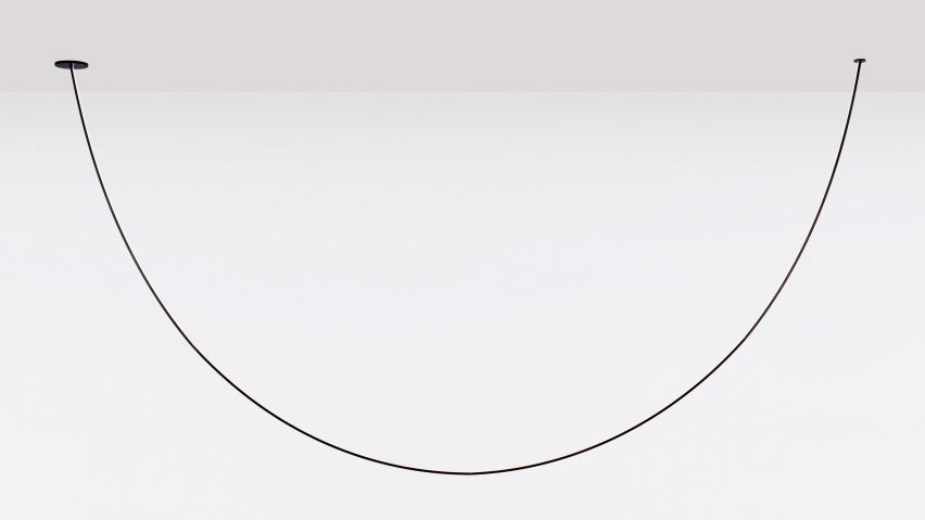
From an arch that stretches across a room, to a ceiling lamp that looks like giant rubber bands, Dezeen editor Amy Frearson picks the top 10 lighting designs from Euroluce 2019.
Lighting showcase Euroluce only takes place every other year as part of the Salone del Mobile, the huge furniture fair at the centre of Milan design week.
At this year's event, which took place from 9 to 14 April, standout exhibitions came from Italian brands Flos and Foscarini, along with Brooklyn brand Roll & Hill and London-based designer Michael Anasstassiades.
Here's our pick of the top 10 lights the show had to offer:
Pole by Philippe Malouin for Roll & Hill
Designed to make lighting the centrepiece of any room, Pole creates large curves spanning between walls, ceilings and floors. Designed by London-based Philippe Malouin, the light is solid and flexible, meaning it moves when touched but isn't too fragile.
"The Pole light came together as an accident," Malouin told Dezeen. "After an exhibition we had a few elements left: collapsible tent poles, a reel of LED tape, cable ties and four bricks. When I saw these four elements, I put them together crudely and this became a lighting product."
"I'm very proud of this light as it illustrates an alternative way of generating ideas," he said.
Madre by Andre Anastasio for Foscarini
This frosted glass lamp doubles as a vase, but it cleverly integrates a heat-proof layer that keeps flowers from drying out. A hole at its centre allows light to reflect even when the lamp is turned off.
Designer Andrea Anastasio, who was also behind Foscarini's popular Filo light, said: "The form alludes to the large hips of mother goddesses, the divinities that protect the fertility of the earth."
Wireline by Formafantasma for Flos
Like the WireRing that Formafantasma designed two years ago for Flos, Wireline is designed to make the power cable a design feature. Here, the cables are contained within belts that resemble giant rubber bands. An LED light tube is suspended in between.
"The lamp plays on the contrast between the industrial feeling of the rubber and the sophistication of glass," said designers Andrea Trimarchi and Simone Farresin.
VVV by Vandont for DCW Editions
Design Academy Eindhoven graduates Esther Jongsma and Sam van Gurp first presented their "curtain light" in Milan in 2017. Two years later, French brand DCW Editions has put it into production.
Now called VVV, the design celebrates traditional mechanics. Its modular design allows you to create a wall of light that fits your space.
Gradient by Maarten De Ceulaer for Vibia
Shadows become the most important feature with this art-deco style wall light by Belgian designer Maarten De Ceulaer. Thanks to the arrangement of the light fittings, it casts a gradient of shades across the wall behind.
Both square and circular versions are available, with the shadows always matching the form.
Vale by Caine Heintzman for ANDLight
This industrial-style ceiling pendant is made from textured acrylic, making it appear both crystalline and heavy-duty. When illuminated, patterns of dots become visible across the surface of the material.
"Dynamism, created by juxtaposing light with a wave-like contour, fuelled the initial research," explained Canadian designer Caine Heintzman. "Exploring scale, pitch, frequency and various materials helped us settle for the most effective and interesting radiance."
Pagina by Alessandra Dallagiovanna for Davide Groppi
Although not the most visually striking light that Davide Groppi is launching this year, this almost invisible wall light is certainly one of the more innovative.
Although is looks like paper, it is actually made from a specially developed material with micro suction cups, meaning it can be endlessly moved around the wall. It is completed by an LED fixture designed to look like a pen.
OE Quasi Light by Olafur Eliasson for Louis Poulsen
Artist Olafur Eliasson explores complex mathematical geometries with this large-scale pendant light. It comprises two shapes nestled together – an aluminium outer layer in the shape of an icosahedron and an inner layer that is a dodecahedron.
"What distinguishes it from so many lamps is that it shines in towards the core, from which the light is reflected back out onto the surroundings," said Eliasson. "In one form, the lamp combines precision in design with quality atmospheric lighting."
Ripple by BIG for Artemide
Following the success of the Alphabet of Light, architecture studio BIG has once again teamed up with Artemide. Their latest collaboration is a system of circular ceiling lights that can be arranged together in clusters.
Attachments can be added on top, either to diffuse the light or to create acoustic dampening, making the lights ideal for offices.
Bird by Bernhard Osann for Nemo
A counterweight embedded within the aluminium body of this table light allows it to balance on the edge of any surface with only a single support. The name Bird alludes to its distinctive shape.
"The lamp was born from the bold attempt to overcome the laws of nature," said German designer Bernhard Osann. "It almost seems as if this succeeded. It balances at the limits of the impossible, like a bird."

