Monotype redesigns Helvetica font for digital age
Typeface company Monotype has overhauled the Helvetica font over 60 years after it was first created to give it a fresh new look for the 21st century.
Spearheaded by the company's type director Charles Nix, Monotype's redesign provides a new take on the typeface that Swiss designer Max Miedinger created in 1957.
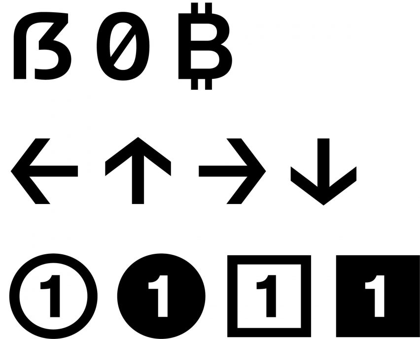
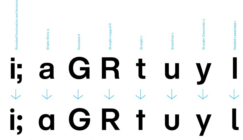
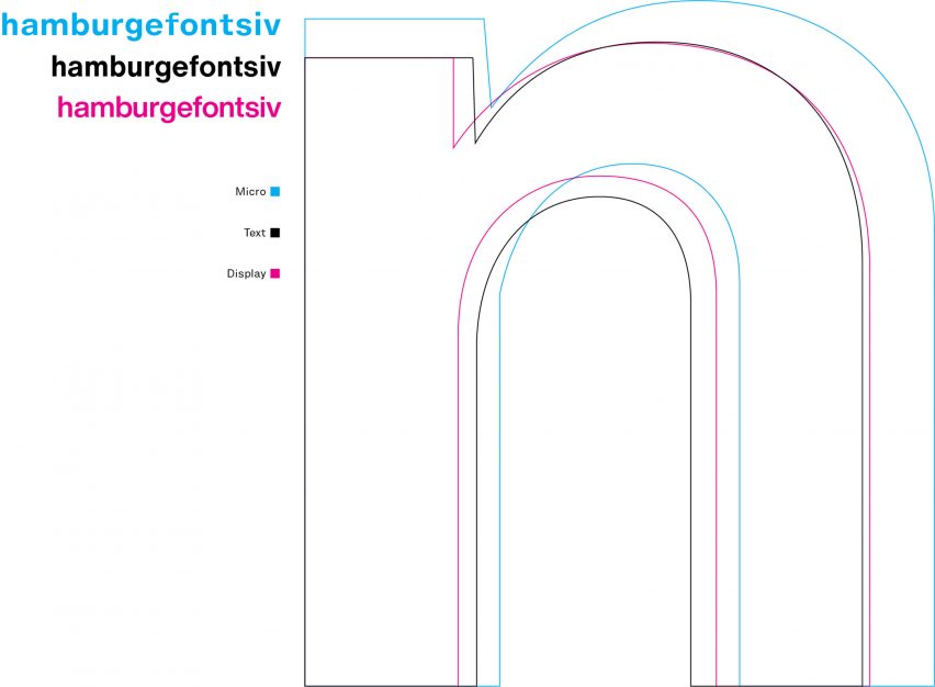
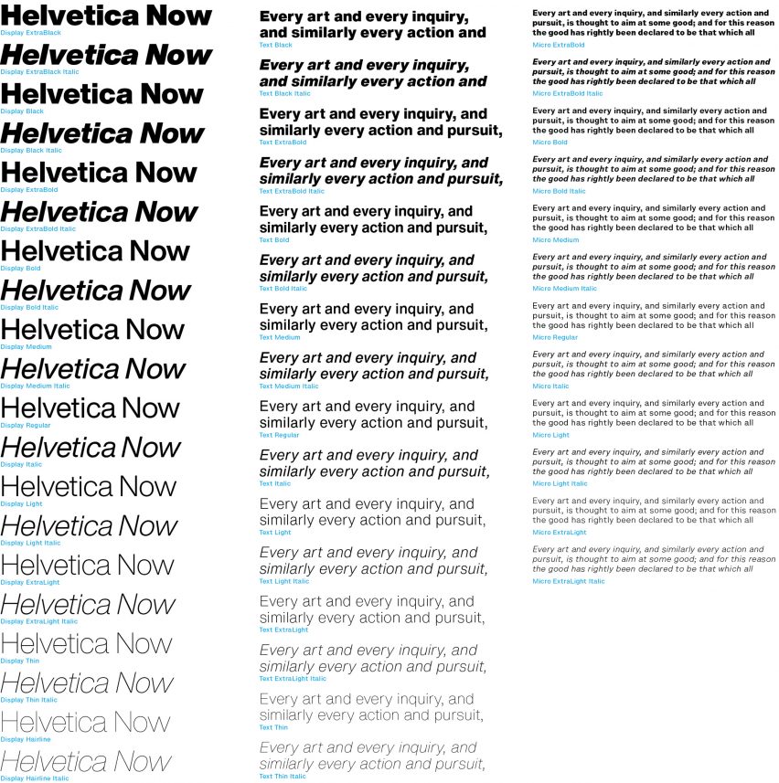
Called Helvetica Now, the new family of 48 fonts and three sizes is intended to optimise the original version for use in digital graphic design, and allow more flexibility and improved legibility for branding.
"Older versions of the font were lacking in some important areas," Nix told Dezeen. "Helvetica Now solves the legibility and style challenges that brands using Helvetica have consciously and unconsciously faced for years."
The new design combines clarity, simplicity, and neutrality; an "often-repeated mantra" Monotype used to guide themselves through the process of redesigning the nearly 40,000 characters.
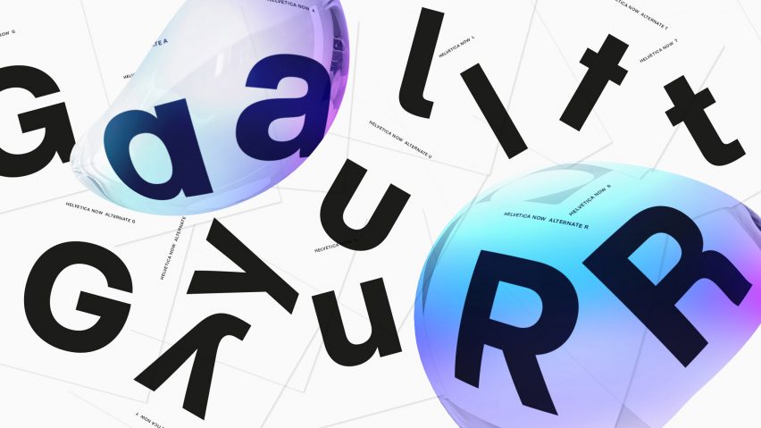
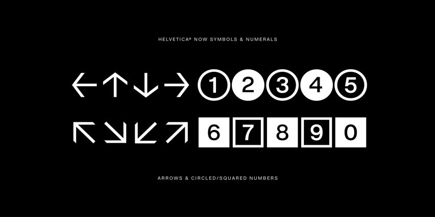
Described by Nix as "screen-first font", the updated typeface includes additional alternate characters and typographic tools.
Some features, like the glyph "f", resembles code typography, as the line through the stem is slightly pinched.
Since its creation in the 1950s, Helvetica's design has gone through a number of iterations. However, it's been 35 years since the last major redesign of Helvetica. Nix believes the upgrade is long overdue.
"That's a long time – especially in digital years," he said. "It was made for a different time – a far less screen-dependent time."
Monotype combined feedback from customers with visual and technical updates to create the new font. The redesign gives a nod to its original predecessors, even before the well-known last version, Neue Helvetica was born.
"Neue Helvetica was designed for one size that was optimized to work well in text," Nix said.
"Pre-digital Helveticas had subtle-but-important adjustments for small, medium, and large sizes," he continued. "We wanted that size-specific detail back."
Helvetica has become a go-to font in recent decades – the typeface had its own documentary released in 2007.
The typeface has also been used for a number of company logos and branding campaigns, such as American Apparel, Lufthansa, Crate & Barrel, and Panasonic, and in wayfinding systems like New York City's subway system by the Metropolitan Transit Authority (MTA).
Nix and the company don't know if the typeface will be as popular in the next 60 years from now as it currently is, but he hopes that "for those moments when you want to speak as plainly as possible in the manner that comes as close as visible language can to being universal, you'll use Helvetica".
Founded in 1887, Monotype has produced a number of typefaces for computer-ready use, and for brands. By buying out other type companies, they acquired the rights to other fonts, including Helvetica.
Among these are the overhaul of the 100-year-old typeface especially designed for Transport for London.
Its other projects include a collaboration with Google to create a typeface that spans all written language and a font based on the drawings of British designer Eric Gill.