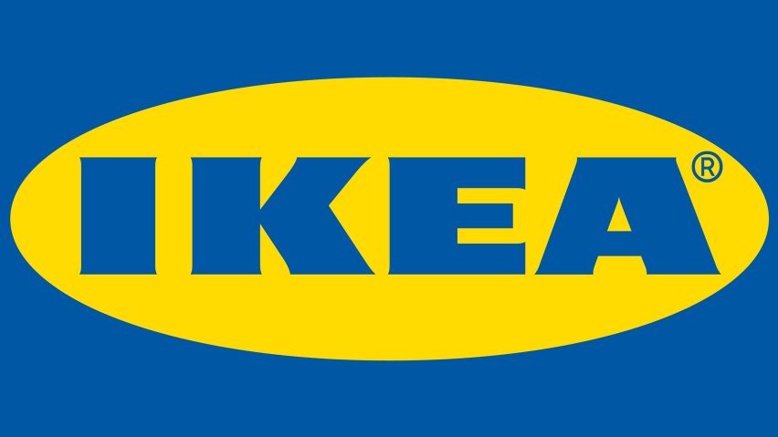
Swedish furniture giant IKEA has unveiled an updated logo, although the changes will only be spotted by those with a keen eye for detail.
Stockholm brand agency Seventy Agency developed the new identity, in its first redesign since 1983. It sees the blue block letters of the iconic IKEA logo subtly enlarged to snugly fill the edges of its surrounding yellow oval.
The brief given to the designers was to increase readability both in a digital and physical format, and across a range of sizes. The challenge was to achieve these criteria without needing a re-registration of the trademark.
The new logo also had to be similar enough to the old design that both could be used in close proximity to one another for the time it takes to make the change across the stores, packaging and online, without the two clashing.
"We wanted to maintain the unique characteristics of the original iconic design, but make subtle, yet impactful changes to the logo for a better experience across all formats," said Seventy Agency.
The designers made the discreet yet dynamic change of moving the trademark symbol from outside the logo to be included inside the yellow oval.
They also refined the block font by further reducing the already subtle serifs and increasing the counter-space of the letters E and A.
Another solution the studio decided on was to enlarge the optical size of the brand name, increasing the size of the lettering by 15 per cent to make the font seem less stretched.
Graphics website Brand New has published a series of diagrams that show how simple the changes are.
The result is intended to create a "bigger brand presence" within the same amount of media space.
"We have updated the IKEA logo to future proof it in a digital world," said IKEA. "It is a small change that is more of a refinement to secure it is easy to recognise, at all times."
"The IKEA logo has basically looked the same since mid-60s, while shopping patterns and media consumptions have changed," the company added. "This puts new demands on functionality of logotypes in general."
"The updated IKEA blue and yellow colours will take on a larger branding role, aiding the experience of IKEA in current and new meeting points," added Seventy Agency.
"The new colours make it easier to reproduce the logo more consistently," it continued. "They are now optically enhanced, optimised for individual colour experiences, even when they are not sitting next to each other."
IKEA recently collaborated with Sonos to create a pair of hybrid speakers that double as table lamp and a shelf. The Symfonisk speakers were launched at this year's Milan design week, which took place from 9 to 14 April 2019.

