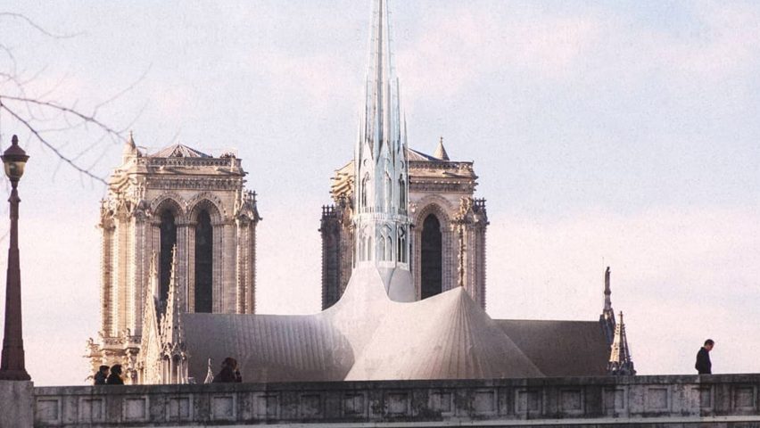
In this week's comments update, readers are angered by designs proposed to replace Notre-Dame Cathedral's destroyed spire.
In with the old: since the fire devastated Notre-Dame Cathedral designers have been offering alternative proposals to replace its spire, but they haven't all been well received.
"Quasimodo will be very disappointed," said Chris.
"Why not repair the damage and replace it with what was there before?" asked Clujan. "It already attracted millions of visitors every year because of its beauty. Trying to put some modern spin on this would be an utter travesty."
"It would be better to leave it as a historical pile of rubble rather than modernise it," agreed Doug Lough. "The only modern addition that would acceptable would be fire sprinklers."
Generic User added sarcastically: "Why not add a 10-meter-high statue of a hooker if we're going to prostitute a gothic masterpiece to modern architecture?"
This reader had one word for the proposals:
What do you think of the spires? Join the discussion ›
Material matters: New York City mayor Bill de Blasio's decision to ban construction of glass and steel skyscrapers in a major bid to tackle climate-change, has divided readers.
"Fair play," said Liam Briggs. "Let's be honest, whether you like him or not, whether you think it's missing the point or not, this will save emissions, it's a change for the better."
Matthew Bentley agreed: "Banning glass skyscrapers is an extreme reaction, but it's a reaction to an extreme problem. We missed our chance to gradually introduce climate change legislation, so now we have to play catch up."
Heywood Floyd wasn't convinced though: "Are properly designed insulated glass facades really that much less energy efficient than the brick cavity wall or brick party wall buildings which account for the majority of buildings in New York? The logic this initiative is based on seems at best flawed."
"While I don't like this application of a one-size fits all solution," replied Rthko, "it does serve to remind us that over the next few decades we'll have to make some difficult decisions, and that sustainable options aren't always sexy."
The ban is a negative move according to this commenter:
Is this a step too far? Join the discussion ›
BIG issue: readers are unimpressed with Danish studio BIG's recently completed project, a glass-walled building in Tórshavn that contains three schools.
"It's a 'no' from me!" said Spadestick.
"It just seems like such a lost opportunity," agreed Troels Steenholdt Heiredal. "Another piece on geometrical shapeshifting dumped on the landscape, the vernacular of the site not considered."
Natalia went on: "Obnoxious in utter disrespect for the landscape and surrounding architecture."
"An interesting programming of spaces," offered Willy Ritch diplomatically, "but it looks clumsy and unrefined, like it was built with a blunt instrument."
One reader was prepared for the criticism:
Are the negative comments unfair? Join the discussion ›
Spot the difference: not everyone agrees that Swedish furniture giant IKEA's latest logo update was necessary or even noticeable.
"Congratulations, the world has been waiting for this," joked JW.
"Well I for one found it interesting," replied Robots Forever. "I like to see these small tweaks. The bigger type and more open letterforms will help legibility in small-size digital applications. I also appreciate moving the ® mark inside the logo."
Mavao was also pleased: "I'm glad it's not drastic. Iconic logo."
As was Three Floating Orbs: "I have to say as an architect the attention to micro-metric detail in graphic design is impressive. My gnat-like attention span lacks the discipline and patience. Deep respect for the graphic design industry."
The redesign inspired this reader for different reasons:
Can you tell the difference between the logos? Join the discussion ›

