The Standard's first UK hotel opens this summer inside a brutalist building, featuring colourful interiors designed by Shawn Hausman to contrast "the greyness of London".
Occupying the former Camden Town Hall Annexe in King's Cross, The Standard is designed by Shawn Hausman Design with brightly-hued guest rooms and communal spaces that have an "element of lightheartedness".
The studio worked alongside London-based Archer Humphryes Architects, who carried out internal structural changes as part of architecture practice Orms' wider refurbishment of the building.
Opening its doors to the public this July, the hotel will have 266 rooms, a bar, recording studio, and three restaurants – one of which is on the building's roof and overlooks the surrounding cityscape.
"What I've found with designing the various Standards is that each project is completely unique because of the location, the building," Shawn Hausman, founder of the studio, told Dezeen.
"The thing that's consistent is the spirit and keeping the 'wit' [of The Standard brand]. It's finding the right blend of relaxed sophistication, something that's accessible and not pretentious."
This is the sixth hotel to become part of The Standard chain, joining branches in New York's Meatpacking District and East Village, Miami Beach, downtown Los Angeles and Hollywood, all with interiors developed by Shaun Hausman Design.
For the first UK outpost, the studio was given creative free reign by the hotel's CEO Amar Lalvani, and opted to work with a much bolder colour scheme.
"I would say with this property we were a bit more colourful than usual, and I think part of that is acting in contrast to the brutalist building that the hotel's in and the greyness of London," explained Hausman.
"It was about setting those main colours, and then playing off what we'd call a disruptor, something that's a little off."
The guest rooms have been decked out with flecked cobalt-blue carpet, while cushioned window seats and ottomans are upholstered in plum-coloured fabric.
Bright red wardrobes have been finished with recessed semi-circular handles and curved door frames, a visual nod to the rounded form of the windows that punctuate the building's facade.
Some of the rooms that are situated at the building's core and have no access to natural light, so have been fitted with special faux blinds that seem to have daylight shining through from behind.
"It was a fun challenge to exceed expectations on those [rooms] – we drew a lot of inspiration from the early 1970s when there was a richer sort of like apocalyptic and underground living and people's alternate ways of perceiving the future," said Hausman.
Adjoining bathrooms feature stripy black-and-pink tiled walls, while fixtures like the tap faucets and perforated under-sink storage shelves have been completed in contrasting mint green.
Some suites will also have their own terraces, complete with outdoor bathtubs that overlook the nearby St Pancras train station.
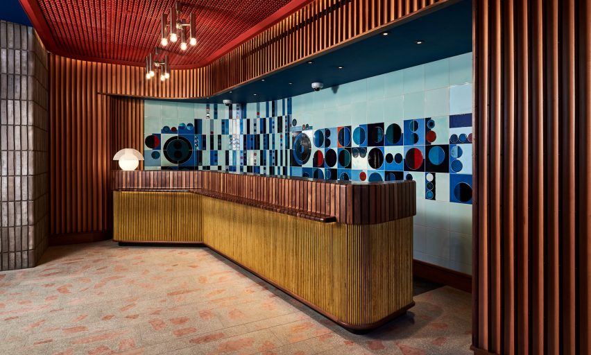
Downstairs on the ground floor – which formerly played host to a public library – the reception area has a tiled turquoise feature wall by ceramics artist Lubna Chowdhary, printed with dark blue and blood-red circles. A grooved timber service counter sits directly in front.
"We tried to take over in a friendly way – keeping the library's essence, but almost as if California rebels had taken over a government building and made it more free-spirited," Hausman explained.
"My background is in film; creating a fictitious room or set based on these characters and their history. I try and do that [in hotels] to create depth in what we're designing, so it's not just materials and objects there for no reason – it gives a connecting thread to everything."
The Standard is one of several other hospitality projects that have popped up across King's Cross as part of its long-term redevelopment – this includes the Heatherwick Studio-designed shopping centre Coal Drops Yard, and Tom Dixon's restaurant The Coal Office.
However, Hausman took little design inspiration from the neighbourhood's most recent additions.
"In a sense, we looked more at the past King's Cross and the seediness of the area – all these one-hour hotels that were still there and are slowly been redone. The Standard is a brand that likes to be a bit naughty, and not be appalled by those things," he added.
"If anything we were trying to be part of the old King's Cross."
Photography is courtesy of The Standard.

