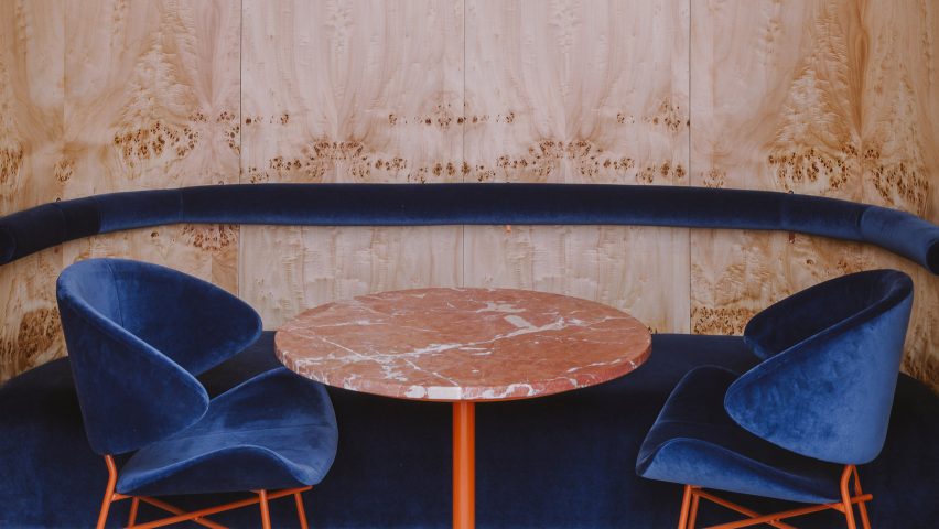
Buck Studio played with colour and texture inside this restaurant in Warsaw, which features boldly contrasting orange fixtures and grooved blue surfaces.
Situated in Warsaw's city centre, Opasly Tom offers diners contemporary Polish dishes that are inspired by slow food – an international culinary movement that sprung up in the late 1980s, encouraging the use of traditional cooking methods and locally-grown produce.
The 260 square-metre restaurant occupies a split-level building that was previously broken up by a series of different-sized rooms. When it came to transforming it into a dining space, Wroclaw-based Buck Studio employed a select few colours and materials to create visual continuity throughout the restaurant.
"It was crucial to propose a solution that would connect all the rooms and integrate the design into a coordinated, distinctive whole," explained the studio, which is headed up by Dominika Buck and Pawel Buck.
"This contemporary, minimalistic design approach produces the impression of coherence while creating a powerful aesthetic impact."
The upper-level of the restaurant now accommodates a large dining room that features corrugated steel walls upholstered with teal-blue velvet. Matching coloured curtains have been suspended beside expansive windows, which look through to a house-lined street.
A couple of dressers have been made from burl, a type of wood taken from misshapen tree trunks and characterised by an unusual grain pattern.
Juxtaposing timber chairs with coral-orange seat cushions have been arranged around the tables.
Above hangs a series of bespoke lamps that are comprised of totem-like stacks of glass spheres, while grey terrazzo tiles have been applied in a geometric zig-zag pattern on the floor.
A white tile stairway leads down to another dining area, which has a more intimate atmosphere suited to dinners amongst small groups of friends or couples.
This level has also been arranged into three different zones. The first is a honey-hued dining room overlooked by an open kitchen where guests can observe the chefs at work. Ridged walls here are instead upholstered in tan-coloured velvet, complemented by parquet oak floors and tall burl storage units that openly display extra glassware.
A second ink-blue zone is used for wine tasting, complete with orange velvet chairs and tables with peachy-marble countertops. Bottles are displayed in a floor-to-ceiling criss-cross rack that's illuminated from behind.
The third zone is a rear teal room which offers a more closed-off dining experience.
There is also a private dining room that's host to just one dining table, where walls have been covered with an ornate floral fabric.
Similar to Buck Studio, design studio AK-A used green and white paint to fashion dramatic two-tone interiors for a restaurant in Athens – the space is also dotted with rust-red lighting fixtures.
Photography is by Basia Kuligowska and Przemysław Nieciecki from Pion Studio.

