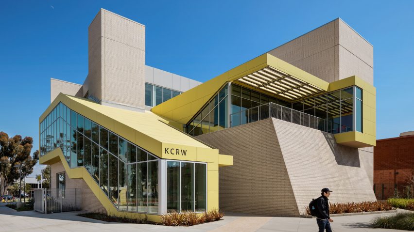
Bold yellow cladding enlivens media buildings at Santa Monica College by Clive Wilkinson
California studio Clive Wilkinson Architects used bright colours, ample glazing and angled lines to create a media campus in Los Angeles' Silicon Beach that aims to break down "the schism between education and the workplace".
Founded in 1929, Santa Monica College is located in an area referred to as Silicon Beach due to the prevalence of media firms and tech startups. The college's Center for Media and Design offers degrees in fields such as entertainment technology, graphic design and film production.
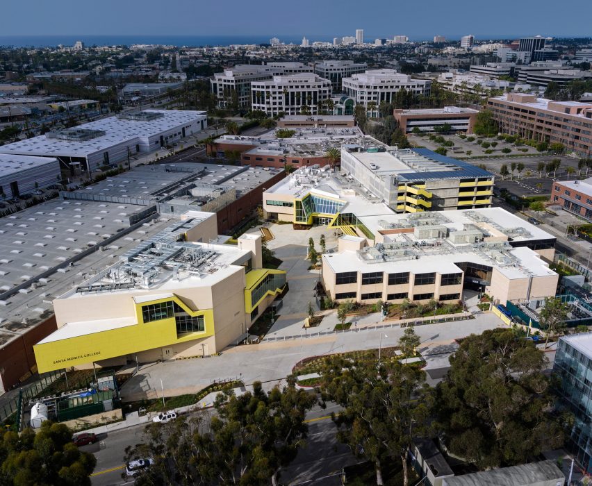
LA-based Clive Wilkinson Architects was charged with renovating and expanding an existing academic building, along with creating a new facility for the radio station KCRW, which is licensed to the school. A member station of National Public Radio, KCRW broadcasts music, news and talk-based programming.
The design team spent countless hours analysing curricula, visiting classrooms and conducting visioning sessions. The client was focused on creating a learning environment that truly prepared students for their chosen professions and broke down "the schism between education and the workplace".
"Early on, it became clear that the client considered instructional education alone insufficient preparation for a world in constant flux," the team said.
"The new campus that resulted is a symbiotic experiment in co-locating a media education programme and a professional broadcasting organisation to maximise the collateral benefits between the two renowned institutions."
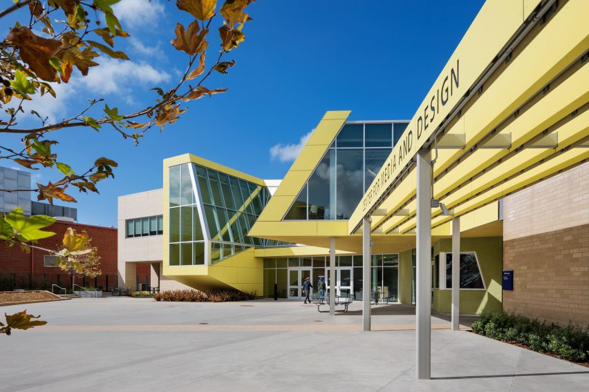
The buildings occupy an irregularly shaped, corner property on campus. The expanded Media Technology Building stretches along one side, while the new KCRW Media Center occupies the east corner of the site. Situated between them is a courtyard with a cafe, landscaping and a stage.
"This central space encourages collaboration and interaction while enabling all CMD programs to publicly converge into a single creative community," the team continued.
Roughly triangular in plan, the KCRW headquarters encompasses 34,000 square feet (3,158 square meets). This is the station's first dedicated building in its 35-year history, as it formerly was scattered across five different locations.
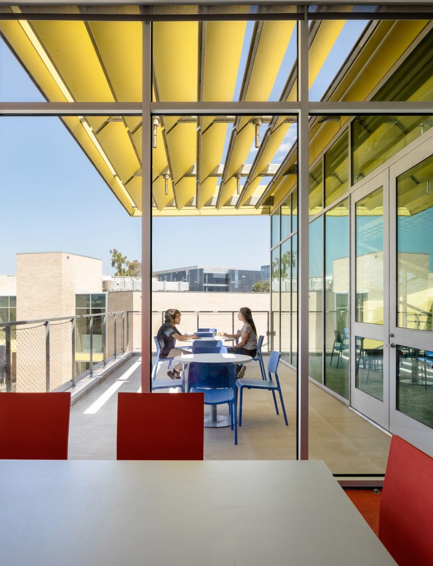
Exterior walls consist of light-toned brick, bright yellow panels and glass. The building has a broken-up massing that consists of various setbacks, protrusions and angled surfaces.
On the east-facing side of the building, a triangular volume cantilevers over the site, creating a shaded terrace at ground level. On the northwest side, the building's interior stairs are visible through a sculptural form wrapped in glass and lemon-hued panels.
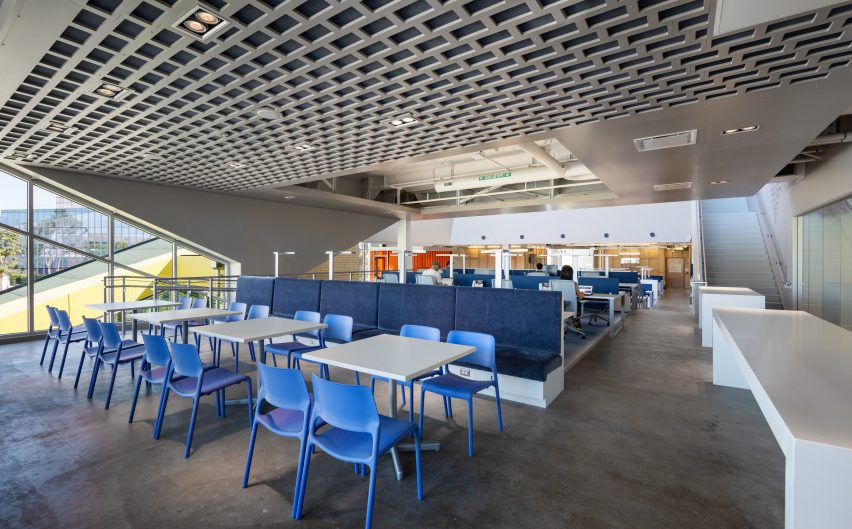
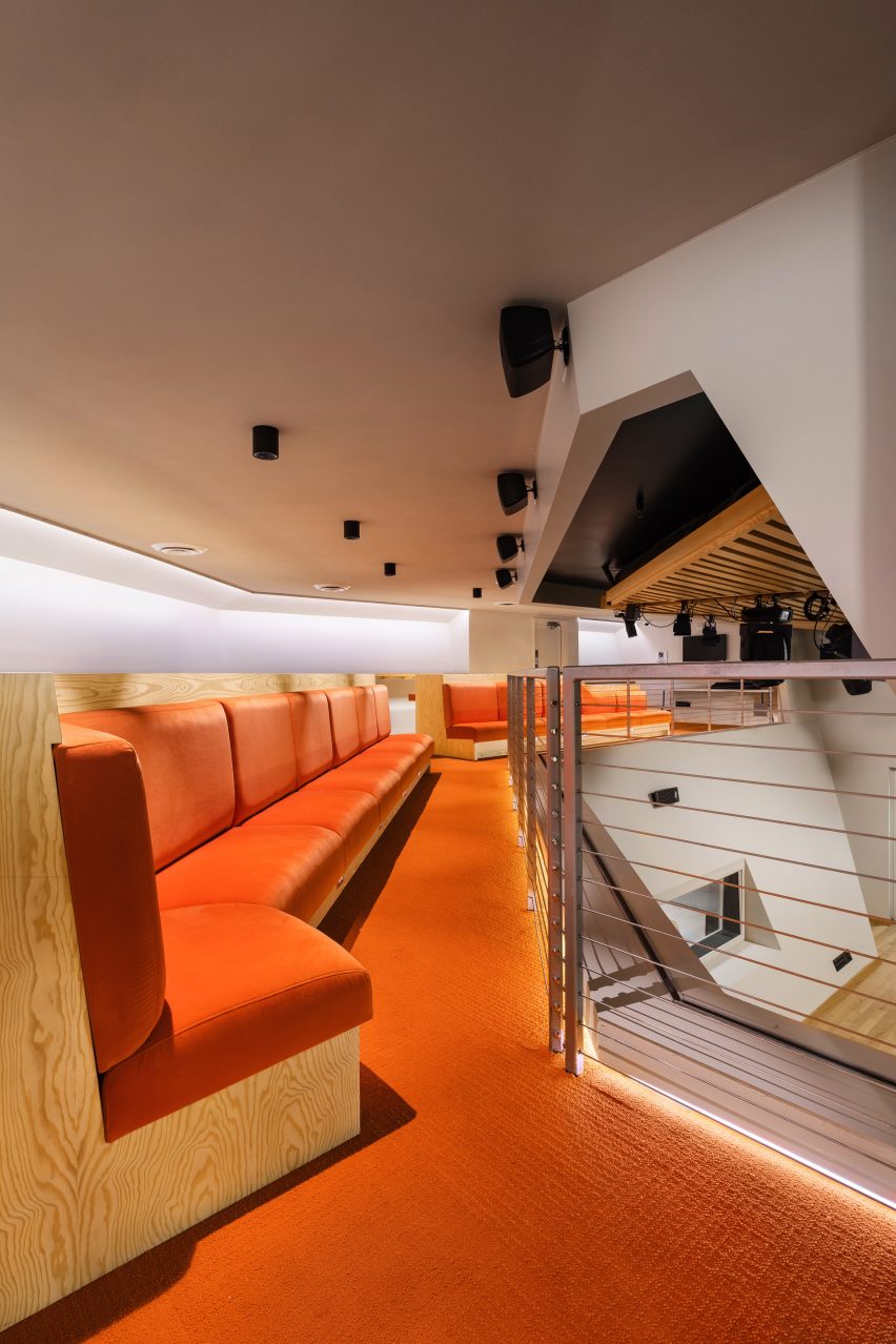
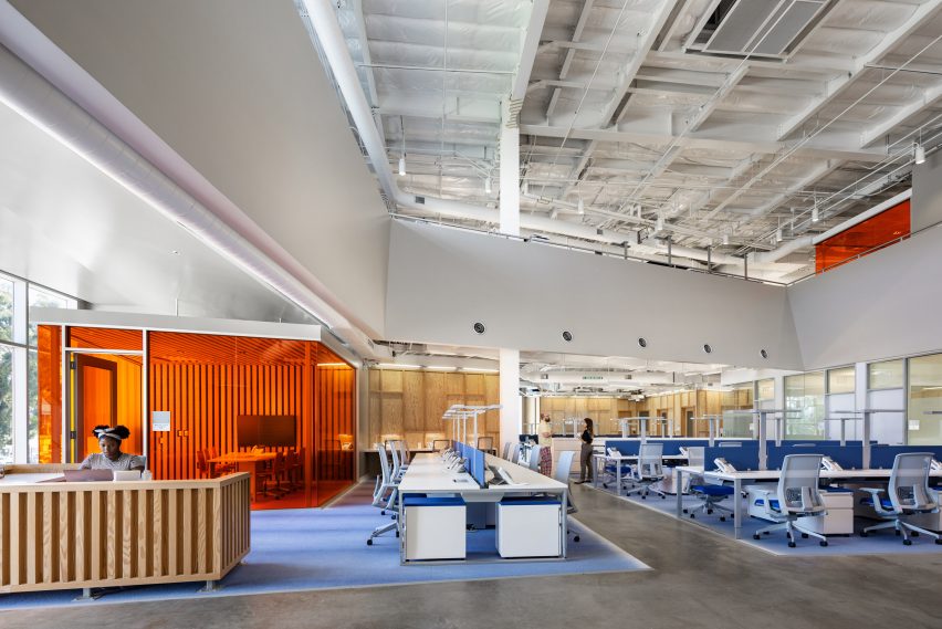
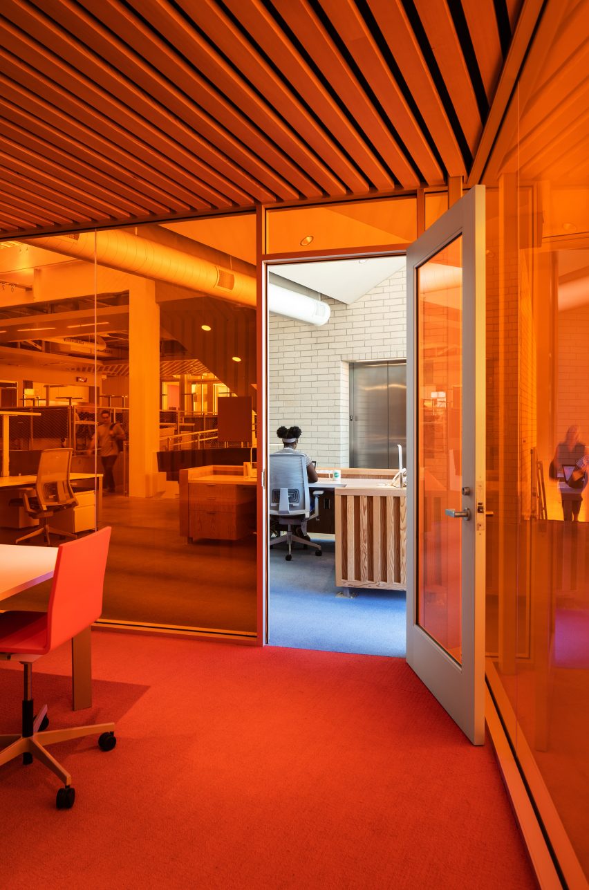
Inside, the KCRW Media Center contains open workspaces, an audience viewing gallery and over two dozen studios. White walls, wooden slats and orange carpeting are among the interior finishes. Exposed ceilings lend an industrial feel to a double-height work area that is ringed with balconies.
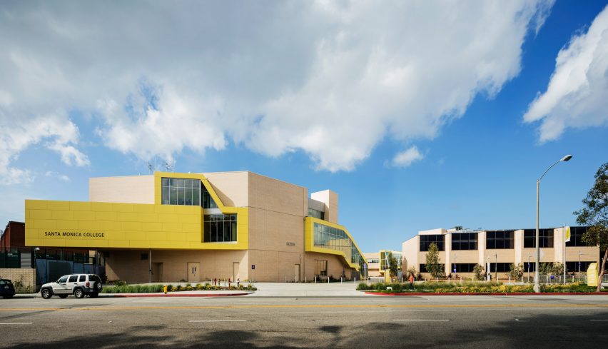
The existing Media Technology Building, which measured 49,000 square feet (4552 square metres), received an interior overhaul. The team also added a 32,000-square-foot (2,973- square-metre) wing and a seven-storey parking garage.
The team used the same design vocabulary as the KCRW Media Center, including vivid yellow cladding and large stretches of glass.
In addition to classrooms, the expanded building contains a 180-seat auditorium, a production suite, a broadcasting suite, editing bays, computer labs and collaboration spaces. Yellow accents and glass partitions were used throughout the building.
Beyond providing functional and inspiring spaces for learning and working, the media campus at Santa Monica College is meant to "showcase education as a progressive cycle".
"We set out to create architecture that acts as a narrative vehicle," the team said. "The three buildings and the central courtyard embody a student's progression from higher education to the professional world."
Founded in 1991, Clive Wilkinson Architects has an extensive portfolio of workplace and educational projects, including the transformation of a Vancouver department store into a Microsoft headquarters and a new Texas office for the tech company GLG, which contains no cubicles or corner offices.
Photography is by Michael Moran.