"It looks like a Beluga whale's fanny"
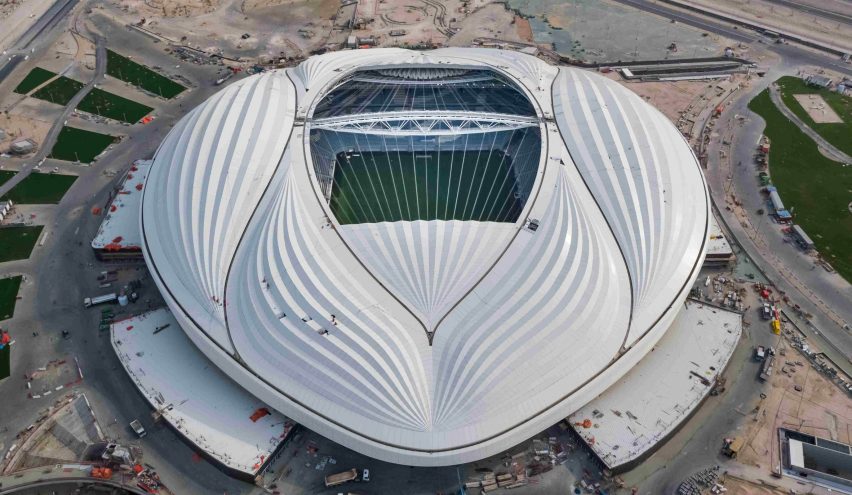
In this week's comments update, readers are poking fun at the Zaha Hadid-designed stadium in Qatar, which will host matches during the 2022 FIFA World Cup.
Genital resemblance: readers think the Al Wakrah Stadium in Qatar, designed by Zaha Hadid and Patrick Schumacher, looks like a vagina.
"It looks like a Beluga whale's fanny," joked Terry.
Kirsten agreed: "Poor old Qatar. Little did they realise when they chose this design that their World Cup would come to be overshadowed by a discussion centred on whether their landmark stadium resembles a Beluga whale's fanny."
"They missed a trick not having the roof retract down the centre into the sides. It would have worked well with the whole giant vagina look they've gone for," added Conan.
"Zaha had a wonderfully wicked sense of humour," said Julia PJ. "She would have loved the idea of teams of fit young men playing with their balls inside her giant 'vagina', it would have been a hoot!"
One reader didn't think Zaha would've been amused:
Do you agree? Join the discussion ›

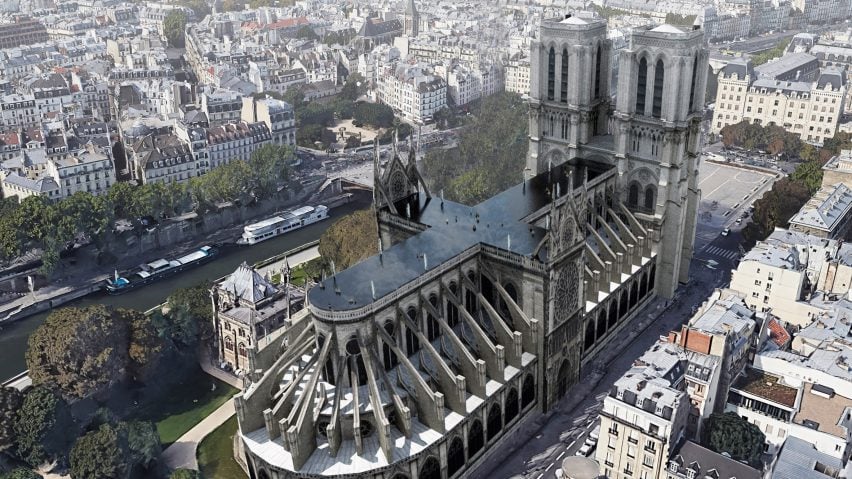
Notre don't: while some readers are amused by the outrageous design proposals for Notre-Dame Cathedral's roof and spire, others are simply over it.
"Please... just rebuild Notre-Dame as she was, and forget all this tosh," said Starcruzer.
"Imagine being French, losing a cultural artifact, and seeing this egotistical junk that mocks your heritage and loss," said bored millennial. "This 'big dick energy' is beyond disrespectful and toxic."
Meanwhile, Egad take the proposal for what they are: "People relax already. Can't you understand these tongue-in-cheek solutions? Thanks for the laugh, Dezeen."
Milton Welch agrees: "Good humour. Hope these will function as a friendly reminder to anyone who is about to submit a 'serious proposal' to take one more time a hard look at it."
This reader sheds light on the real problem:
Which of the proposals is your favourite? Join the discussion ›

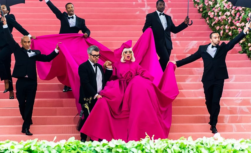
Fashion police: Li Edelkoort criticised celebrities, including Lady Gaga, for not understanding the concept of camp, the theme for the 2019 Met Gala, and several readers agreed.
"Spot on! I have found someone who has succinctly put words to Gaga's vapid stardom and the hubris of this event," said Odidi.
"Finally, someone who disagrees with what Lady Gaga did at the Met 2019!" said Richard Foo. "Nobody gets art anymore, especially the rich but tacky celebs. For gathering more clicks and followers, designers have now reduced to tackiness and contentless loudness... shame."
However Carlos disagreed: "I'm sorry but Gaga will always be an icon!"
Jon pointed out that the Met Gala also had a positive side: "Its extravagance and exclusivity are what drive those record numbers of donations, which amount to hundreds of millions of dollars for The Met, which keep its admission free and its doors open."
This reader was not amused:
Thoughts? Join the discussion ›

Over thinking: readers didn't agree with Ben Terrett assertion that the Brexit Party logo was a clever piece of design that could influence voters in the upcoming EU elections.
"I was just doing my postal vote. I didn't even notice this facile logo when I was filling it in. Clever? Ludicrous!" said Barry D.
"I, an academic, hereby declare the average voter to be an illiterate idiot, vulnerable to selecting the party based on the pretty picture," said RuckusAmsel.
One reader thinks otherwise: "God some people complain about nothing! Great logo, great party...get used to it!"
"A house that's fallen over and is signalling to the right? Very apt indeed," joked Chris.
To which this reader responded:
Clever or not? Join the discussion ›