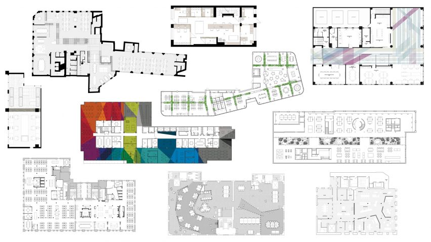
Ten offices with floor plans divided in interesting ways
Architects and designers have come up with inventive ways to create privacy in open-plan offices. From plants to tunnels, here are the floor plans of 10 workplaces that are divided in unusual ways.
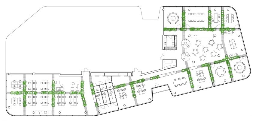
The green room
Dutch studio Space Encounters used low walls topped with tropical plants to partition the 14th floor of a recently completed tower in central Utrecht.
The planters are designed to provide privacy to workers of Dutch property developer Synchroon, while adding greenery that will improve their wellbeing.
Read more about the Synchroon office ›

The inhabited wall
To divide the communal areas from the workspaces at Pocket Living's London office, Threefold Architects created a 40-metre-long wall from plywood spruce and light-grey steel.
The "inhabited wall" incorporates meeting rooms, wellness rooms, break out spaces and a canteen.
Read more about Pocket Living's office ›
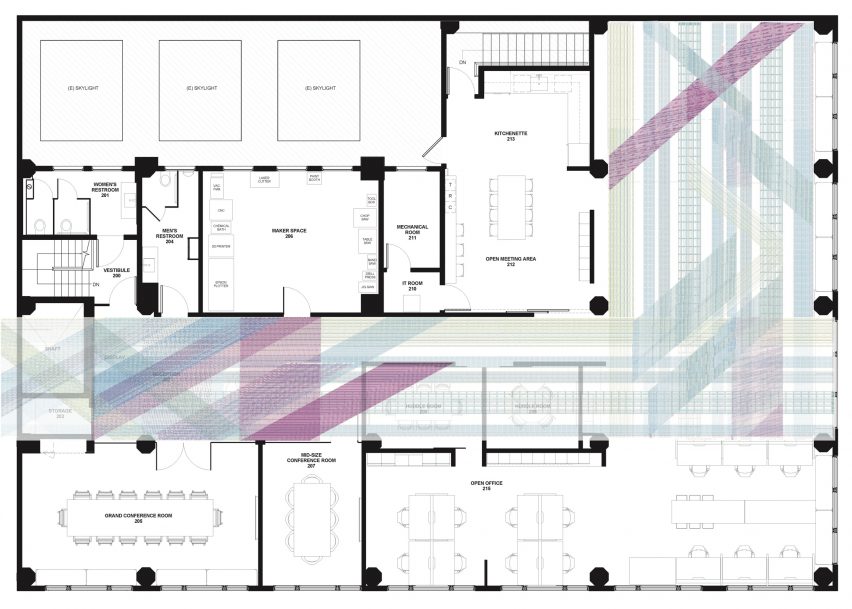
The colourful canopy
These offices for branding company Enlisted Design, designed by Medium Plenty, have been divided up using white partitions and plywood pegboard walls.
Against this neutral palette, a colourful canopy of blue, red and grey strings created by artist Annie Tull defines a route from the entrance to the workspaces.
Read more about Enlisted Design's offices ›
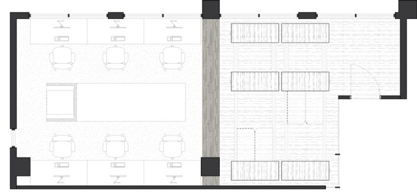
The shapeshifter
Taking cues directly from the design of micro homes, Particular Architects incorporated moveable furniture into its own office so that it can easily be reconfigured.
Fold-down desks can be used to divide up the space, or stored so that the room can be used as a meeting space.
Read more about Particular Architects' office ›
The tunnel
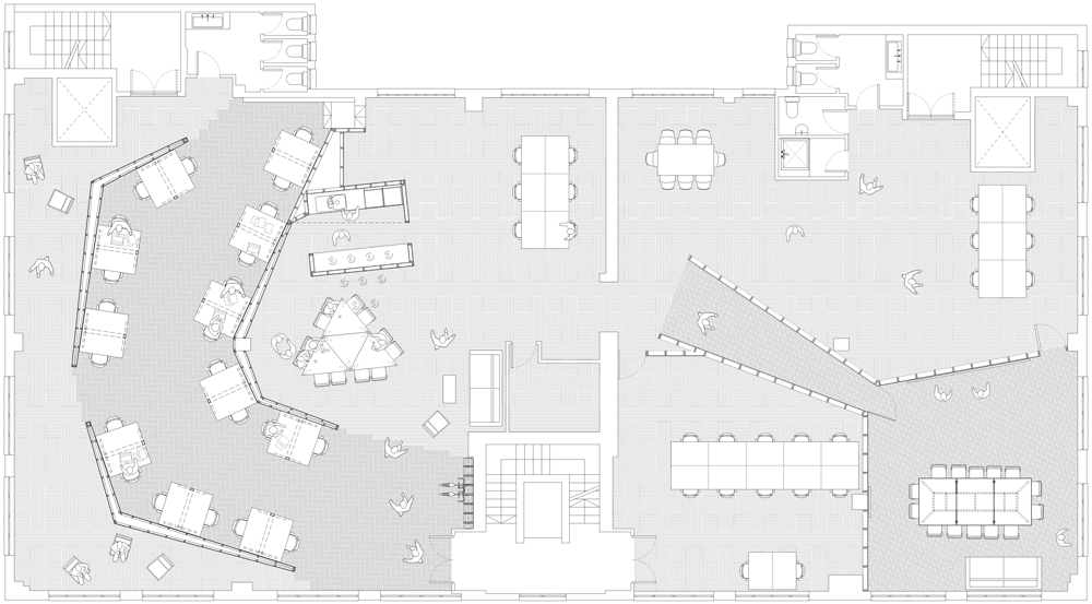
At the UK headquarters of advertising agency 18 Feet & Rising, architecture practice Studio Octopi created a dark and mysterious tunnel that leads from the offices to the board room.
The plywood tunnel divides up the office, while low plywood screens are used to separate the desk areas from communal spaces.
Read more about 18 Feet & Rising's offices ›
The rainbow
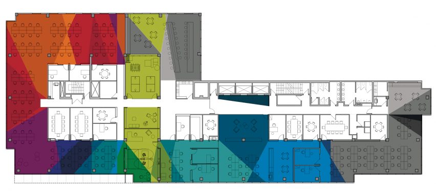
Canadian studio ACDF Architecture used colour to denote the different areas of subscription-based entertainment service Playster's 1,670-square-metre headquarters in Montreal.
The colours, which are used on walls and floors throughout the office, are taken from Playster's logo.
Read more about the Playster headquarters ›
The divider
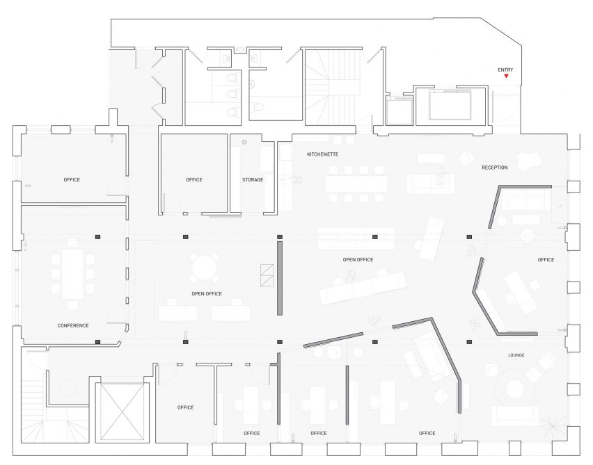
Vladimir Radutny Architects placed two irregular-shaded volumes into the offices of Sukhman Yagoda Law to divide up the 372-square-metre loft in Chicago.
The partition's blank white walls are designed to contrast with the buildings old timber columns and exposed brick walls.
Read more about Sukhman Yagoda Law's office ›
The glasshouse
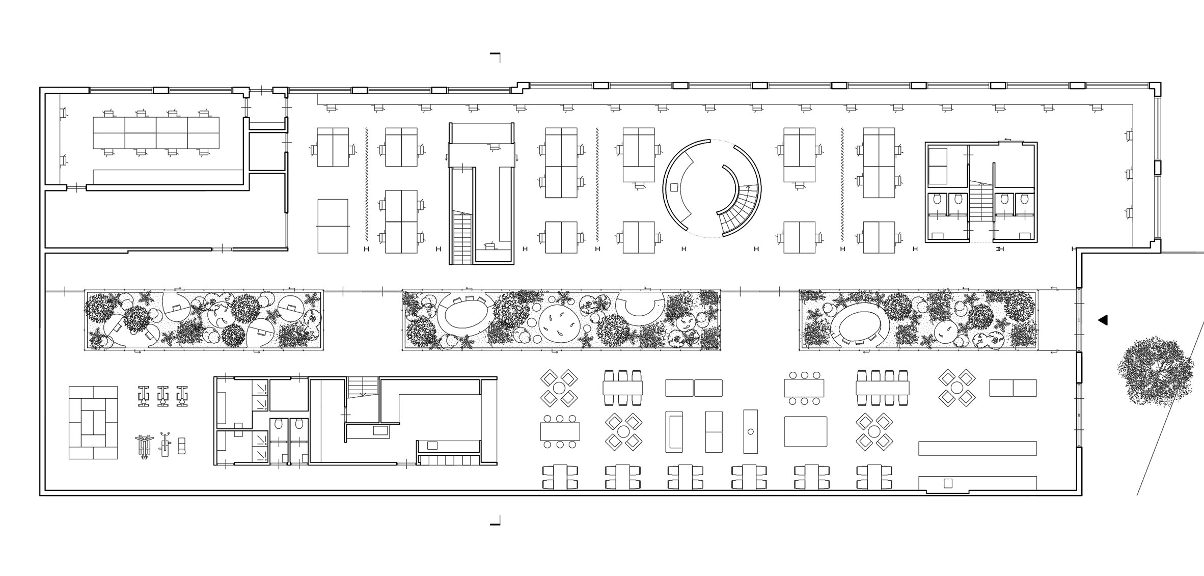
Space Encounters split the offices for ergonomic buggy manufacturer Joolz in two with a row of three glasshouses.
The glasshouses run down the centre of the former warehouse and are filled with plants. They also have benches in so that they can be used as informal meeting rooms.
Read more about the Joolz office ›
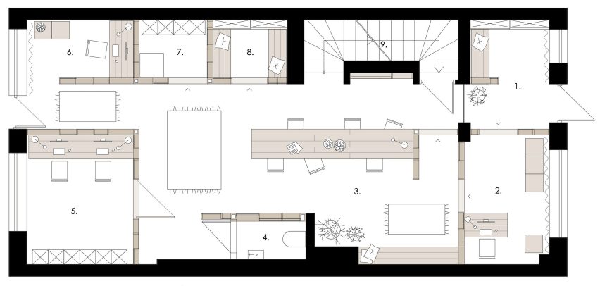
The semi-transparent one
Polish architecture studio MTRMGR created a series of office cubicles around a central space for sound production company Ztudio.
The semi-transparent workspaces are constructed from varnished pine frames and polycarbonate sheets.
Read more about Ztudio's offices ›
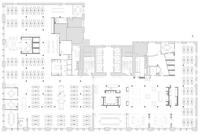
The sleeper
The offices of mattress brand Casper in New York, designed by Float Studio, are arranged around three blue boxes.
While two of the boxes house storage and a meeting room, the third contains three beds that employees can use for informal meetings, or sleeping.
Read more about Casper's headquarters ›