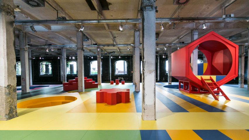
Aberrant Architecture has created a huge playground in a former Madrid slaughterhouse, based on the work of Dutch architect Aldo van Eyck.
Landscape for Play is a temporary installation in Intermediae, a gallery in one of the old warehouses that make up the Matadero Madrid cultural centre.
The design comprises a large colourful patterned floor dotted with objects and openings that invite children to run, jump, hide and climb.
These include a big red hexagonal prism that you can climb into with a ladder, circles set into the ground, stepping stones and a blue doorway.
London-based Aberrant Architecture developed the design after researching the many playgrounds that Van Eyck created in Amsterdam after the second world war. Studio founders David Chambers and Kevin Haley then developed a strategy based on patterns and rules they spotted in the designs.
"We were particularly interested in how Van Eyck utilised an architectural vocabulary for his playground designs," explained Chambers.
"This vocabulary utilised a series of varying geometrical shapes that aimed to craft a terrain that stimulated the imagination and led to human interaction and play," he told Dezeen.
"We broke down Van Eyck's architectural vocabulary into seven concepts which we proceeded to use to generate our own design: shapes, surface relationship, boundary, composition, territory, graphic language and threshold."
Colourful graphics decorate the forms, offering a striking contrast with the industrial architecture of the old slaughterhouse building. The colour palette, with its bold shades of red, yellow, green, blue and black, references postwar graphic design.
"We looked at colour palettes that were being used at the time that Van Eyck was designing and creating his playground," said Chambers.
According to Chambers, this method of using historic colour palettes was one they were keen to continue after completing their Rosemary Works school project in London's Hackney.
"We shortlisted over 100 colours before creating colour samples which we mixed and matched before settling on the final combinations," he said.
The pattern was also adopted from Van Eyck, based on a pattern applied to a wall overlooking one of his playgrounds.
"We played and adapted this pattern, changing both its scale and the design of the pattern itself so that the colours and pattern started to define actual spaces that people could inhabit and respond to. We then applied the pattern horizontally as a landscape that people could occupy," said Chambers.
The installation opened in April and will remain in place until late September. It will be used for hosting a variety of programmed activities, not just as a play space. Aberrant Architecture is keen to encourage adults to play as well as children.
"This playground is not just for kids," added Haley. "Adults can also inhabit the spaces, create games and interact with their children."
Photography is by Lukasz Michalak.

