
Landini Associates creates "the ultimate McDonald's" on Times Square
McDonald's has opened a glass-fronted restaurant topped with a giant billboard on Times Square in New York City.
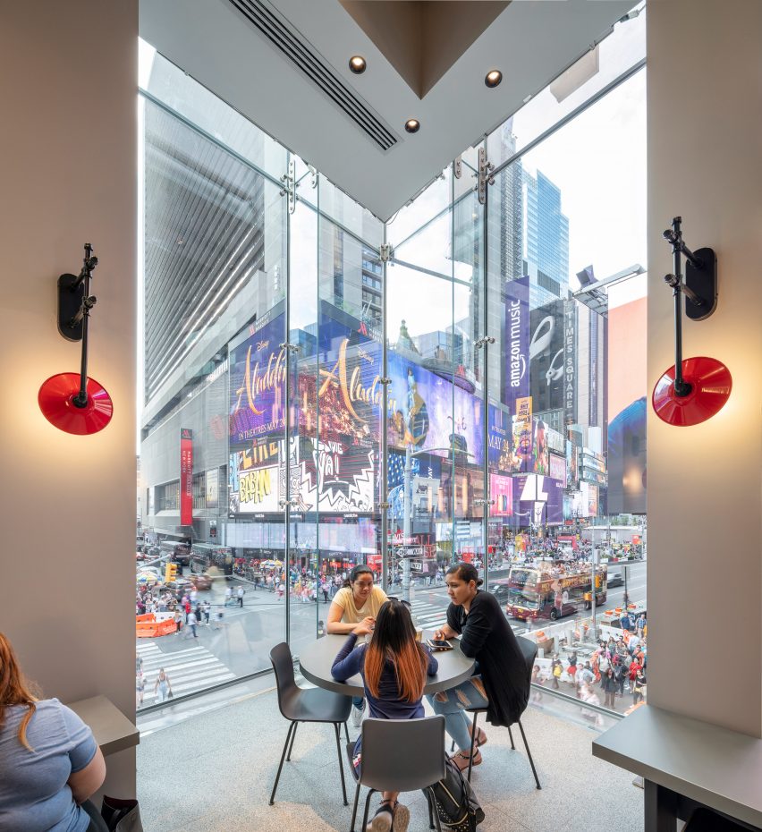
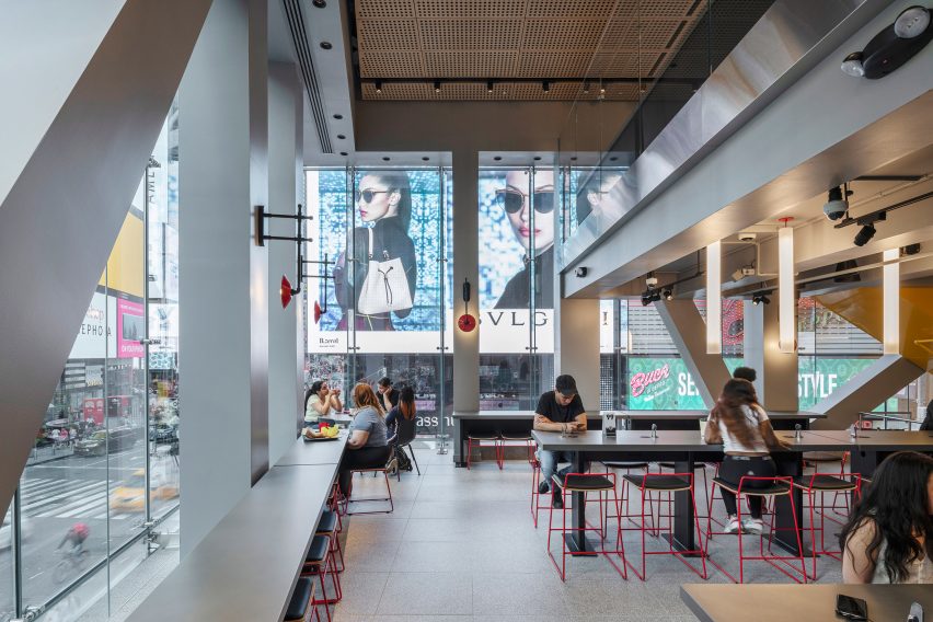
Designed by Landini Associates, with Progressive AE acting as architect of record, the three-storey restaurant at the corner of 45th and Broadway has a fully glass facade with seating areas overlooking the square.
The restaurant is topped by a billboard with a display area of 862 square metres (9,280 square feet) – the third largest on Times Square.
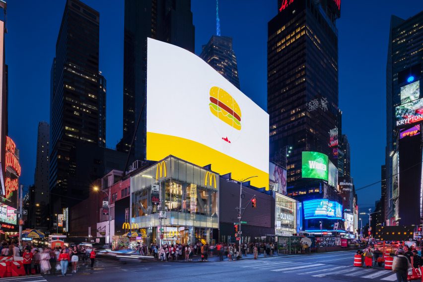
The flagship store is the latest McDonald's to be overhauled following the pared-back Ray Concept, developed by Landini Associates with the aim of updating the image of the fast food chain.
First introduced in Hong Kong in 2015, the redesigned restaurants are now being rolled out across the rest of the world, including one that opened in Chicago earlier this year, which drew comparisons to Apple Stores.
"It's another step in changing customer perception, which puts us on the path to retain, regain and convert," said Chris Kempczinski, president of McDonald's USA.
"We're showing off what McDonald's can do… in the centre of New York City. While the flagship showcases the ultimate McDonald's experience, we've been delivering new levels of convenience, personalisation and service throughout the US since 2016."
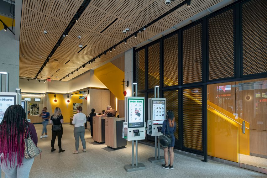
The 10,040 square metre (11,199 square foot) restaurant has 21 order points, including 18 self-order kiosks, on the ground floor, with two floors of dining areas above.
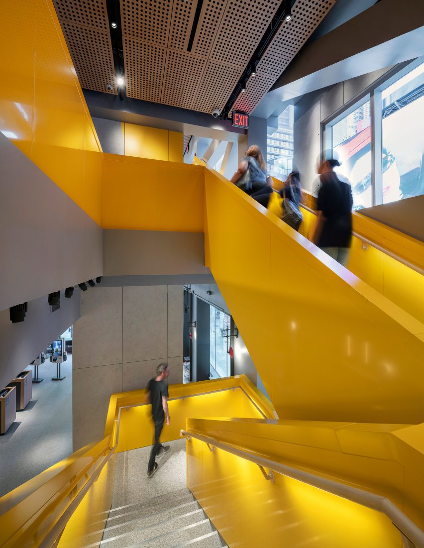
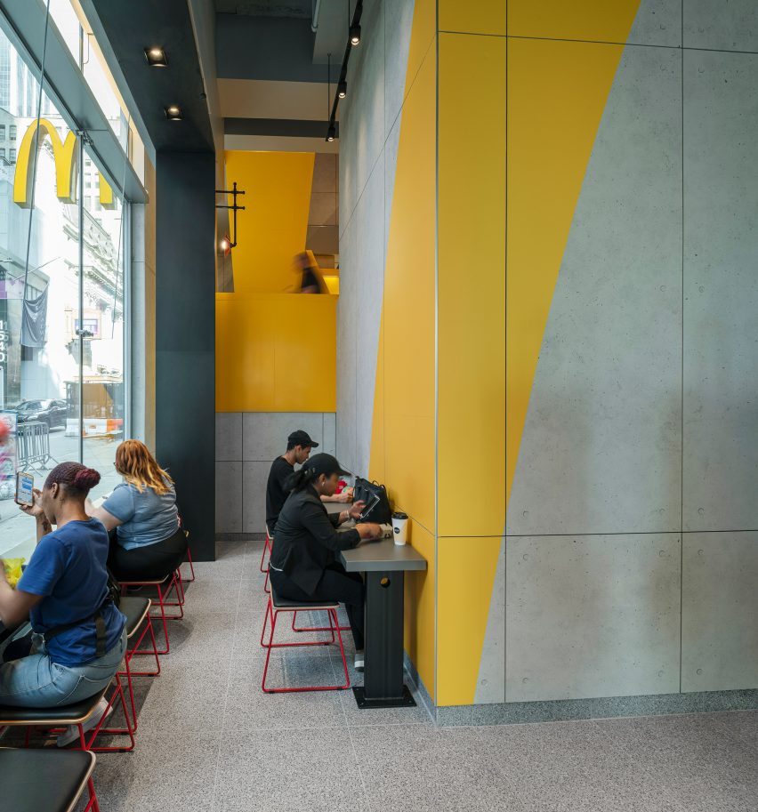
The restaurant's upper floors are accessed by a bright yellow staircase, which contrasts with the concrete and oak interiors. The walls are broken with occasional abstractions of the McDonald's golden arches.
Various seating arrangements have been created to cater for the McDonald's varied diners and challenge "customer's historical perceptions".
Zinc, concrete and oak tables and benches of differing heights have been designed with families, groups and solo diners in mind.
To create a calm atmosphere for diners, the restaurant's kitchen has been placed in building's basement with food carried upstairs using dumb-waiters.
Lighting throughout the restaurant is computer controlled so that the mood can be altered to create different atmospheres at day and night.
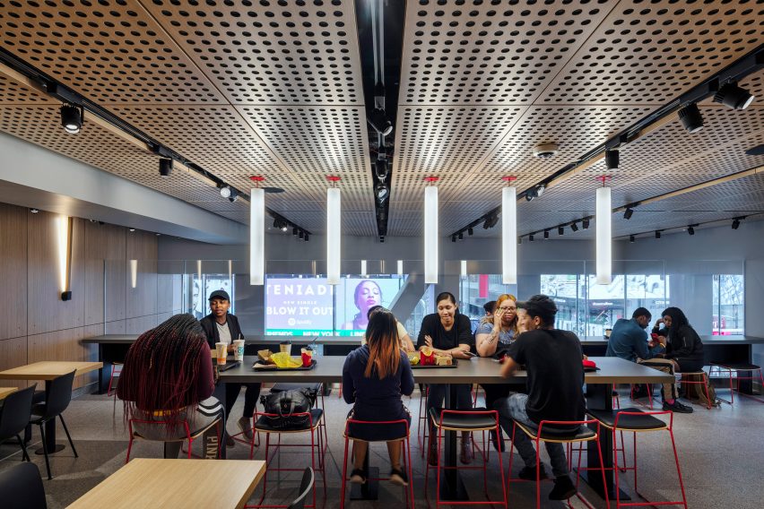
"The new design is aimed at offering customers a calm respite from the non-stop action of Times Square," said Wayne Cheng, design director at Landini Associates.
"We used a timeless material palette of concrete, stainless steel, oak and glass as a backdrop of 'recognisable neutrality' promoting the service, the product, and the people who come to enjoy it."
Numerous McDonald's restaurants have been redesigned in recent years as part of the fast food's brands push to rebrand itself. Along with the stores in Chicago and Hong Kong, its store in Paris has been given a "truly novel" makeover by Patrick Norguet, and Mei Architects rebuilt a store in Rotterdam.
The fast food brand has also recently completed a headquarters building in Chicago, which includes a Hamburger University for new recruits.
Photography is by Andrew Meredith.