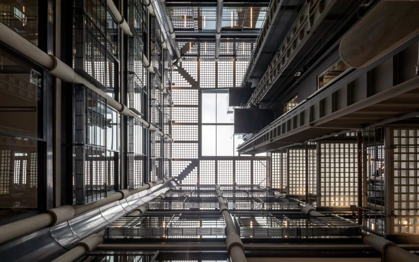
John Robertson Architects has renovated Bracken House, in London, for the Financial Times' return, carefully updating its Hopkins Architects-designed "gothic high-tech" atrium.
John Robertson Architects refurbished Bracken House for the Financial Times (FT), which is returning to its former office after three decades.
Improvements to the block, which was the first post-war building to be listed in the UK, include turning the roof into an accessible walkway and linking up the structures built at different times.
Bracken House was built on a bomb site near St Paul's Cathedral in the 1958 by Albert Richardson as the offices for international economics newspaper the FT, which had its printing presses there.
Hopkins Architects redeveloped the building after the FT vacated in the 1980s, replacing the hall that held the printing press with a glass and metal structure.
John Robertson Architects retained and refurbished all the major architectural elements of Bracken House, while making several interventions to unify the two eras of the building and make the office spaces more suitable for the needs of a modern print and digital news publication.
The striking atrium was carefully preserved in the refurbishment.
"It's very much an important set piece," David Magyar, director at John Robertson Architects, told Dezeen.
"It has a film noir feel – it's Gothic high-tech."
Glass lifts with exposed machinery were carefully remade and installed to maintain the aesthetic of the original shafts while updating the signage and smooth running of the systems.
Most of the translucent glass blocks – originally inspired by Paris' Maison de Verre – were preserved, but carefully selected panels from the ceiling were removed and replaced with transparent glazing to allow more light in.
"It was a contentious feature," said Magyar. "It was very much a feature of Hopkins' design. We agonised about it, but it makes the space less gloomy."
The entrance was opened and streamlined, removing walls each side to create space for visitors to sit.
Where interventions like this happened, no effort was made to cover up the traces of places where old partitions had been marked on the concrete.
"It was about finding a balance between breathing new life into the building and respecting what's there," said project director Zemien Lee.
A new, modular ceiling was designed to improve the open plan offices on each level. The old, running-track style lighting system was re-ordered so all the lights now face inwards towards the atrium.
To preserve the views from the street, the distinctive original light fittings along the building's perimeter were either cleaned and repaired, or remade to fit the new ceiling panels.
The glass meeting rooms have been named after different currencies, such as Sterling, Dollar, and Dong.
Reconciling the 1950s parts of the building with the later additions required cutting into the cores to create linking voids, where staircases with half landings can link the mismatched floor levels.
Glass walls and open office kitchens create a visual connection between the desks in different parts of the building.
The original doorway, complete with a clock that features the face of Winston Churchill, and gold leaf lobby to Bracken House has been painstakingly restored. Original lanterns have been given LED bulbs and discreet power sockets added, so the space can be used as a museum of newspaper artefacts in the future.
Despite strict restrictions from St Paul's over what can be done with the roof, John Robertson Architects turned the space into an outdoor place for journalists. This fulfilled Albert Richardson's original vision for the top of Bracken House.
"Everything had to be discrete," said Magyar. "We put the lights under planters and the seating. Originally we wanted the promenaded to be in the FT pink [the colour of its pages], but St Paul's insisted on grey."
Journalists can take in a panoramic view of central London from the walkway, whose scalloped edges are a nod to Richardson's original inspiration of the Palazzo Carignano in Turin.
Older buildings provide their owners with a readymade sense of history, but often require careful tweaking to be turned into spaces that work for a contemporary workforce.
Interior design studio ID: SR has turned a set of railway arches into offices for a coffee company in London, while in San Francisco a huge ship-building warehouse has been transformed into the headquarters for a startup.
Photography is by Peter Cook.
Project credits:
Architect: John Robertson Architects
Client: Obayashi Corporation
Structural engineer: Arup
M&E engineer: Arup
Fire consultant: Arup
Heritage consultants: Purcell
Cost consultant: Turner & Townsend
Project manager: Turner & Townsend
Landscape architect: Townshend Landscape Architects
CDM coordinator: Bureau Veritas
Building control: Bureau Veritas
Agency / lease advisory: CBRE
Agency / lease advisory: JLL
CAD software used: ArchiCAD (BIM)
Main contractor: McLaren
Cat B Works: Perkins + Will

