As Jony Ive steps down from Apple, we take a look back at his incredible list of industry-defining career highlights, from the iMac, to the iPod, iPhone and Apple Watch.
iMac, 1998
Described by Apple as a computer for the next millennium, the iMac was Ive's first major contribution at the technology company.
The computer broke away from the previous industry standard of grey boxes, by wrapping the all-in-one machine in a translucent plastic shell. Originally available in Bondi Blue, the computer was later released in ten different colours.
The iMac also marked Apple's move away from legacy interfaces with the adoption of USB for the first time and the lack of a floppy-disc drive.
iBook G3, 1999
Following the release of the iMac, Ive introduced the distinctive transparent shells to other products – one of the first being the iBook G3. Like the iMac, the clam-shell laptop used USB instead of legacy interfaces and was without a floppy-disc drive.
The iBook G3 was also one of the first mainstream computers to have wireless capabilities built in.
iPod, 2001
Apple's first move into digital music-players, the iPod would revolutionise the whole market.
The 5GB MP3 player, which was designed to be a compromise between capacity and size, had a simple design with just five buttons and a scroll wheel. It would come to dominate the music-player market, until the iPhone destroyed the need for dedicated players.
iMac G4, 2002
The iMac G4 was Ive's first major design update of the iMac since the original in 1998.
With an appearance similar to a desk lamp, all of the computer's hardware was contained within a semi-spherical base, while the screen was attached via an arm that allowed it to be rotated to suit the user.
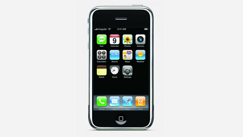
Apple's first foray into the mobile-phone market would, like the iPod before it, revolutionise the entire industry. Apple founder Steve Jobs said that the company aimed to "reinvent the phone" with the device, which was a wide-screen iPod that had internet-browsing capabilities and a touch-screen user interface.
Described at the time by Dezeen editor-in-chief Marcus Fairs as one of the "outstanding designs of the 21st century so far", the iPhone was nominated as the Design Museum's Design of the Year in 2008, but did not win. Design Museum director Deyan Sudjic later described this as "a howling error".
Since its original release the iPhone has been updated multiple times, and remains a mainstay in the smartphone market.
MacBook Air, 2008
At the time of its launch, Apple claimed the 1.94-centimetre-thick notebook was the thinnest laptop in the world. The lightweight computer was designed to be extremely mobile.
Last year Apple released its latest update to the laptop, which it described as the "greenest Mac ever".
Essentially an enlarged version of the iPhone, the iPad marked Apple's entry into the tablet market. The 9.7-inch touch-screen device was compatible with the majority of Apple's existing apps and was designed for reading, browsing the internet, listening to music and playing games.
"iPad is our most advanced technology in a magical and revolutionary device at an unbelievable price," said Steve Jobs, Apple's CEO at the time.
"iPad creates and defines an entirely new category of devices that will connect users with their apps and content in a much more intimate, intuitive and fun way than ever before."
The first major update to Apple's user interface following Ive taking over as lead of both hardware and software at the tech giant, iOS 7 was designed to have an uncluttered appearance. The redesign aimed to bring the company's software in line with the minimal aesthetic that Ive had developed for its phones, watches and computers.
"I think there is a profound and enduring beauty in simplicity, in clarity, in efficiency," said Ive at the time of the launch. "True simplicity is derived from so much more than just the absence of clutter and ornamentation; it's about bringing order to complexity."
With the Apple Watch, Ive created a device that could be more available and accessible than a phone. Along with a watch display, the device was designed to communicate with iPhones and other devices to alert the user of messages and calls. It could also be used to control music.
"So personal you don't put it on your desk or in your pocket but you wear it on your wrist," the designer said at the watch's launch.
The watch had a square digital face, included a Fitness App and Workout App and was launched with interchangeable straps.
Ive oversaw construction of the Foster + Partners-designed Apple Park – the vast doughnut-shaped headquarters for the technology company in Cupertino, California.
Throughout the process he insisted the project was treated like an Apple product, making prototypes and adapting the design accordingly.
"A lot of the buildings that are being built at the moment are products of software-only cultures. [But] we understand making," he told WSJ Magazine during a tour of the campus in 2017.

