"Like mopping a floor while the tap is still running"
In this week's comments update, readers are in disagreement over Christine Murray's statement that designers have a responsibility to help prevent a myriad of issues facing society.
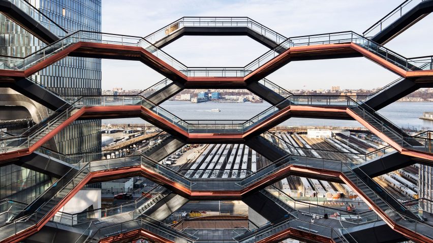
Crisis averted: Christine Murray says "designers may not be able to save the world by themselves, however they must help avert societal problems and the looming climate crisis," but few readers agree.
"Where does the idea come from that design can fix political issues?" asked Rd. "Trying to avert climate change with design is like mopping a floor while the tap is still running. These are not problems that need fixing, they need to be prevented."
Peckish79 had a different analogy: "It's like blaming the doctor if the patient dies – he went to the hospital so I guess he wasn't okay to begin with. Of course doctors try their best and of course we all hope that they don't make mistakes but there are limits to what they can do."
"Design, like everything else in a capitalist economy, is driven by what people will pay for," added Chris. "If you don't like what is being created, you have to change the financial incentives of consumers and developers, which is not a design problem.
Seth went on: "Designers have ceded their role in visioning with the communities for which we design. We now are brought in for compliance after money has been appropriated, bad ideas instigated and local input has been marginalised and sidelined."
Murray had an ally in one commenter though:
Do you think designers should be helping to avert societal problems? Join the discussion ›

Flagging the issue: readers are divided over Nike's decision to pull a special-edition Fourth of July trainer featuring an old version of the American flag. The move came after former NFL player and Nike ambassador Colin Kaepernick accused the design of being offensive.
"What they find offensive, and for good reason," explained Christopher Gon De Leeuw, "is the association of the Betsy Ross flag with white nationalist groups. I'm not sure how the shoe got this far through the product development cycle before someone realised that."
"So what if deplorable sections of society have attempted to co-opt the flag, reclaim the thing, be proud of the original idea," replied Le Ego. "Insofar as political ideas go, liberalism isn't exactly the worst."
BillH11103 was particularly annoyed by the design's removal: "Never buying Nike again. A) its shoes suck, and B) the brand has no idea what that flag actually stood for during the revolution. Nor does Kaepernick."
"Betsy Ross' version of the American flag is no more a symbol of 'white' nationalism than is my last name," concluded Jay C. White Cloud.
This reader had a suggestion:
Was Nike right to pull the design? Join the discussion ›

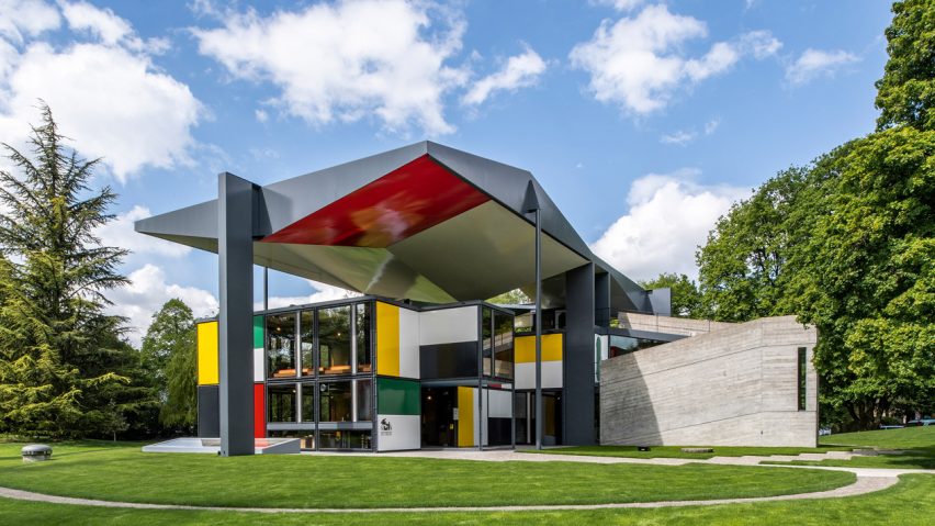
Public property: having been restored to its original state by architects Silvio Schmed and Arthur Rüegg, Pavilion Le Corbusier in Zurich has reopened to the public, and readers are delighted.
"My heart is all aflutter! Great photos," said Benny.
Michael Boo agreed: "What a wonderful structure to remind us that Corbu wasn't as one-dimensional as some might think."
"I think Le Corbusier should do the next Serpentine Pavilion, I don't know why he hasn't been invited," joked Donacio Cejas Acosta.
To which Pierre Mangeol replied: "Frank Lloyd Wright voted against him (again) this year."
One room especially caught the eye of this commenter:
Have you visited the art museum? Join the discussion ›

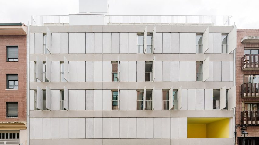
Throwing shade: FRPO has completed the Elcano housing block in Madrid with openable concrete panels and sun-shading blinds, causing controversy among commenters.
"Who would ever want to cut 99 per cent of the light out of their spaces?" asked Three Floating Orbs. "This seems very heavy handed. I love the minimalism in terms of its form and potential for constant flux, but civically this gives not nearly enough back to the streetscape."
"Heaven forbid they ever fall off their hinges," added Spadestick.
Leo was more positive: "I think the way the facades are treated in this building is quite inspiring. The voids seem like a bit of wasted space though."
"Love the look of the concrete shutters/panels, works well with the bright yellow!" praised Stephanie Kim Heldan. "Great idea and simple design."
One reader thought the panels and blinds called for a specific occasion:
Are you a fan? Join the discussion ›