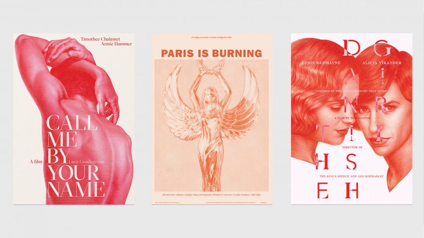
In our latest competition, we've teamed up with creative agency Grand Matter to offer five readers the chance to win the print of their choice, illustrated by artist Aiste Stancikaite.
This competition is now closed. Congratulations to the winners, who are Sara Fabian from California, USA, Marek Czuba from Berchem, Belgium, Finn Beames from London, UK, Desmond Leung from Yau Tong, Hong Kong and Ricardo Labra Mocarquer from Santiago, Chile.
Stancikaite has re-imagined posters for the films Call Me by Your Name, Paris is Burning and The Danish Girl as hyper-realistic red pencil drawings.
These are paired with bespoke typography and printed on A2-size specialist artist's paper.
The artist worked with graphic designers Chris Clarke, Polytechnic and iWant Design on the typography for each poster – with concept and creative direction from London-based Grand Matter.
Forming a series called Alternative Stories, each film was chosen for its themes of inclusivity and diversity in stories of LGBTQ+ experiences not widely represented in mainstream media.
The poster for Call Me by Your Name shows the nude back of a male with arms stretching upwards. Set in 1980s Italy, the film tells a coming-of-age love story between a teenage boy and an older man.
"The film was rich with references to the Italian Renaissance sculptures which inspired me to focus on the body, creating a pose that resembled ancient nude sculptures and had that sense of heat-soaked exhaustion and a touch of eroticism about it," said Stancikaite.
The artist's monochromatic pencil style allows for a "variety of tones" and "visual complexity" in the poster, drawing on the sculptural qualities of the nude form.
"The simplicity is an ode to the magnitude of a single colour – the spectrum of light to dark that can be created when constructing the form and detail shows the visual complexity and variety of tones available," she explained.
Stancikaite worked with The Guardian's deputy creative director, Chris Clarke, on the poster's bespoke serif typography in bold red against the white background and contrasting white against the male figure.
The collaboration with Polytechnic took to New York City in the 1980s and the rise of ball culture – a subculture in which members of the LGBTQ+ communities competed in elaborate performances.
A metallic female winged-figure is depicted holding a laurel wreath above her head, above which the bold Franklin Gothic font spells out the film's title in heavy uppercase letters.
"[The winged-figure] emerged as the key visual, alluding to the open acceptance and inclusion," said Polytechnic, a graphic design studio based in London.
Names of the film's cast are in a slanted italic lettering that the studio took from formal engraved cards.
For the third poster, Stancikaite reproduced a promotional image from The Danish Girl, focusing on the characters' faces. The film tells the story of Lili Elbe, a Danish painter who was one of the first people to undergo sex reassignment surgery.
"I think the pose from the official poster really shows the intimacy, tenderness and love between the two main characters," explained the artist.
John Gilsenan, founder of iWant Design, was responsible for the overlapping font design. It merges together sans serif and serif typefaces, designed to be a subtle reflection on the themes of the film.
"The two characters are almost merging as one in parts of the drawing," said Gilsenan. "I felt the type should merge too, binding the characters together."
Drawn by hand, the complex red-pencil artworks each took between two and five days to complete.
The winner can choose which of the three film posters they would like to receive as their prize. The posters are also available to buy online from the Grand Matter shop.
Competition closes Wednesday 7 August. Five winners will be selected at random and notified by email, and his or her name will be published at the top of this page.

