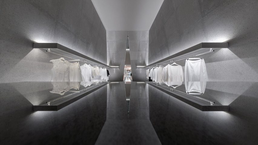
Slanted walls frame monochrome display areas in Chongqing's SND boutique
Architecture studio Various Associates has fashioned monochromatic interiors with mirrored surfaces and unusual fur-covered partitions, for this womenswear store in Chongqing, China.
Shenzhen-based Various Associates ensured that symmetry was the focus of the store's design by creating a rectangular floor plan that encloses a smaller rectangular zone inside.
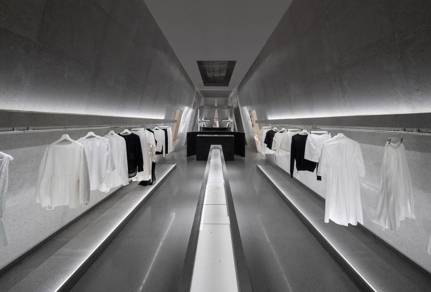
Described by the studio as a "milestone", the enclosed core accommodates a service desk, a small lounge area and VIP dressing rooms decorated with distinct furry pods where customers can change in privacy.
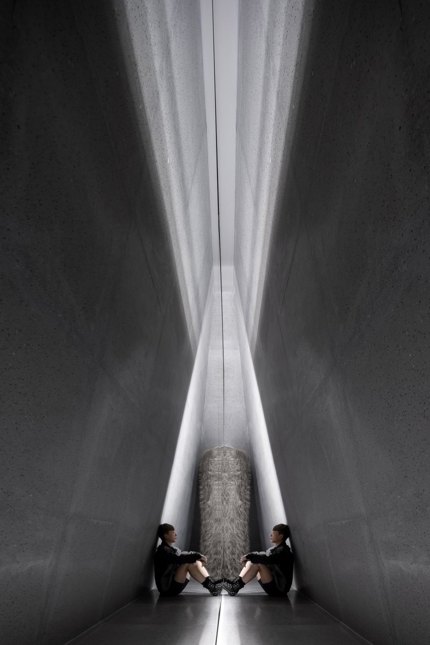
Its peripheral terrazzo walls are slanted to make the room a trapezoid shape, accentuated by a triangular entrance doorway.
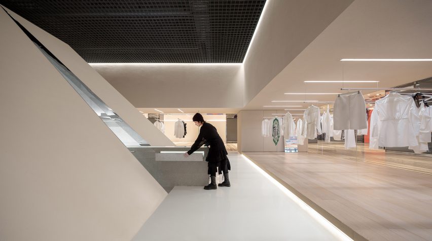
It can also be accessed via a series of openings that have been punctuated in the angled walls, intended to help customers effortlessly weave their way through different collections in store.
"Customers can clearly know the routes and view every product in display while walking, offering them a chance to select and compare goods easily," said the studio.
A slender, glass-topped plinth that displays the brand's jewellery collection juts out through the triangular doorway onto the external store floor.
Behind the service desk are also a couple of sofas where customers can sit and relax.
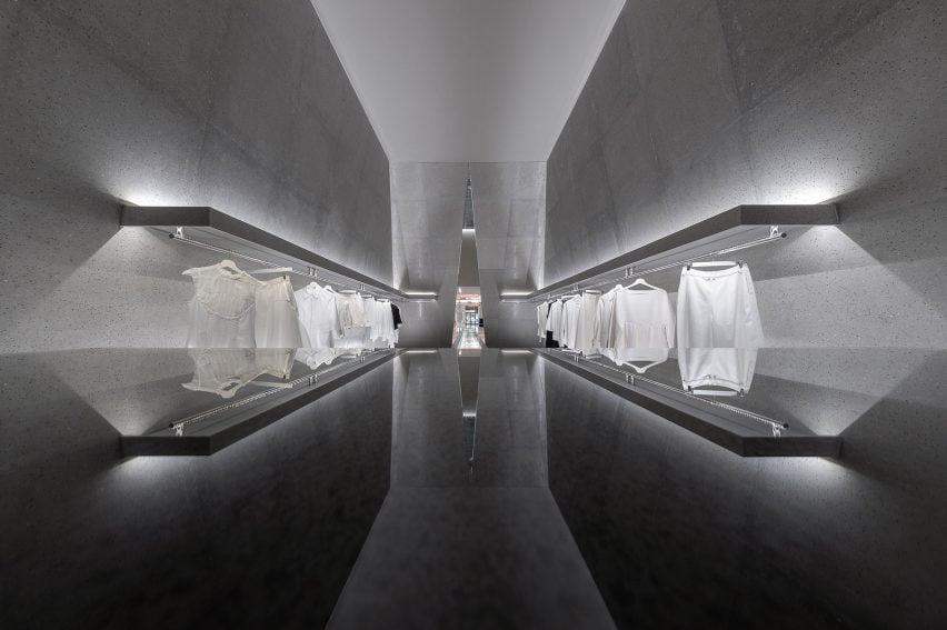
Symmetry has also been created in the placement of the various clothing rails.
"We continued the idea of symmetric design, offering the interior space a sacred and ceremonial sense," the studio explained.
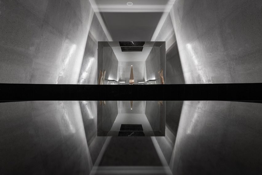
Mirrors have been integrated throughout the store's circulation spaces, a move the studio hopes will increase interaction amongst customers as they stop to glance at what items will look like on.
Sheets of mirror have also been used to clad the border of doorways in the "milestone" and to form large rectangular screens in the lounge area.
"In the mirrored corridors, the reflected image brings a more fun and futuristic sense to the real world," said the studio.
"The reflection of the mirror makes the store more visually magical and spacious."
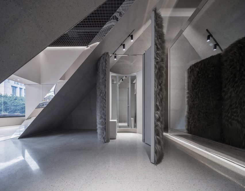
A majority of the store's surfaces are painted a neutral grey tone to bring the brand's clothing collection to the foreground. Strip lighting hidden behind concrete panels also softly illuminates certain garments.
Combining terrazzo walls with plush furry surfaces helped the studio create a softer, more comfortable atmosphere for visitors.
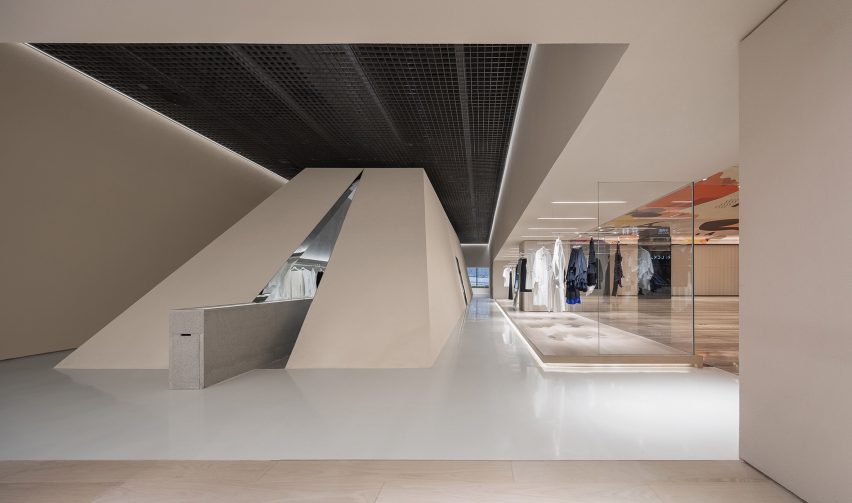
While the store's narrow, rectangular layout came as a result of site limitations, it ended up being a starting point for SND's new branding concept.
Keen to move away from the "mundane world" of fashion, the brand instead looked to "display clothes like art, so that people are full of love and respect for good design".
The longitudinal plan thus helps the store "become a runway for everyone" and attract the curiosity of visitors.
"We strengthened a sense of awe and spatial awareness in our design language, showing strongly contrasting design theme to differentiate the past image of the shop," added the studio.
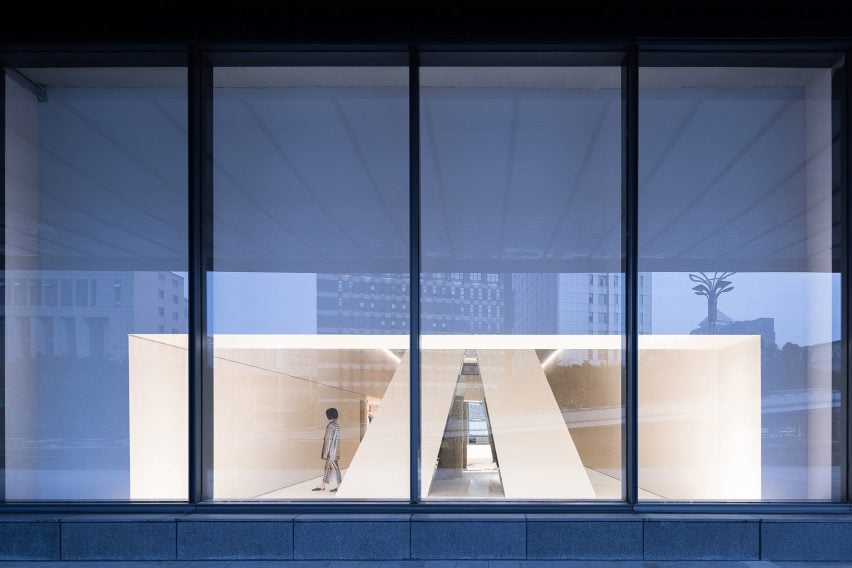
Additional spaces in the store that are fronted by expansive windows have been left unoccupied, allowing the SND brand to host events and presentations.
SND Boutique is longlisted in Dezeen Awards 2019 in the retail interior category, which was announced at the start of July.
Much like Various Associates, Xian Xiang applied stainless steel throughout Wellsky fashion boutique in Hangzhou. Atelier Tao + C also used the material to form the greyscale interiors of Zhengzhou menswear store JHW.
Photography is by Shao Feng.
Project credits:
Design firm: Various Associates (https://various-associates.com/)
Main designer: Dongzi Yang
Project leader: Qianyi Lin
Designer team: Dongzi Yang, Jingjing Tang
Professional lighting supplier: Viabizzuno