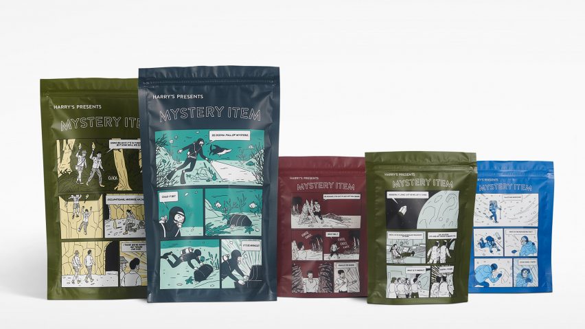
Customers of male grooming brand Harry's are taken back to 1950s confectionary advertising, through the comic strip packaging of their Mystery Item product.
Harry's looked to the aesthetics of Bazooka Joe – a comic strip character that was introduced on confectionary industry wrappings in the 1950s – for the packaging of its Mystery Items.
The Mystery Item programme offers shoppers the chance to add the product to their basket whilst shopping online, without knowing what is inside the package.
Following its launch, the packaging's graphic language was developed to elevate the customer experience and has been longlisted in the new graphic design category for this year's Dezeen Awards.
The Bazooka Joe mascot appeared in comics printed on the wrappers of Bazooka bubblegum, which illustrated the misadventures of the group and their comical conversations within compact storylines.
Harry's used the Bazooka Joe style for their packaging design by recreating stories about treasure hunts undertaken by a group of explorers, over five panels.
The scenarios were depicted at the climax of the discovery, which helped make use of the limited panels available for the narrative.
The packaging is intended to help the consumer relate to the sense of discovery and adventure by reading the comic strip.
The initial Mystery Item wrapping prioritised a loose-fitting form in order not to prematurely reveal the contents.
Whilst Harry's replaced the plain, reflective surface from the original packaging with the graphic panels, the pouch-like shape that masks the product inside was retained.
"The comic works to obscure the product, while adding a certain wink of fun to the consumer," explained the brand, who worked with illustrator Janne Iivonen on its design.
The package encloses the product with a seal near the top. They come in two sizes, depending on the value of the Mystery Item chosen.
Various colours are available, including a teal blue and olive green, and act as the backdrop for the comic strip printed on the front.
Accent colours within the illustration are matched with the background colour tones, which show a limited palette and saturation levels compared to the brightly coloured Bazooka Joe cartoons.
"It was great to have the creative design of the packaging be the main goal, rather than needing to communicate functionality or sellability," said Scott Newlin, design director at Harry's.
"There is something special about making an object that's typically thrown away fun and inspirational."
Harry's introduced the Mystery Item programme to their online retail experience in 2018, one year after the brand was founded. It has now become a permanent offer and has risen to become their second most popular product.
Items that the customer has ordered previously in the last year are omitted from selection, ensuring that they receive something new and different.
The product inside is hand-selected, ranging from bathroom and washing essentials to limited-edition items such as coloured razor handles.
"One of Harry's goals as a brand is to surprise and delight our customers," they said. "We are showing we are intentional about our customers receiving something special and tailored to them."
All Dezeen Awards 2019 longlisted projects were revealed earlier this month and you can vote for your favourite project on our Pinterest boards.
Coca Cola recently looked back to old packaging, as they reintroduced glass Hutchinson bottles from nearly a century ago, whilst Johnson Banks' meat alternative packaging draws attention to its contents and stands out on the supermarket shelf.

