Five design-focused delis with delectable interiors
Delicatessens might simply be places to pick up provisions, but architects and designers are increasingly completing them with striking interiors. Dezeen has picked out five of the best.
Ranging from a store in London with minimalist concrete display stands and another in Melbourne with salami-like counters, check out the full selection below:
Natoora, UK, by Noé Golomb and Finch
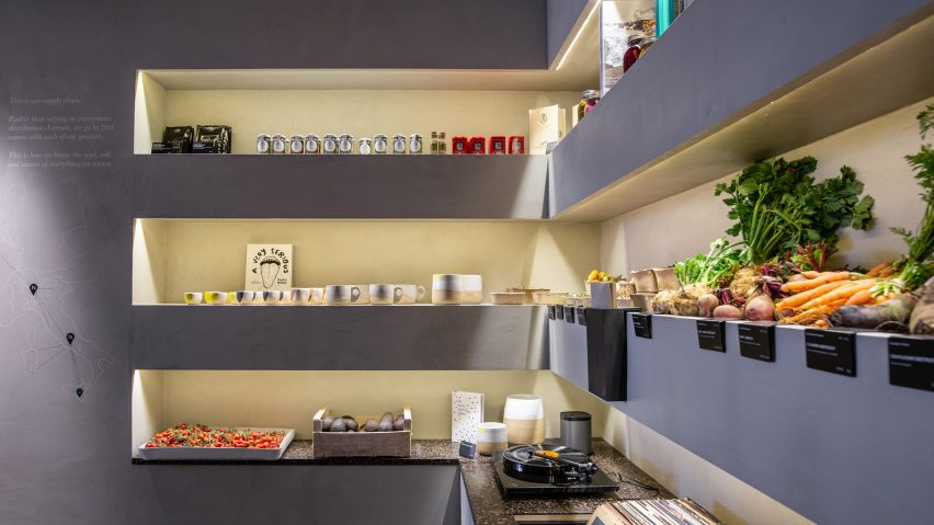
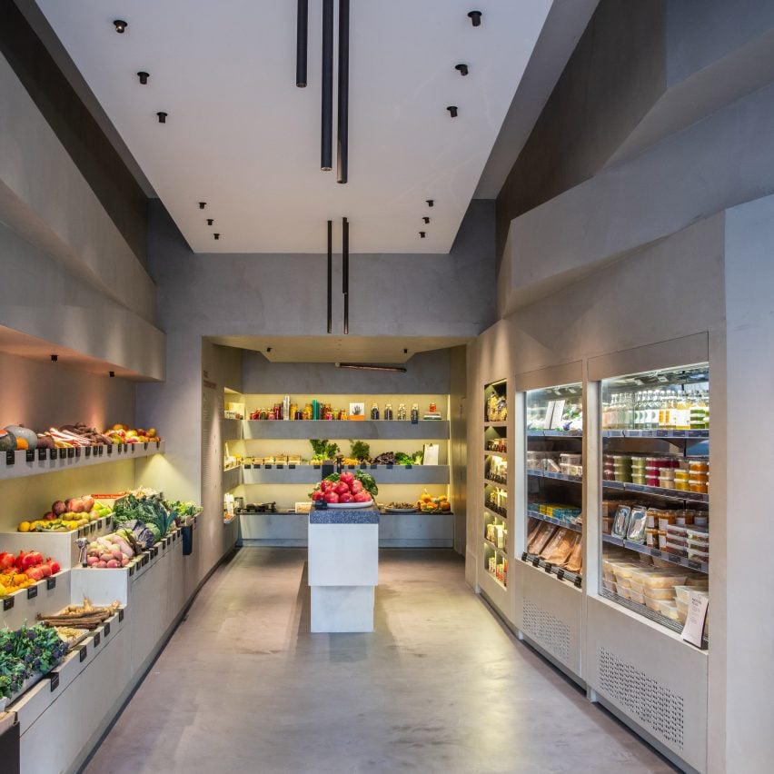
The "slick and minimal" interiors of this deli in west London's Chelsea do without typical supermarket food storage like produce-filled hessian sacks and plastic crates.
Food stuffs are instead arranged in order of seasonality and displayed on stacked concrete shelves, which are intended to reference layers of soil.
Grey surfaces throughout are offset by a terrazzo-like till counter and central sink basin.
Hunter & Co Deli, Australia, by Mim Design
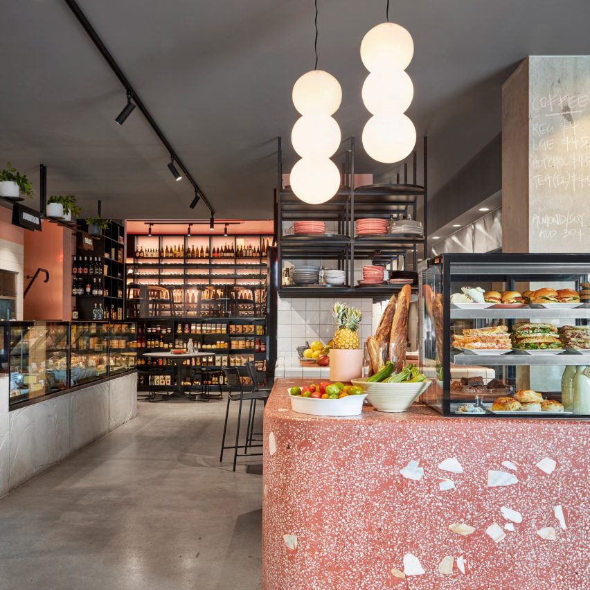
The produce on offer inside this Melbourne deli directly informed its interiors – a flecked pink counter at the store's entrance is meant to resemble sliced salami.
Meanwhile, spherical pendant lamps suspended from the ceiling are supposed to look like strings of small mozzarella cheese balls called bocconcini.
As well as a small cafe, the space also plays host to a rosé-coloured wine-tasting area where visitors can sit and sample the diverse selection of bottles that are available to buy.
La Sartine, France, by Bertrand Guillon
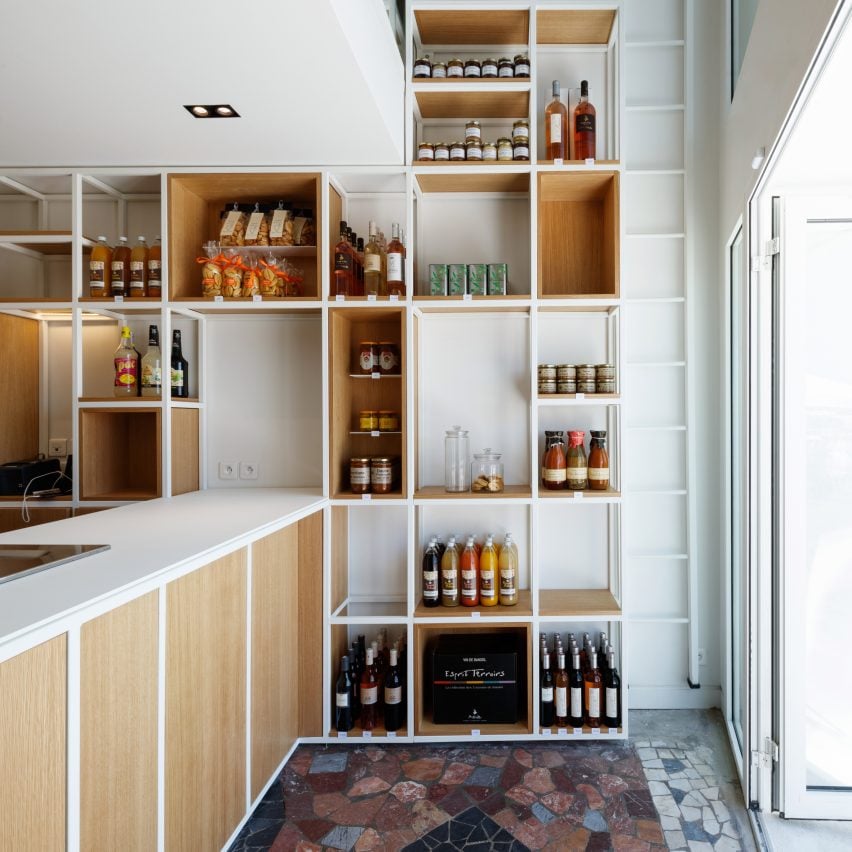
Intended to be a "punchy" alternative to traditional Provencal grocery stores, this deli has been completed with a host of quirky decor details.
Different-sized oak shelves display packaged goods, and coloured fragments of stone have been inlaid across the floor.
A narrow step ladder also rises up through the store's double-height entryway to a mezzanine level, where the company has a small culinary studio.
Finefood, Sweden, by Note Design Studio
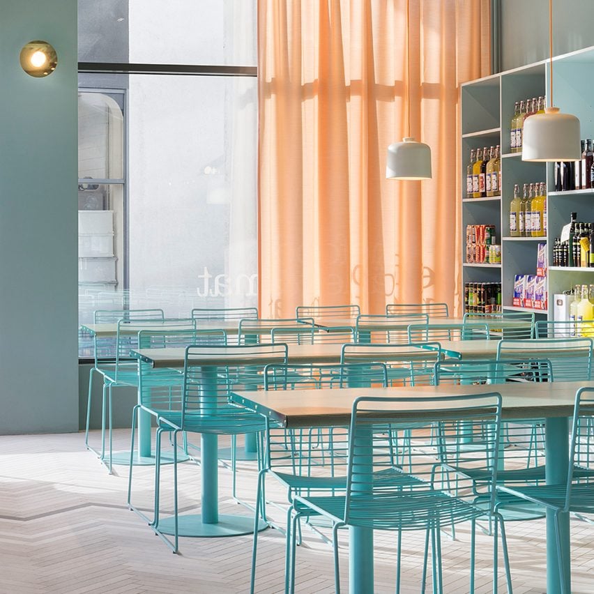
Photographs of Death Valley in California inspired the interiors of this deli in Stockholm, which has been decked out in sun-bleached shades like pale blue and peachy-orange.
"[The colour palette] is a direct translation of the variations of natural light in the mountains," explained Note Design Studio.
Green Guatemala marble has also been used to clad several walls, contrasting against the grey herringbone-pattern floors.
Via Porta, Australia, by Studio Esteta
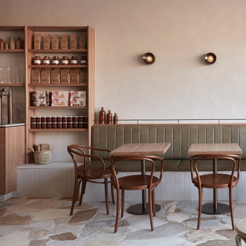
Designed in homage to its owners' Italian heritage, Via Porta has been completed with paved floors and sandy plaster walls that nod to Rome's narrow alleyways.
Joining the deli downstairs is a marble coffee bar and olive-green seating banquettes where visitors can grab dishes with a European twist. A formal dining room lies behind a Juliette balcony upstairs.