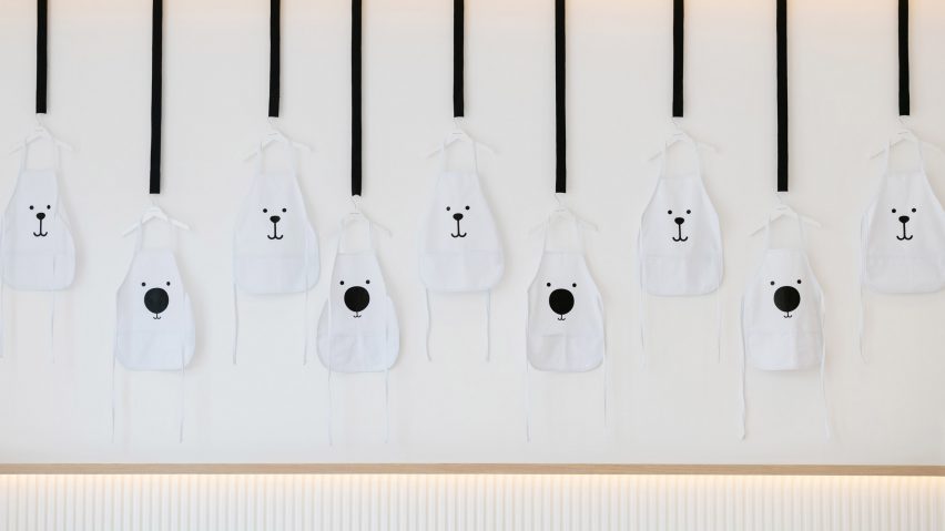
White & The Bear children's restaurant has white surfaces and timber furnishings
Sneha Divias Atelier has swapped stereotypical primary colours for neutral tones inside this restaurant in Dubai, which is designed specifically for children.
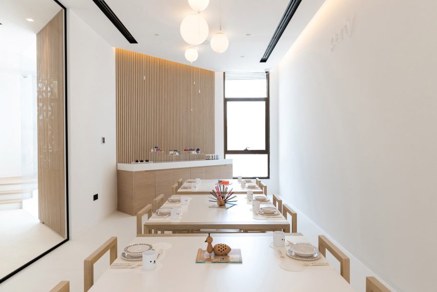
Located in Dubai's Jumeirah district, White & The Bear has been designed by Sneha Divias Atelier with "urbane" interiors that avoid the bright shades usually used within child-focused spaces.
The restaurant and retail space is instead decked out with neutral colours and materials that, according to the studio, will foster children's curiosity.
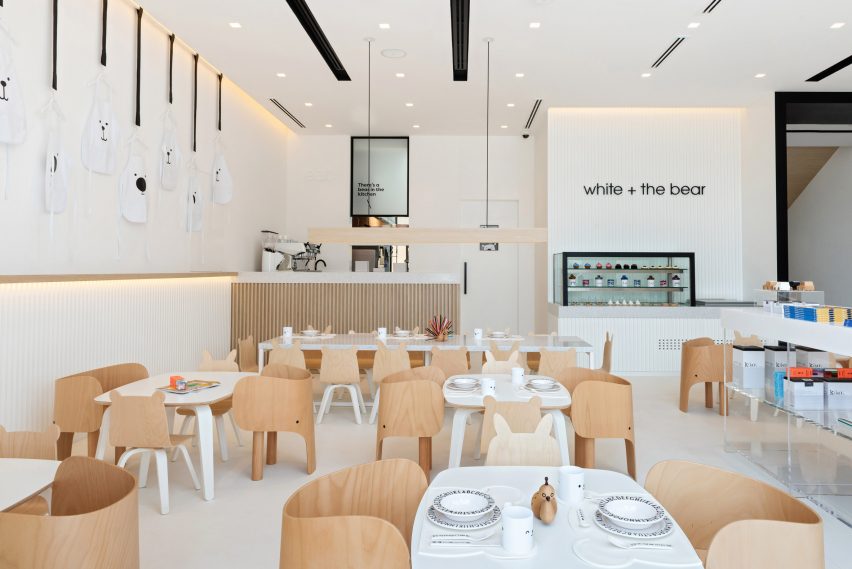
"At the atelier we selected such distinct palettes for kids' spaces to not overstimulate the senses," explained the studio.
"Instead, the colour scheme promotes creativity, imagination, and learning."
The ground floor of the building has been made into a singular open-plan space with all-white surfaces.
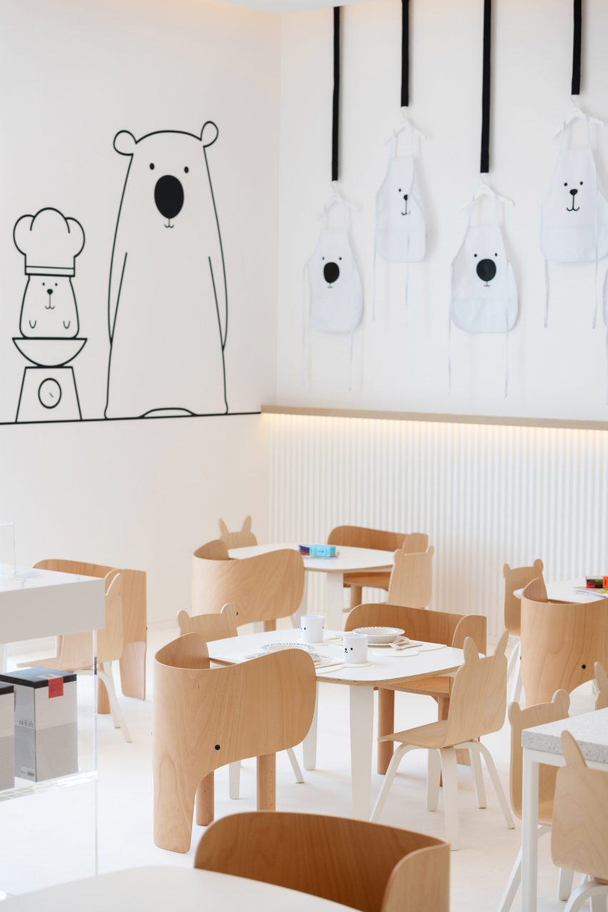
One half of the room is dedicated to the restaurant, which will offer a menu of healthy meals specially curated by a children's nutritionist. Timber has been used to form a grooved coffee counter where visiting parents can grab a hot drink and a series of tiny, animal-shaped seats for kids.
Some of the chairs featuring curving arms and a rear central leg to appear like an elephant, while others have bunny or bear-like ears extending from the backrests.
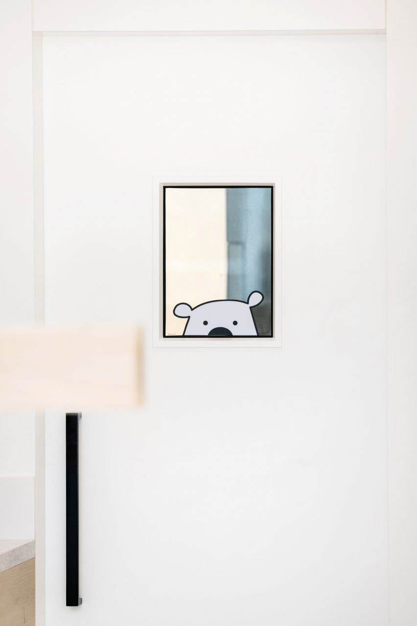
A flock of bird-shaped pendant lamps and mirrors printed with peeking bears have also been used to bring a fun feel to the space.
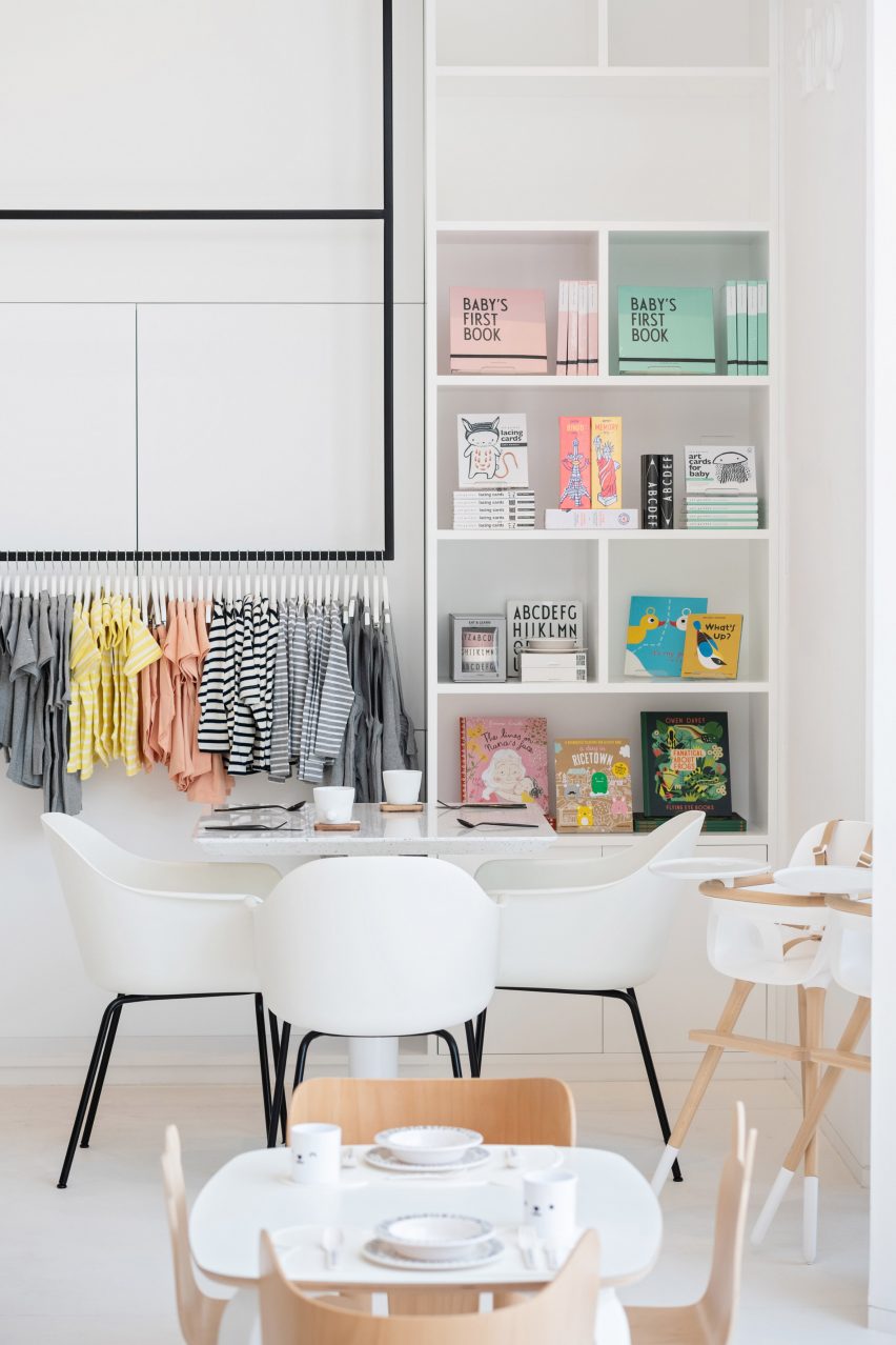
The other half of the room accommodates a small shop where clothing, books and toys are displayed on full-height gridded shelves.
The shop continues up to the building's first floor, which includes a large glass-fronted room that can be used for arts and crafts workshops or birthday parties.
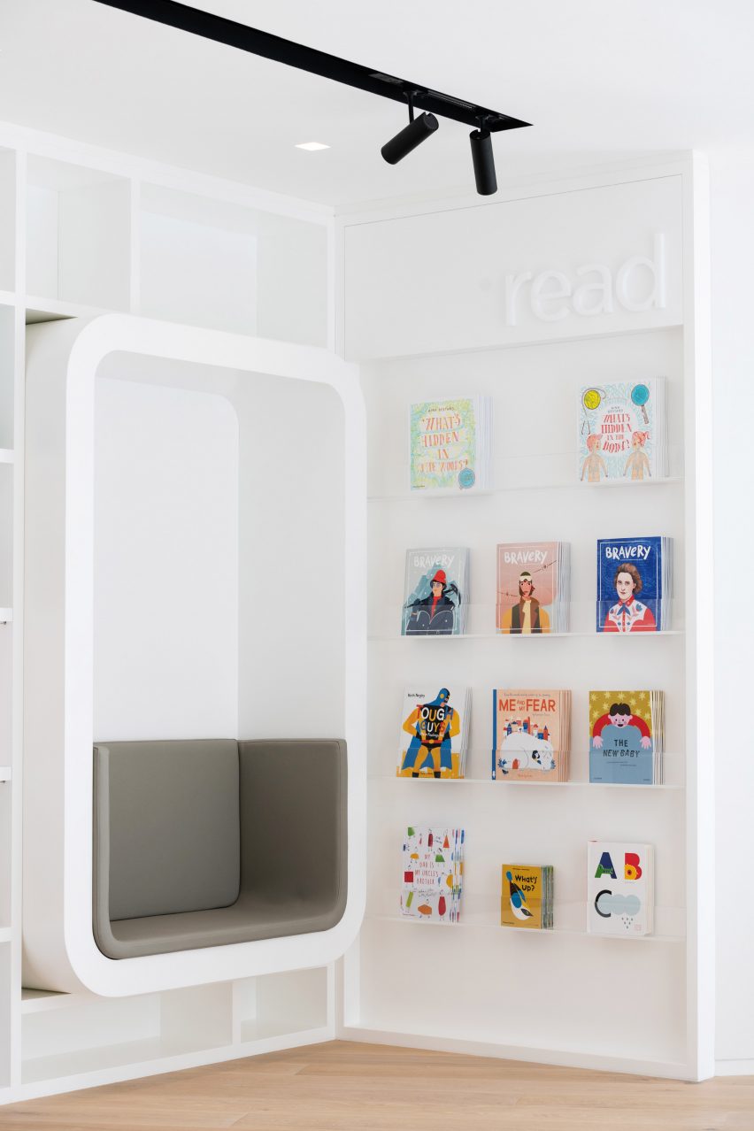
Connecting corridors are lined with books and have cushioned reading books inset into the walls.
At this level there is also a nursing room where mothers can feed their young babies in privacy, as well as a bathroom with lowered sink basins and toilets so that kids can use with ease.
"Children should be left to explore their surroundings and find their own space where they feel comfortable," the studio added.
"Our design is focused on humanizing the interior architecture, bringing a sense of proportion and scale for children to feel integrated."
A handful of other studios have taken a more pared-back approach to children's design. Early last year, Danish brand Ferm Living created a minimalist play kitchen that can fit in small homes.
Kartell also produced an ultra-simplistic dolls house made from candy-coloured plastic back in 2017.
Photography is by Natelee Cocks.