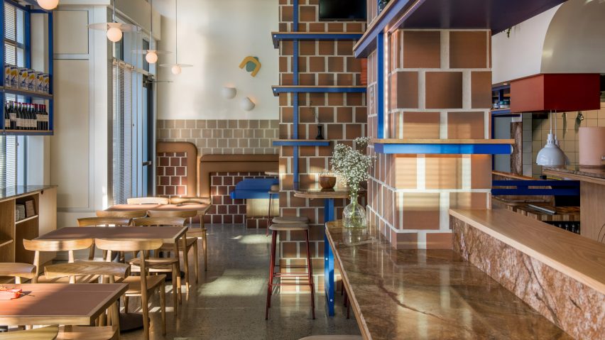
Vancouver studio Ste Marie has designed a cafe in the city wrapped in tiles as a riff on cosy, compact Spanish tapas bars.
The local design studio modelled the eatery Como Taperia on Spain's "standing-room-only" tapas bars in places like Barcelona's lively Poble Sec neighbourhood and Madrid's La Latina district.
"At Como, our goal was to provide a casual spot that clients could relax, have a little fun, and enjoy themselves," said Ste Marie's Rachel Martinuk, who led the design. "That's all."
"These spaces are tight, acoustics are loud, and you may or may not be offered a place to sit, favouring conversation and community over intimacy and comfort," the firm added.
Square, terracotta tiles line the majority of the walls. The upper portions painted white to keep the space feeling fresh, complete with polished concrete floors.
This materiality of Como Taperia references the three brick chimneys of Barcelona's industrial Poble Sec power station, in the area of Jardins de les 3 Xemeneies.
Bright blue is used for trim, meanwhile, and is a reference to the cobalt used by the late Spanish painter Joan Miró. The abstract and geometric details in the cafe were also informed by notable Spaniards Salvador Dali and Antoni Gaudí.
The cafe is a "homage to all we love about Spain," said Ste Marie.
The 1,400-square-foot (130-square-metre) restaurant is a rectangular space and comprises a collection of high tables with stools, and a built-in upholstered booth that provides lower cushioned seating.
Accents of terracotta and dark red enliven the decor, while moments of brown marble and light wood panelling enhance to the materiality of the project.
The restaurant's kitchen is concealed by a counter with a volume that extends down from the ceiling.
A portion of the storage volume has a drawing at the bottom with organic shapes in blue and red, evocative of paintings by German-French modernist Jean Arp.
In addition to this tapas spot, Ste Marie has developed a number of creative concepts for other eateries in the Canadian city, including a restaurant based on a fictional muse and an Italian cafe designed as if was the home of a fox.
Photography is by Conrad Brown.
Project credits:
Design principal: Craig Stanghetta
Design lead: Rachel Martinuk
Brand and graphic design: Glasfurd & Walker
Styling: Kate Richard

