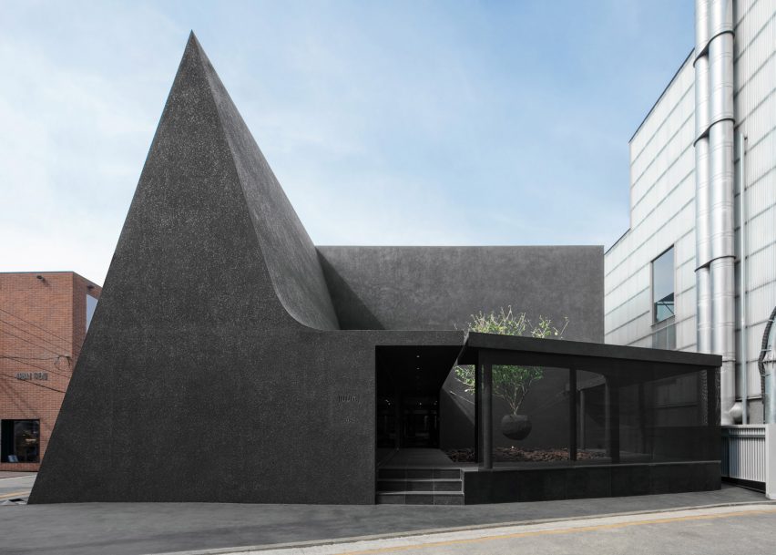
Korean practice WGNB has designed the flagship shop for fashion brand Juun.J in Seoul as a cluster of black geometric forms.
Working with the motifs of circles, triangles and squares, the store occupies a black-rendered building that abuts a cafe with a steep triangular roof sweeping down to cover a glazed circular courtyard.
WGNB drew on ideas from Tanizaki Junichiro's essay on Japanese aesthetics and their subtlety, In Praise of Shadows, when conceptualising the building.
Entry into the store is through an open corridor that runs between the cafe and the courtyard, leading into the cube that houses Juun.J womenswear at ground floor level and menswear above.
The ground floor womenswear space is the brightest and most open space in the store, with its white finishes and a high-gloss floor and walls that is designed to put "more emphasis on the darkness".
Fitting rooms and clothes rails sit within dark niches, and sculptural elements have been introduced such as a black, textured girder-like rail in the centre of the space. The rail hangs above an elliptical pit in the floor filled with black stones.
Above, the dark menswear space is dominated by hanging geometric forms – rectangular screens and semi-circles – with most of the clothing rails pushed to the edges of the spaces.
"The darkness, formed naturally by the intangible shadows of tangible objects hung in the space of the geometric structure, makes for an attractive look," said the studio.
Fitting rooms have been wrapped in a black curtain, introducing another black texture to the space. A triangular window looks down into the cafe below and brings a small amount of diffused light into the space.
The triangular cafe, operated by Felt Coffee, is lit by a high skylight, which draws light in and across the curved form of the ceiling onto a long wooden table and black counter below.
Full-height glazing overlooks the courtyard opposite, in which a tree sits in a planter suspended by several steel cables, hovering above a pit of earth-coloured rocks surrounded by a walkway.
Glazing wraps around the exterior of the courtyard, providing glimpses into the shop from the street and also allowing for changing light conditions.
While the interiors use smooth black textures such as wood, metal and stone, the exterior has been covered entirely with a finely-textured black render.
Fashion shops often require architects to take a conceptual approach in order to communicate a brand's values. Studio Goss designed a brutalism-inspired shop for Kloke in Melbourne designed by Studio Goss, and Ciszak Dalmas' design for a shop in Madrid was influenced by a fashion label's own accessories.
Photography is by Yongjoon Choi.

