TBWA creates "soothing and hypnotising" animations of McDonald's Egg McMuffins
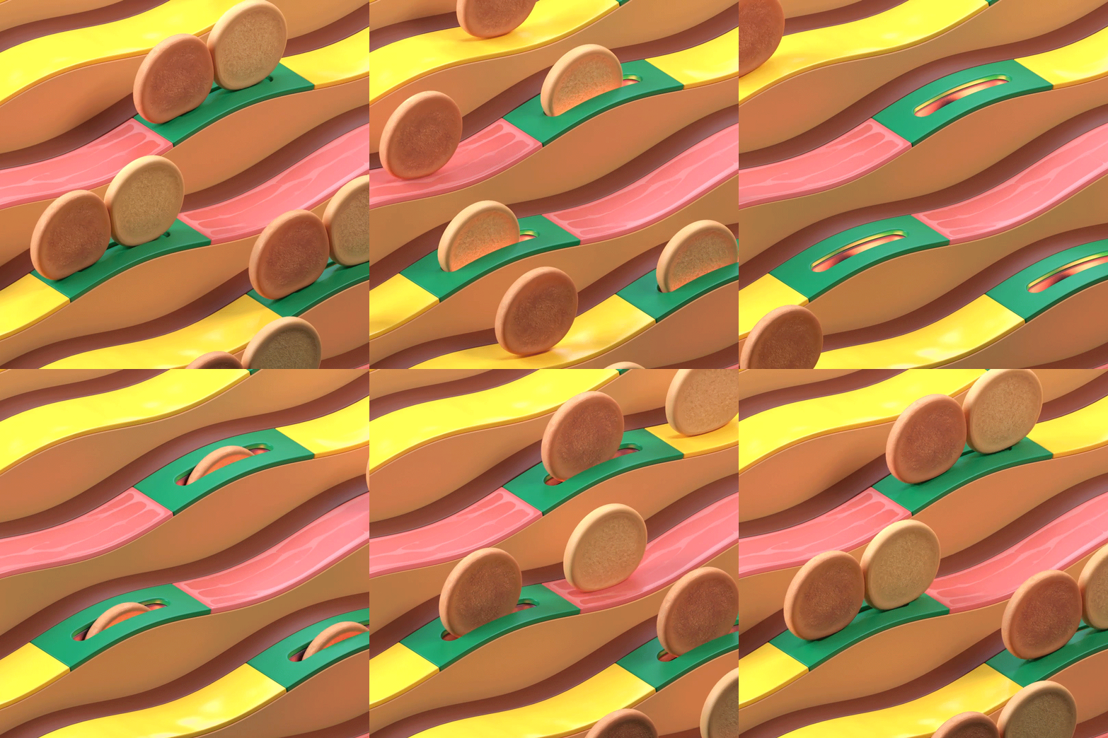
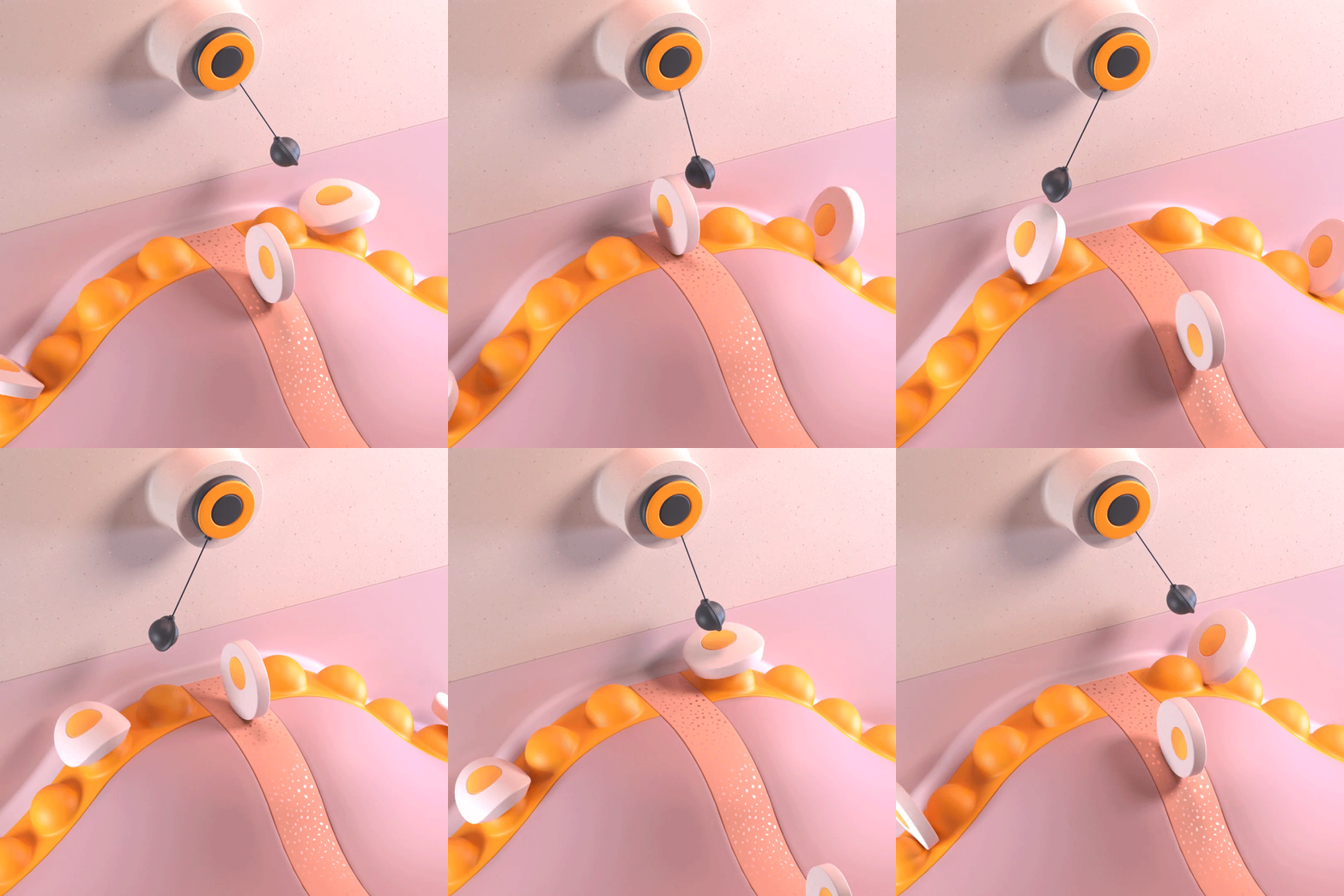
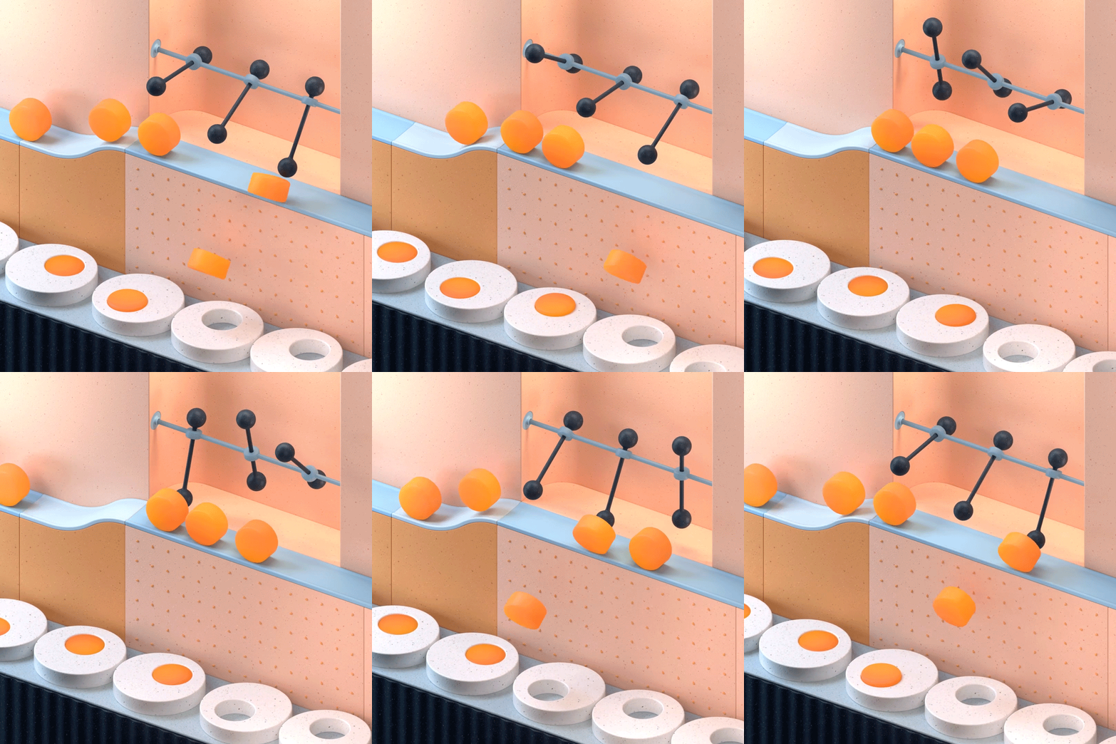
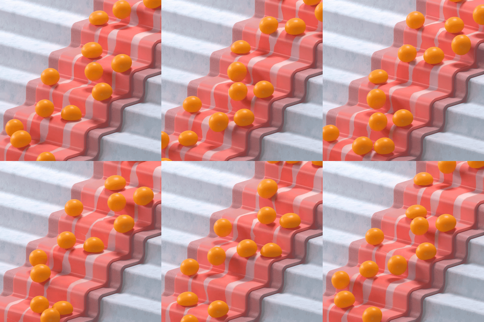
To celebrate the Egg McMuffin being available all day in McDonald's restaurants in France, TBWA has created 15 satisfying animations of the deconstructed breakfast item coming together.
Advertising agency TBWA created the looping animations to promote the Egg McMuffin in an alternative way to standard food advertising that would appeal to millennials.
Each of the fifteen colourful animations shows elements of Egg McMuffin moving through a cartoonish production line.

"There was an interesting idea in showing food without actually showing the product. To create a new language for an industry that has not done much to change its ways of communicating," explained TBWA digital creative lead Nicolas Barrès.
"We deconstructed the product and used its separated ingredients – bun, bacon, egg, and cheese – to create 15 abstract allegoric 3D animations," he told Dezeen.

The animations are designed to be "soothing and hypnotising" to match with TBWA's branding of the Egg McMuffin as The Smoothest Burger.
"We needed a way to distinguish the Egg McMuffin from other burgers. Looking at its intrinsic qualities, such as its muffin bread and silky egg texture, labelling it as 'smooth' became quite obvious early on," added Rafaël Riffiod, a copywriter at TBWA.

TBWA designed the graphics to try and communicate the idea of smoothness to a digital audience.
"We were looking to turn a tactile experience into a visual one," explained Barrès. "We drew our inspiration from the digital trend of satisfying video GIFs that have a soothing effect, and decided that the only way to properly show the sense of touch would be to use 3D animation, where we can work with textures, physics, and colours with great attention," explained Barrès.
"Half of the desired effect comes from the motion and repetitiveness. So, we chose infinite loops as a format to further enhance the soothing and hypnotising effect of the animations."

The playful graphics are a fun move away from much of McDonald's branding, which over the past couple of decades has progressed from cartoonish to more mature.
"What was important to us was to create something new, memorable, and universally understandable," added Riffiod.
"It fits with McDonald's branding through the choice of colours and the use of recognisable elements, but it is the digital space that allows us to explore further than the usual branding codes allows."
The fast food company's latest restaurants are designed following the pared-back Ray Concept, which was developed by retail and branding consultant Landini Associates as part of a plan to update the chain's image.
The first rebranded store opened in Hong Kong and it has been followed by a restaurant in Chicago that was compared to Apple Stores and the "the ultimate McDonald's" on Times Square in New York.
In France, Paola Navone created a new visual identity for seven McDonald's restaurants.