Snøhetta designs Aesop store in Sydney to resemble coastal cliffs
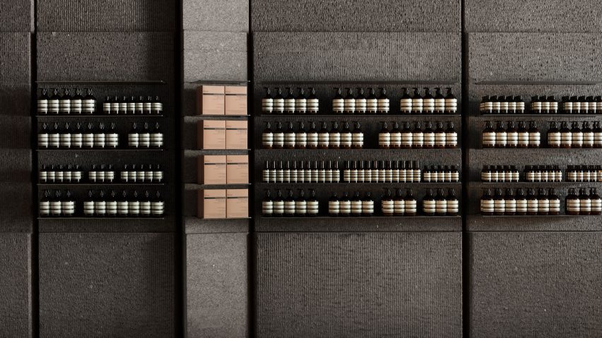
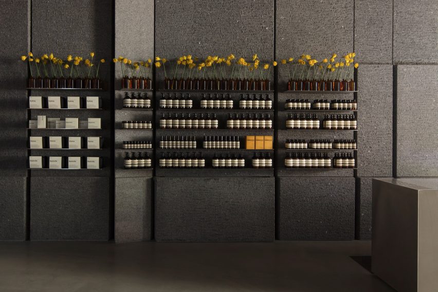
Granite covers almost every surface inside this Sydney Aesop store, which architecture firm Snøhetta has designed to look like a rocky coastline.
Situated amongst the busy, shop-lined streets of Sydney's central business district, Aesop Pitt Street has been designed by Snøhetta to "slow down the pace of passersby".
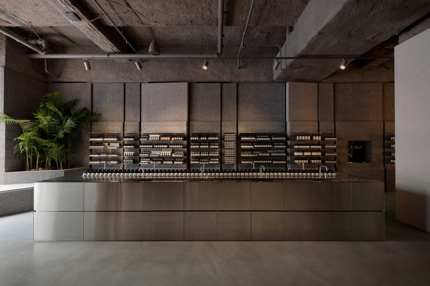
"We sought to create a space that, though large in scale, still embodies the spirit and ambience of what Aesop is recognized for – a space of calm and reflection that allows one to focus for a moment on oneself," Peter Girgis, senior interior architect at Snøhetta, told Dezeen.
Granite has therefore been used to line almost every surface of the 250-square-metre store – Aesop's largest retail space to date – nodding to the appearance of coastal cliffs and the tranquil ambience associated with beachside settings.
The practice was also hoping that the extensive use of a single material would lend the store a sense of monumentality.
Images of stone quarries became a point of reference, along with Wrapped Coast – a 1969 installation that saw art duo Christo and Jeanne-Claude drape over 92,000 square metres of fabric over towering cliffs in Syndey's Little Bay suburb.

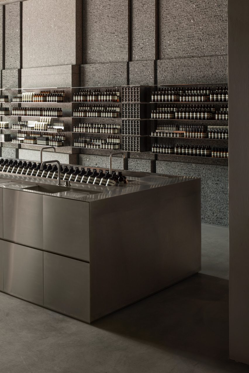
Vertical grooves have then been carved out of the stone walls to delineate rows of shelves, which openly display Aesop's products.
A block of silver metal also forms a huge sink where staff can test and demonstrate products for customers.
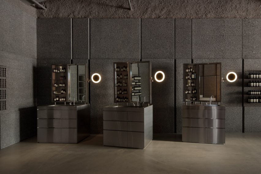
Towards the rear of the store there is an additional trio of singular basins, much like bathroom vanity cabinets, which are meant to create a "home from home" atmosphere where customers can have a more personalised experience selecting products.
A splash of colour is provided by a foliage-filled planter in the room's corner.
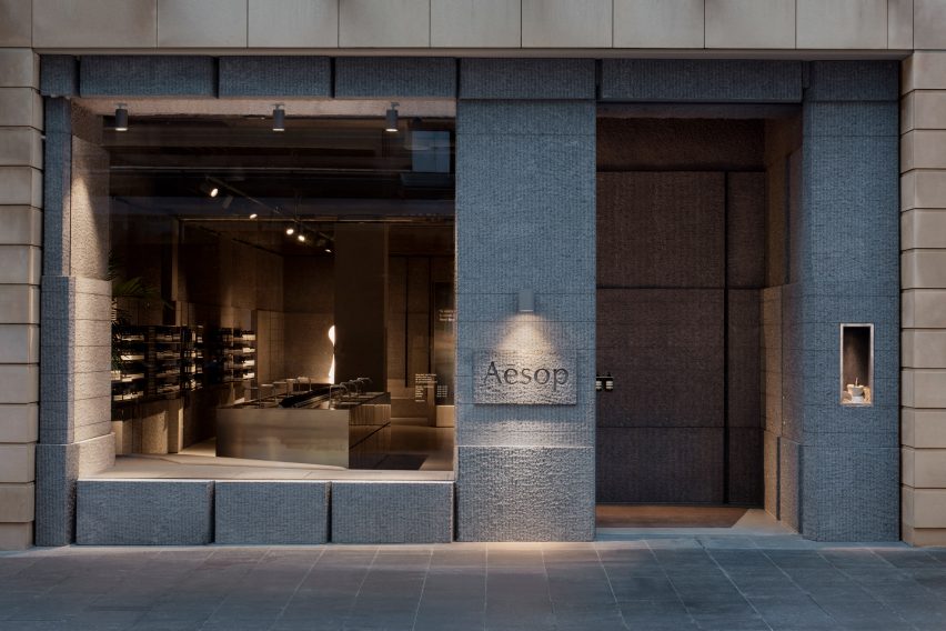
The store's entrance door is slightly set back from the outdoor pavement, a feature intended to allow shoppers a "moment to decompress" and acknowledge their transition into a calmer space.
Granite also covers this area and the store's facade, visually detaching the retail space from the area's surrounding sandstone buildings and the chaotic commercial streets.
Aesop Pitt Street marks the eighth store that Snøhetta has designed for the brand. Others include a branch in London that's centred by 12 rose-coloured arches and another in Oslo that's lined with three-dimensional oak panels.
Photography is by Benjamin Hosking.