Seven ice cream shops sprinkled with delicious decor details
As the warm weather fades away and winter approaches, Dezeen has scooped up seven design-focused ice cream shops to satisfy your sweet tooth all year round.
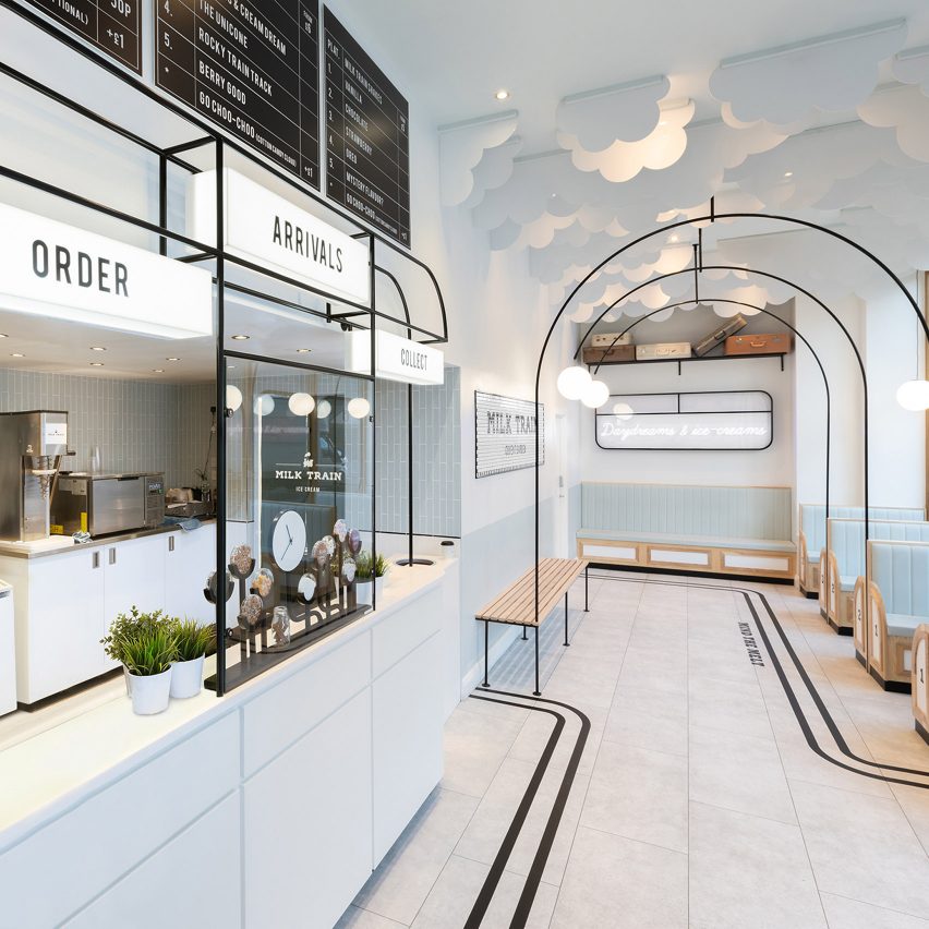
Milk Train, London, UK, by FormRoom
Cut-out clouds and pastel-blue walls form a whimsical backdrop to the London store of Milk Train, a brand that has become increasingly popular on Instagram for its wacky ice cream offerings.
FormRoom interpreted the brand's name into train-like seating booths, departure board-style menus and overhead shelves that display prop suitcases.
Travel-related puns dotted about the interior in neon signage also encourage visitors to snap images and share on the photo-sharing app.
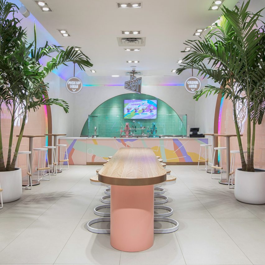
Ice Scream, New York, USA, by Asthetique
Described by Asthetique as a "mental holiday", the interiors of Ice Scream feature neon geometric shapes, palm trees and rounded furniture inspired by Memphis design and the kitsch style of the 1950s.
Employees make the store's nitrogen-based desserts behind a hand-painted counter at the rear of the store. The machine is backed by a striking mint-green arch fitted with colour changing rainbow-LED strips, encouraging visitors to photograph and film the manufacturing process.
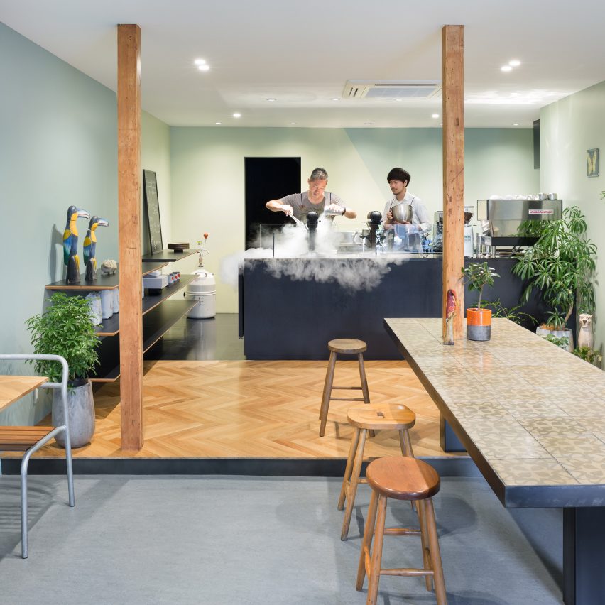
Snow Picnic, Tokyo, Japan, by Torafu Architects
Japanese studio Torafu Architects used three flooring finishes – patterned tiling, blue-grey linoleum and timber parquet – to delineate different zones inside Tokyo's experimental ice cream parlour, Snow Picnic.
Anatomical drawings of animals have been mounted on the walls in a nod to the scientific processes store employees use to make liquid-nitrogen ice cream.
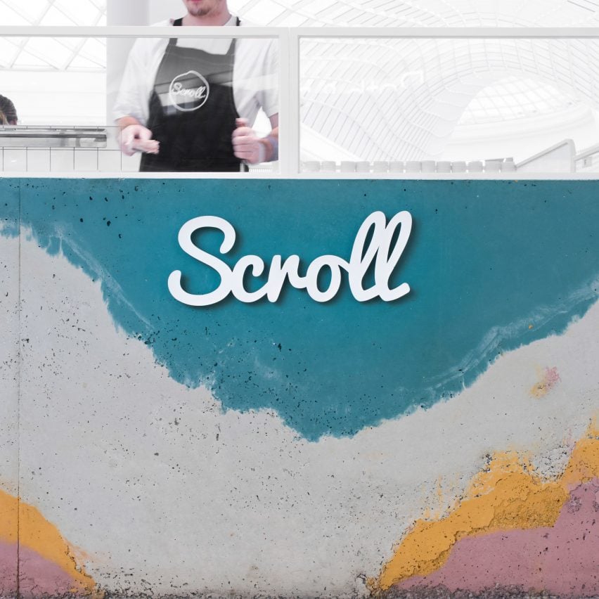
Scroll Ice Cream, Melbourne, Australia, by One Design Office and Studio Twocan
One Design Office employed Studio Twocan's special concrete layering technique to create the technicolour service bar of Scroll Ice Cream, which sits inside a Melbourne shopping centre.
Vibrant teal-blue and off-white concrete mixtures were poured on top of yellow and pink in the formwork mould, reminiscent of "icy layers of flavours and fruits".
Read more about Scroll Ice Cream ›
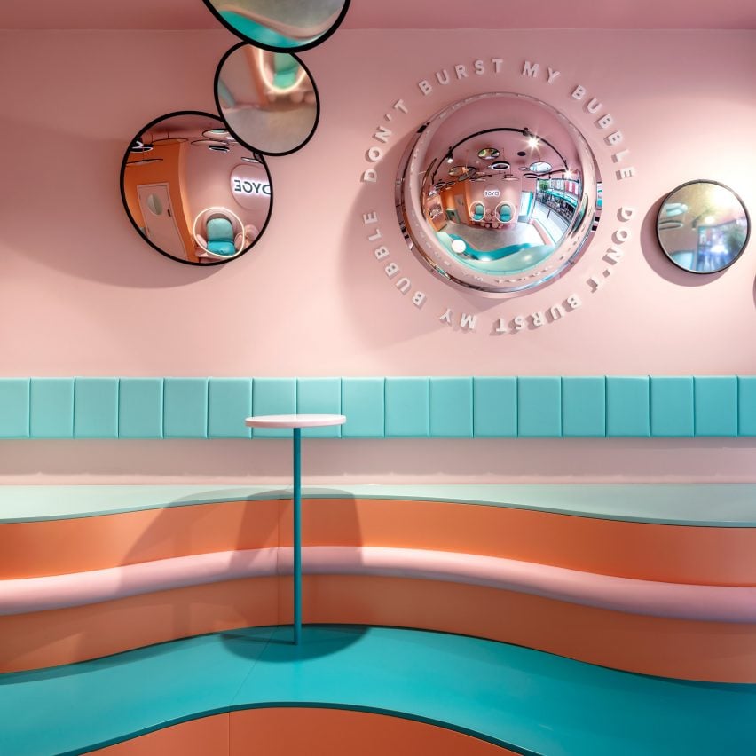
Dyce, London, UK, by FormRoom
Shiny convex mirrors decorate the millennial-pink and baby-blue interior of Dyce, an ice cream parlour in London's Marylebone neighbourhood.
Designed to be both "unexpected and immersive", the space features a mix of Instagrammable and surrealist features – its curved floor and two-tiered seating are meant to resemble melting ice cream, while subtly nodding to the work of artist Salvador Dali.
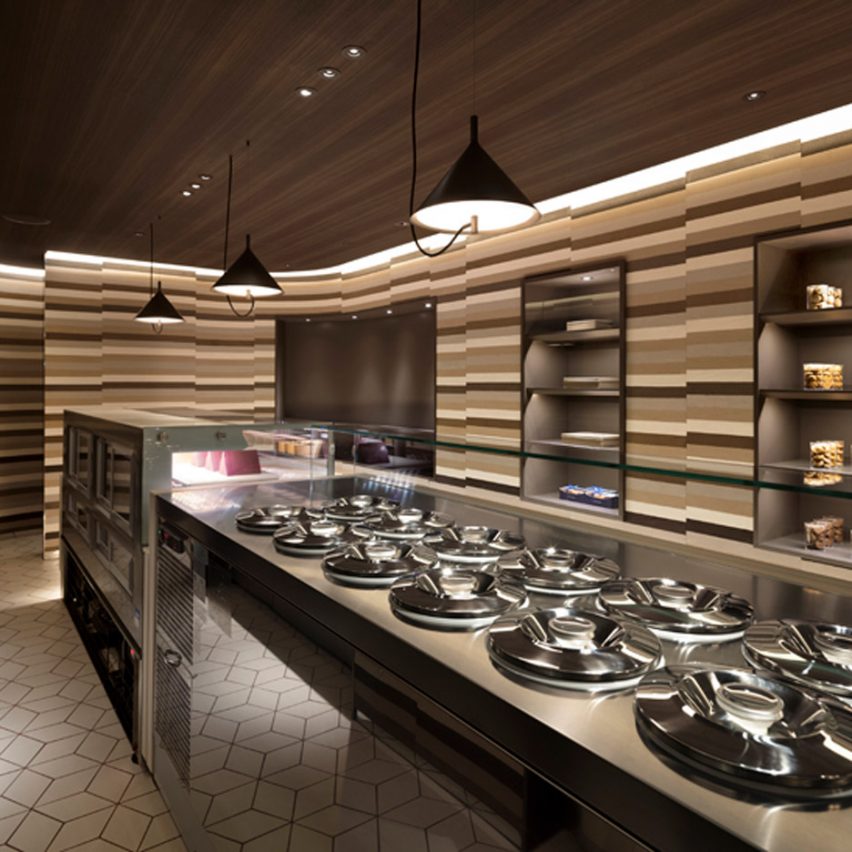
Glace et Chocolat, Tokyo, Japan, by Nendo
Visitors can experience the feeling of stepping inside a multilayered ice-cream cake when entering Tokyo's Glace et Chocolat, designed by Nendo.
The store's gently curving walls are composed of layers of soil in varying brown tones, each mixed with fine aggregate to create a smooth, ice cream-like texture.
Read more about Glace et Chocolat ›
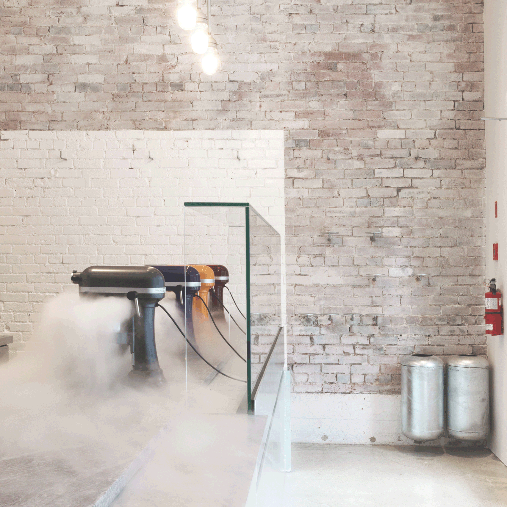
Mister, Vancouver, Canada, by Scott & Scott
Canadian studio Scott & Scott breathed new life into an old warehouse in Vancouver by transforming the industrial space into a liquid-nitrogen ice cream shop.
Durable steel sheets have been used to clad several of the store's fixtures, resulting in an overall pared-back aesthetic.
The studio was also hoping that the galvanised surfaces would also act as a comic reference to "sticking your tongue to the steel guard on a ski lift".