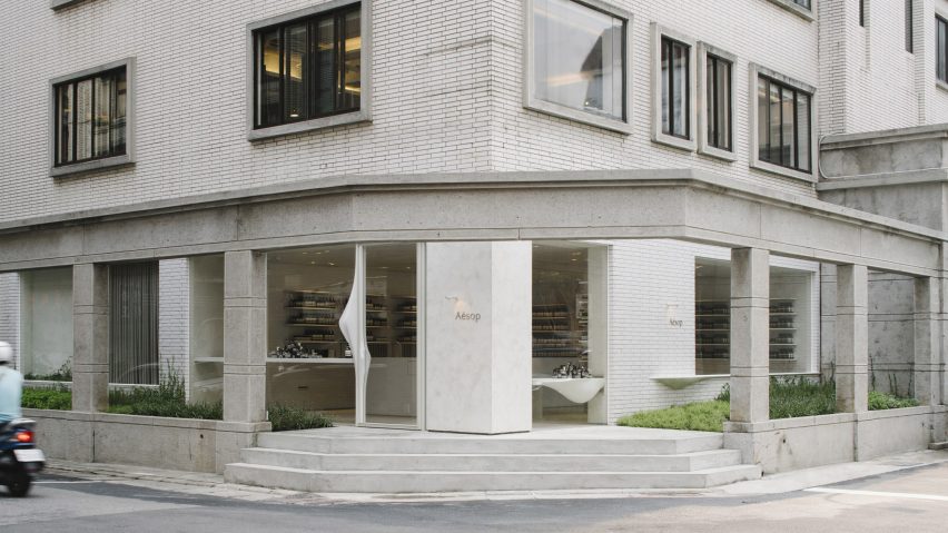
The white-tile interior of this Aesop store has been designed by Mlkk Studio to match the materiality of buildings dotted around Taipei's Daan district.
The Aesop Daan Signature store – which is shortlisted in the retail category of the 2019 Dezeen Awards – is located on a quiet street corner, and takes inspiration from the pale ceramic tiles that can be seen on the district's shopfronts and buildings.
Matte alabaster tiles run across the store's front facade and into its ground-floor interior, creating what Mlkk Studio describes as a "gentle continuation of the streetscape".
"The design explores the tension between nature and urban environments," said the studio, which is based in Hong Kong.
"These dominating ceramic tiles define the city as rigid, durable and unchangeable, but [our] design instead embraces the peculiarities, cracks and imperfections that develop over time to create a record of a changing environment."
The store comprises a retail space, treatment room, flexible meeting area and back-of-house office. It's fronted by large windows that look out across a planted patio and the adjacent road.
Tiles line the walls, ceiling and a pair of chunky service counters that help loosely arrange the space.
A few surfaces have deliberately been left exposed to reveal the textured mortar beneath, intended to sit in contrast to the polished ceramic tiles.
Behind the sales counter lies a sliding door that can be drawn back to extend the space for events, or closed to create a private space for meetings.
A narrow hammered glass door then leads through to a small consultation room – completed in darker tones, it's meant to serve as a calming transitional space that helps visitors relax before treatments.
The treatment room features gently curving window ledges, seating, door frames and handles, offsetting the orderly geometry of the tiles.
"The smooth cement surface of the organic furniture requires exceptional craftsmanship to create," explained the studio.
"Each is first milled into a rough shape, and then the cement layer is applied by the local master and handcrafted to a smooth geometry before the cement is dry and then further sanded to smooth."
The studio has also added various climbing plants and herbs that will grow up the mortar walls, in between the tiles and across the facade, changing the store's appearance over time.
"Often as an architect, we are being asked to design something to stay timeless and near perfection, so the outcome always looks new and fresh. However, in the commercial world and particularly in Asia, time is relatively short. In every few years, the brand or the landlord often ask to relocate the store or make a new one," said the studio.
"Our question is whether we can embrace changes and appreciate the transformation, refreshing the store's appearance in a subtle and prolonged manner without a drastic and abrupt renewal."
This is not the first Aesop store that Mlkk Studio has completed. Earlier this year the studio created a branch for the Australian skincare brand in south Seoul, which is entirely lined in reclaimed red bricks.

