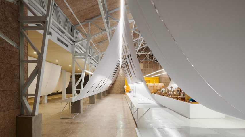
Sheets of paper form a floating backdrop to design exhibition in Taiwan
B+P Architects has used swooping swathes of paper to form a temporary exhibition design in a former military building in Taiwan.
The art and design exhibition is housed within a recently renovated building with a pitched-roof construction and exposed steel framework.
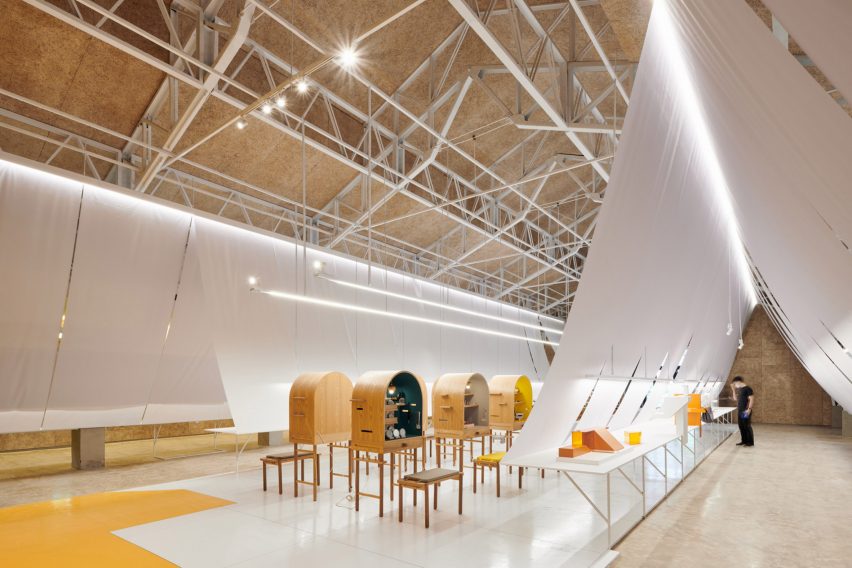
It was originally used by the country's Air Force but its open-plan interior is now dedicated to hosting pop-ups and temporary cultural events.
Run by Taiwan's Ministry of Education, the current exhibition is intended to promote art and design courses in the country by demonstrating how design can be used to improve everyday life.
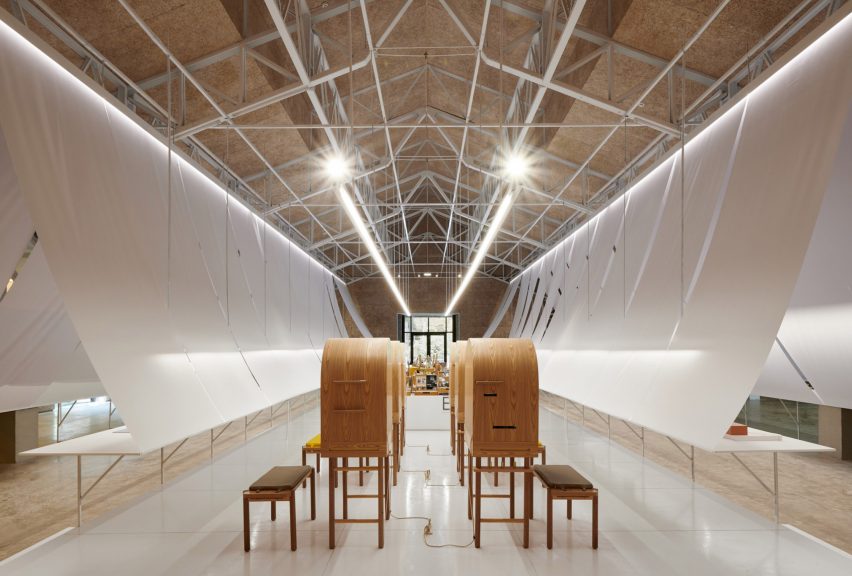
A swooping paper roof is the focal point of the exhibition design, which was created by Taipei-based studio B+P Architects and is shortlisted for a Dezeen Award in the civic and cultural interior category.
The firm said it wanted the design of the space to reflect the theme of the exhibition.
"Paper is the easiest to get and most commonly used material to create things in our daily life," explained the studio. "It's also the material most often used in the beginning of aesthetic education."
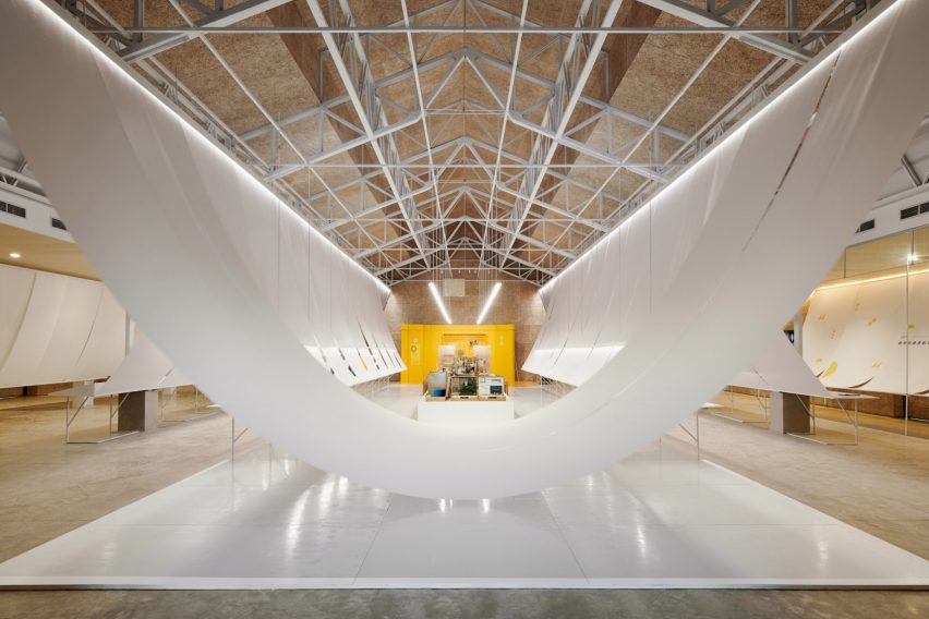
Laid out across the building's barn-like space, two parallel trestle-tables on cantilevered legs run its length while a series of cabinets and display plinths sit in the centre.
A series of large sheets of white paper are hung above the trestle tables to form canopies that also serve as screens, dividing the space into different sections.
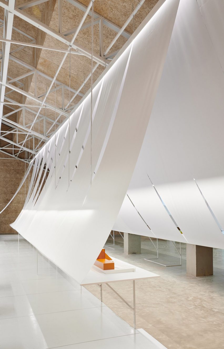
The paper is draped over a lightweight extended truss system that the architects attached to the building's existing steel framework ceiling.
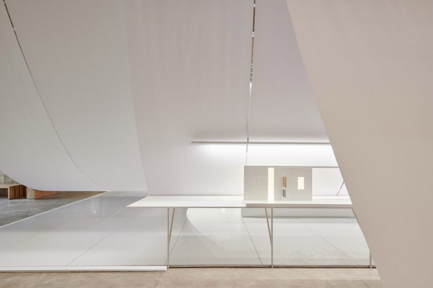
The paper is hung so that it curves downwards where it is fixed to the trestle tables. This was done to create a feeling of lightness while also creating a backdrop for the displays.
LED strip lights and spotlights hang from the ceiling through carefully cut openings in the paper.
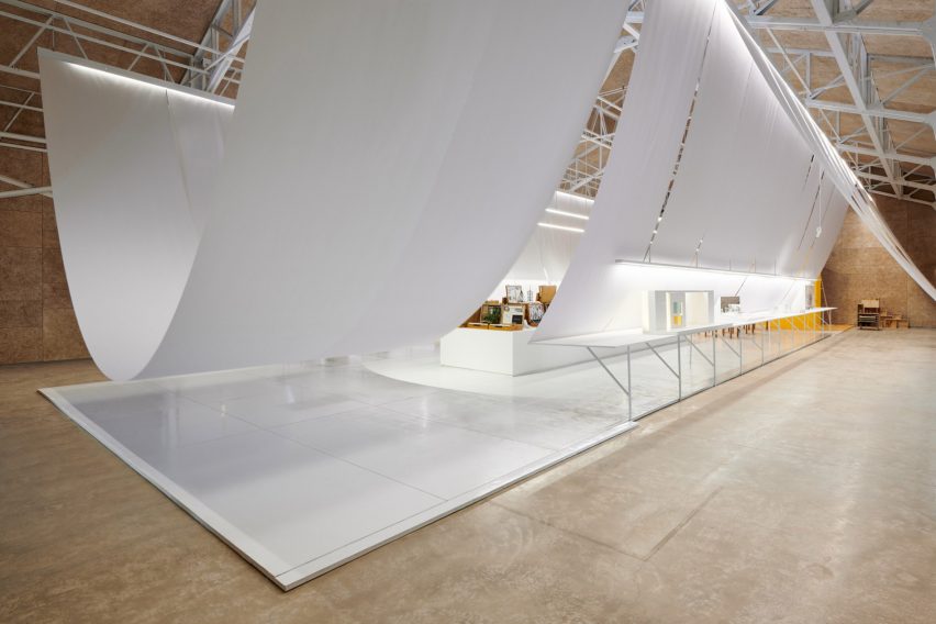
The architecture studio said it wanted the displayed objects to appear as if they are floating in the space.
"The concept of design is using paper elements as lightness to contrast with the architecture roof as heaviness, to build up the conversation of an old building and new temporary events," explained B+P Architects.
In a recent installation at the Center for Maine Contemporary Art (CMCA), local designers Wade Kavanaugh and Stephen B Nguyen laid out curvy and bent wooden strips to resemble a wave.
Long, timber strips are layered across the floor and up the ceiling to fill the open-plan gallery space, with crests curling over entrances to other parts of the contemporary art gallery.