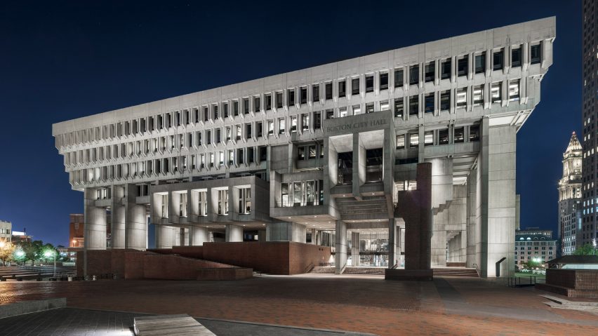
LED lights illuminate the gridded concrete structure of Boston's brutalist city hall, which has been renovated by local firm Utile.
The Boston architecture and planning studio Utile updated the civic building to coincide with its 50th anniversary this year.
Completed in 1968 by Kallmann, McKinnell, and Knowles, Boston City Hall is a leading example of brutalist architecture in America. Its intricate structure features concrete inside and out, complete with an atrium and elevated walkways and ticket portals overlooking the space below.
"City Hall is recognised as among the most important municipal buildings in the United States and is internationally known as an exemplar of brutalism," the Utile team said.
"The original design was intended to express a new and more transparent form of municipal government," the team added. "The concrete armature became simultaneously emblematic of the building's straightforward honesty as well as its civic monumentality."
Utile collaborated with the City of Boston's Public Facilities Department to create a team for the renovation project; the aim was to preserve many of its key existing features. Lam Partners served as lighting designer.
"The project's mandate was to create a more inviting and efficient public realm not so much by changing the existing building, but accentuating its significant features and adapting the structure to changing programmes," the team said.
Exterior LED lights by LumenPulse were added to draw attention to the structure's tripartite facade at night and feature a range of colours.
Preserved details inside meanwhile include the punctured grid concrete ceiling and large concrete pillars that scale the open-plan complex.
Original floor tiles and rough concrete interiors walls are also retained to reference the building's original construction, along with glass walls and other moments of brickwork.
Utile also consulted with American architect Michael McKinnell, one of the original architects, for the project. "[McKinnell] was clear that any new design proposals needed to be bold," Utile architect Michael LeBlanc told Dezeen.
Among the main changes is the reorganised lobby, designed as a large entry with "furniture-like interventions". Three curved rounded wooden volumes accommodate seating and security as well as the front desk and a coffee bar. It is placed in the middle of the lobby and helps guide foot traffic, making use of formerly underutilized space.
Before the overhaul, aspects like entering, existing and security occurred close to one another and caused the middle of the space to become crowded. "Changes in technology and security had rendered the once-open lobby cramped and unwelcoming," the design team said.
The main floor was also expanded to include a formerly underutilised room, resulting in new spaces for security and x-ray scanning.
A new coffee kiosk is located on the main level next to a brick staircase, and there is more space to sit down and to walk around. Stairs lead to ticketing stations.
New lighting was also added inside, along with new signage and branding at the permitting, licensing, and ticketing windows.
Kallmann, McKinnell, and Knowles designed the Boston City Hall government building in the 1960s as a symbol of openness and transparency. The renovation project follows much-divided opinion over the future of the building, with some Boston residents believing it to be worthless and wishing for it to be torn down. However, Boston mayor Marty Walsh has made revitalizing the building a priority, focusing on improving the building.
"It would be an understatement to say the design of Boston City Hall had been greatly underappreciated by Bostonians since it was first built," LeBlanc said. "Negative public sentiment had been shaped and reinforced by decades of local media coverage and nearly 50 years of non-strategic interventions."
"The scheme made it possible to begin recasting public perception through a series of more engaging design initiatives," LeBlanc added.
Echoing this sentiment, American architecture critic Aaron Betsky mused that the renovation work might instate a new appreciation of Boston City Hall building in an Opinion column for Dezeen earlier this year.
Brutalism is an architectural movement of the latter half of the 20th century, and its buildings often feature rigid forms and concrete. The style is common in post world war two architecture, particularly transportation buildings and civic complexes.
The UK has several notable brutalist buildings, including London's National Theatre and Welbeck carpark whose demolition caused an uproar in the architecture community. Recent preservation efforts include a cathedral in Bristol and a bus station in the north of the country.
Other brutalist buildings in the US are a Breuer tower in Connecticut owned by IKEA, Harvard University's Carpenter Center by Swiss-French architect Le Corbusier, San Diego's Geisel Library and Endo pharmaceutical lab on Long Island.
Photography is by Anton Grassl.
Project credits:
Architect: Utile Inc
Partner: City of Boston Public Facilities Department
Signage design: Roll Barresi
Interactive graphics: Small Design Firm
Lighting programming: Available Light Inc

