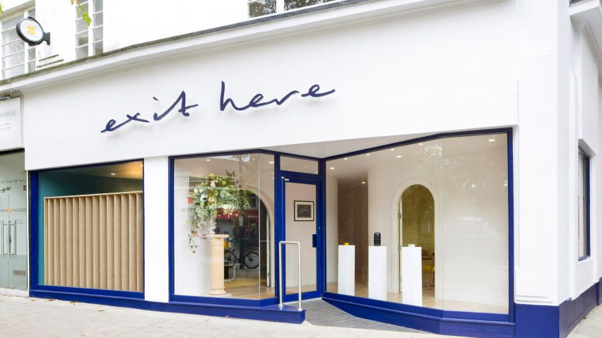
Exit Here funeral parlour is designed to have "the eclectic feel of home"
Hospitality entrepreneur Oliver Peyton has teamed up with Transit Studio to create a design-focused funeral parlour in west London, which aims to make clients more comfortable with the concept of death.
Situated in the neighbourhood of Chiswick, Exit Here overhauls the experience of planning a funeral by immersing clients in a setting that shuns the typically dark and dour aesthetic of parlours.
"The funeral business has remained largely unchanged since Victorian times," Oliver Peyton told Dezeen.
"After both my parents died, I realised that the sector offered limited choice or variety and this meant people didn't have the chance to celebrate their loved ones in a way that reflected their unique lives," he continued.
"Exit Here is an attempt to shake up the sector."
Peyton – who, up until now, has exclusively launched restaurants and bakeries – worked alongside funeral director Barry Pritchard and London-based Transit Studio to realise the project.
"Oliver [Peyton] was very keen to offer and enable a wide variety of choice so that people can really make their exit a personal reflection of themselves," said the studio's director, Ben Masterton-Smith.
"At the same time the brief was not to create a hipster funeral parlour – the retail environment needed to be warm and welcoming to all, but with a level of trust and dignity that you would expect from a company dealing with such an important event."
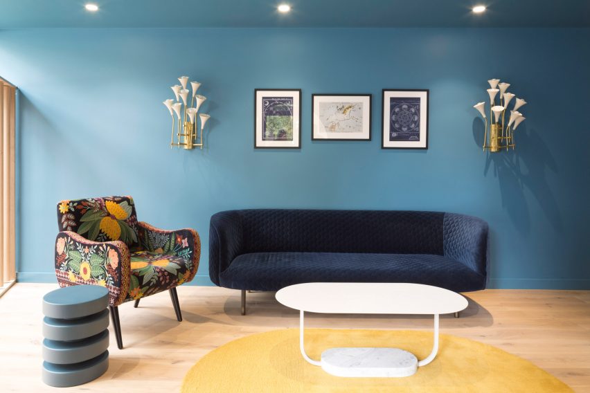
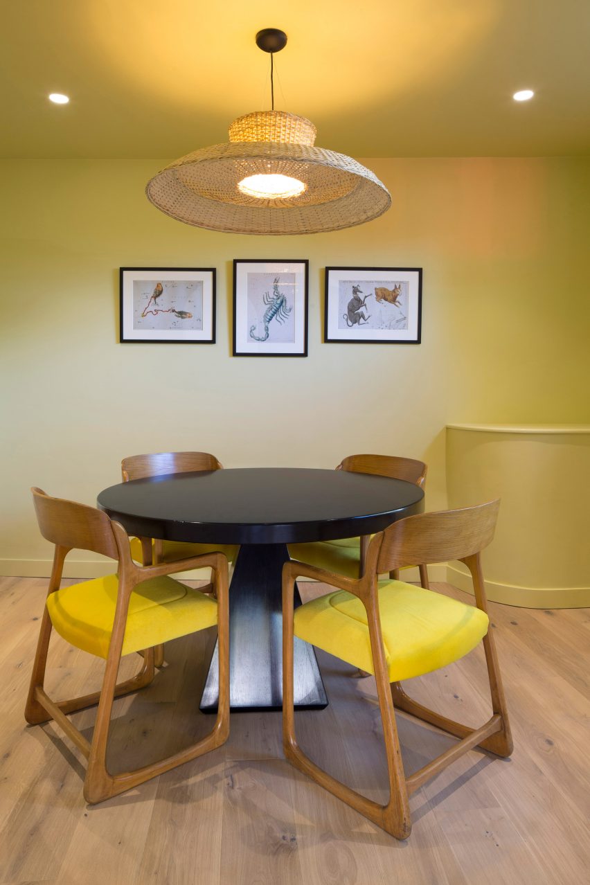
The interior of the parlour thus features two private meeting areas where visitors can gather for consultations, decked out in bright hues like teal-blue and marigold-yellow and finished with light wooden floorboards.
Floral-print armchairs and velvet-upholstered sofas dress the rooms, as well as vintage prints of star constellations – a subtle visual nod to "ethereal other worlds".
"The colours scheme and choice of furniture were about creating the eclectic feel of home, something that, like life, has come together over time," explained Masterton-Smith.
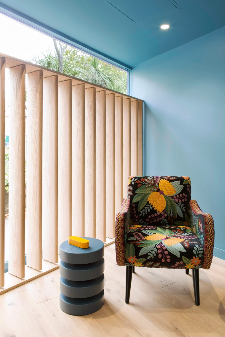
Slatted timber screens can be erected in the parlour's expansive front windows to provide additional privacy, or left down to encourage passers-by to glimpse in and engage with the topic of death.
"My personal bugbear about traditional funeral parlours are the rather dated beige paper and plastic beaded vertical blinds – we wanted the rooms to be open and transparent when they weren't in use," explained Masterton-Smith.
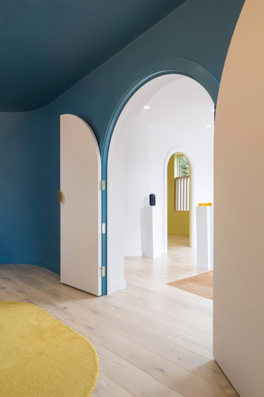
Huge vaulted doorways lead through to a sinuous central corridor that's been painted entirely white. Throughout are a series of plinths that display the parlour's selection of contemporary urns, each of which have a clean, cylindrical shape.
Caskets on offer are equally as simplistic but can be customised. One model is embellished with colourful skulls and flowers inspired by Day of the Dead – a celebratory Mexican holiday where family and friends gather to remember loved ones that have passed away.
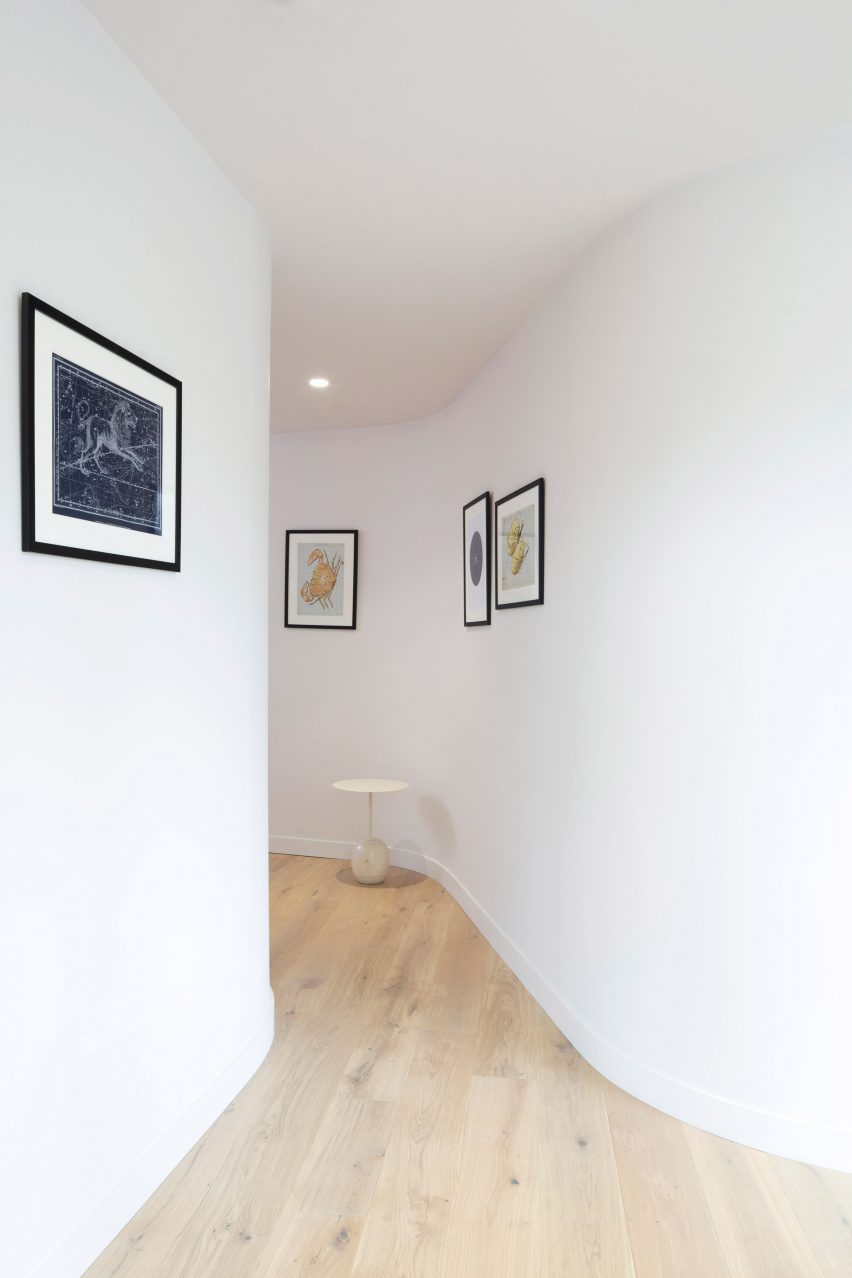
"With the softened language of some of these curves, as well as the caskets and urns that we designed, the arched doorways were a way of creating a more welcoming approach to somewhere that normally you wouldn't want to go into unless you had to," finished Masterton-Smith.
Window and door frames on the otherwise white facade have been painted a deep shade of blue to match Exit Here's sign, which is in a handwritten-style font.
This isn't the only project that's tried to update death and its surrounding rituals. Last year, Dutch designer Maria Tyakina created a contemporary iteration of the traditional cremation urn that would better suit the interior of a modern-day home.
Earlier this year euthanasia advocate Philip Nitschke also produced a 3D-printed suicide machine that would allow users to administer their own death at the push of a button.