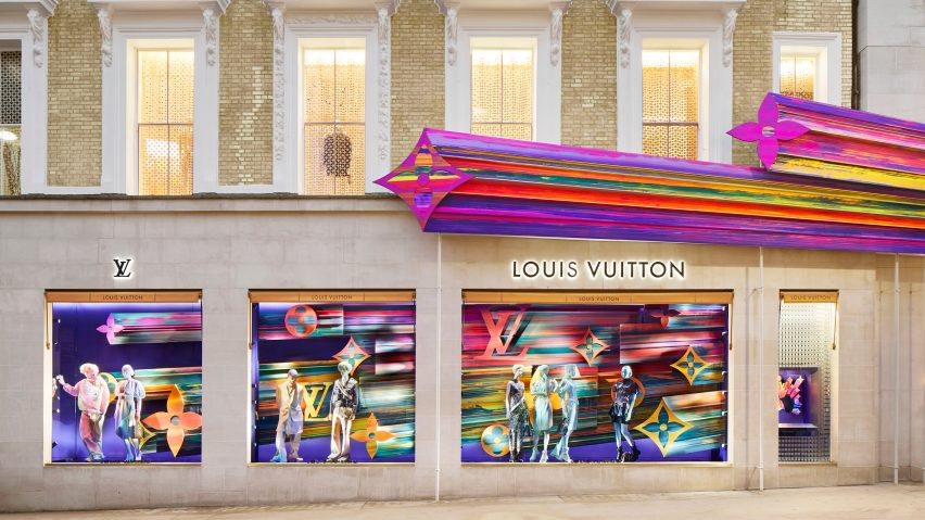
Peter Marino has used artwork by Tracy Emin and the Campana Brothers to animate the interior of Louis Vuitton's New Bond Street store, which has reopened after more than a year of renovation works.
Louis Vuitton dominates a corner-block of New Bond Street, a parade of luxury boutiques in west London's affluent Mayfair neighbourhood.
Over the course of 14 months, American architect Peter Marino has overhauled the fashion label's store to feature bright fixtures and furnishings that evoke "happiness with no feeling of intimidation".
"I have worked with Louis Vuitton since 1994, and we have moved away from all the brown wood we used at the beginning," said Marino.
"There has been a real evolution towards something lighter, clearer and dare I say, happier."
The interior of the store is now composed of several expansive, double-height rooms which are each clad in sand-coloured stone tiles.
Each one has been dressed with a selection of artworks, an attempt by Marino to bring the theatrics of the store's window displays inside.
"Volumetrically, we wanted to expand the existing space. We found that people react to impressive volumes by wanting to spend extended periods of time in these spaces," explained Marino.
"[The volumes] are so vast that they really allow for both the art and the fashion designer to be respected within the same space."
One wall on the ground floor – which is largely dedicated to womenswear – features a painting by American artist Sarah Crowner, which is covered in interlocking blue, orange and fuschia shapes.
It lies adjacent to a heart-shaped neon sculpture by Tracey Emin, which is inscribed with the words "love is what you want".
Perforated, cocoon-like pods designed by the Campana brothers descend from the ceiling.
Glass-topped tables that display smaller accessories like handbags perch upon vermilion-red, lemon-yellow and checkerboard-pattern rugs. Patterned silk scarves are hung against gridded brass frames.
A double-helix set of stairs crafted from oak wood connects customers to two of the store's four floors.
A totem pole by Matt Gagnon Studio that's composed of illuminated disks extends up through a central void, while a cartoonish orange spiral sculpture by New York-based artist Josh Sperling has been mounted on the stairwell wall.
"[The staircase] happens to be one of those 'happy accidents' of fate. I still draw by hand, I had the tracing paper and remember it shifting, which left me with two stairs," Marino added.
The stairs can be used to reach the basement, where a print from German photographer Andreas Gurksy is displayed, or take customers up to the first floor where one of James Turrell's Tall Glass pieces has been inset into a wall.
The LED-powered panels have been programmed by the American artist to subtly change hue over time.
At this level a secondary stairwell – which Scottish artist Jim Lambie has almost entirely covered in multi-coloured strips of tape – leads up to the second floor. It accommodates three personal-shopping suites.
A purple-hued starburst structure has finally been made to extend out over part of the store's front facade, which is dotted with the flowers and LV letters that make up the brand's signature logo.
Peter Marino is often the architect of choice for luxury brands looking to create striking retail space. Back in 2016 he designed a New York flagship store for Swiss watchmakers Hublot, which is externally clad in black aluminium fins and LED strip lights.
Four years ago, Marino also worked with Christian de Portzamparc to create a Dior boutique in Seoul. It features a gently undulating facade that's meant to mimic the fluid movement of garments created in the fashion label's atelier.
Photography is by Stephane Muratet.

