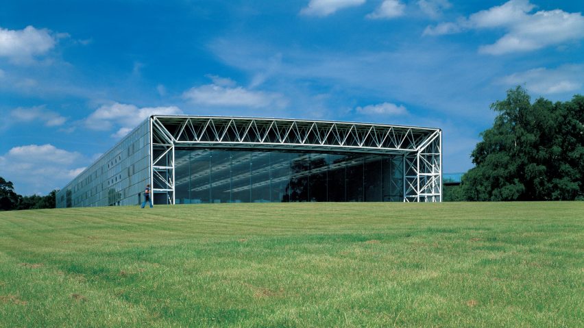
Continuing our high-tech architecture series, we look at how the Sainsbury Centre for the Visual Arts by Norman Foster marked the style's transition from industrial to cultural buildings.
Completed in 1978 the Sainsbury Centre for Visual Arts was the first cultural building designed by married couple Norman and Wendy Foster at their studio, which at the time was called Foster Associates and is now Foster + Partners.
Built to house the art collection of Robert and Lisa Sainsbury at the University of East Anglia in Norfolk, UK, the building is a 135-metre-long, simple lattice steel structure that is glazed at both ends.
It marks the first time that the expressed structure of the emerging high-tech style, which has now been applied to numerous museums and art galleries around the world, was used for a major cultural building in the UK.
Until this time the expressed structure of high-tech architecture was only deemed appropriate for industrial and office buildings, according to Norman Foster.
"The Sainsbury Centre was at that time the first public building for a fledgling practice," Norman Foster told Dezeen.
"Perhaps that expression of the structure, maybe it was considered appropriate for an industrial building, maybe it was considered appropriate for a commercial and office building," he continued.
"For the Sainsbury Centre, as a building for the arts to embrace an industrial typology, that was almost unthinkable, that was revolutionary."
The building was designed to display the Sainsburys' large collection of art, which they had gifted to the University of East Anglia, as well as to house facilities for the School of Fine Arts.
Although the building was originally conceived as being two or three structures, the Sainsburys, who largely financed the project, wanted the art to be accessible and fully integrated into the university, so the gallery space was combined with the school's teaching areas.
The Sainsburys were also determined to create a pleasurable, informal space for viewing art that was unlike traditional, formal art galleries.
All of the building's functions were contained within a single, elongated hangar-like structure that contains a series of free-flowing spaces.
The building's main entrance on the ground floor, and a secondary entrance reached from an elevated walkway leading to a spiral staircase at first-floor level, both lead to a common area.
Alongside this reception space was the large "living area" – an open-plan area for displaying the art collection, which was divided by moveable partitions.
The facilities for the School of Fine Arts were placed at the building's northern end. Two banks of faculty offices were aligned across the width of the building with glass fronts looking on to an open space between them, which contained the library and slide collection.
Each line of offices was topped with a mezzanine, one that was used as the senior common room and the other an open reading room. A restaurant, beyond the School of Fine Arts, is at the end of the building, with views out of the full-height glass window.
A partial basement, containing storage rooms and museum workshops, runs the length of the building and can be accessed from a long ramp for deliveries.
Foster Associates wanted the building to be a single, open shed-like structure, uncluttered by offices, stores and toilets.
To achieve this it envisioned a double skin supported by a lattice tubular-steel structure that was engineered by Antony Hunt, who was responsible for the structures of the majority of the early high-tech buildings.
Toilets, dark rooms, storage and all of the building's heating and ventilation systems were placed within the gap between the two skins. This meant that not only the internal spaces could be uncluttered, but also the internal and external surfaces of the walls could be free of adornment.
"The Sainsbury Centre has an expressed, very economical, lattice steel structure," explained Norman Foster.
"The lattice steel structure is the roof, and is coming down to the walls. It's creating spaces for the secondary activities, bathrooms, kitchens, mechanical plant, which is enabling that flexible space to be free of clutter."
The structure was made from prefabricated tubal-steel elements, with the 74 columns delivered to site fully assembled, meaning that the frame could be assembled in only three weeks.
Externally the entire walls and roof were clad in the same factory-produced panel system – something that had never been done before. The 1.8 metres by 1.2 metres panels, which were standardised and interchangeable, were installed on a grid of neoprene gaskets that also worked as gutters.
While the majority of the building was clad with silver-coloured superplastic aluminium, which was ribbed for stiffness, louvred panels were used for airflow and glazed panels were placed around the School of Fine Arts common area and at the top of the building. Each panel was held in place with only six screws so they could easily be replaced.
When it was complete the radical building received mixed reactions from the public and critics.
"The reaction to the design was wonderfully mixed," said Norman Foster. "I mean, it was either celebratory and generous, or it was so hostile it was cruel, it was vicious. It seemed to be a building that polarised attitudes and reactions."
Since the building was completed in 1978, Norman Foster has returned to it twice to add extensions. Between 1988 and 1991 Foster's studio added a large underground extension, named the Crescent Wing, while in 2006 the studio carried out an extensive refurbishment.
Led by architects Foster, Richard Rogers, Nicholas Grimshaw, Michael and Patty Hopkins and Renzo Piano, high-tech architecture was the last major style of the 20th century and one of its most influential.
Our high-tech series celebrates its architects and buildings ›
Photography is by Ken Kirkwood, unless stated. Illustration is by Jack Bedford.

