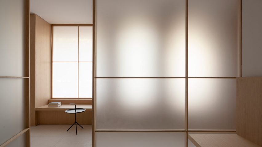
Ash-wood surfaces, translucent glass screens and brass feature inside this serene clinic in Valencia, which Francesc Rifé Studio has designed in reference to Asian meditation rooms.
The facial and dental clinic, named Swiss Concept, has been designed by Barcelona-based Francesc Rifé Studio to feature colours and materials that are typically applied throughout meditation spaces in Asian countries like Japan.
"Mainly inspired by eastern aesthetics and meditation, this clinic was conceived following notions of lightness and calm – a deep approach which has been achieved through very simple means," said Francesc Rifé, the studio's eponymous founder.
"This project demonstrates our ongoing focus on achieving the most with the least."
Clients arriving at the clinic are greeted at a softly lit, ash-panelled reception desk that's backed by a wall painted sage green.
Adjacently runs a white walkway lined with panels of backlit frosted glass. The glowing glass-panels conceal the treatment rooms that sit at the core of the clinic, blurring the figures of doctors and patients behind.
Each treatment area has two doors – one at the front of the room and another at the rear. This design facilitates a circular route around the clinic's floor plan, creating a continuous flow of doctors and patients.
The waiting area has been integrated into the clinic's rear corridor, where a series of timber-framed windows are covered with translucent screens to soften daylight streaming through from the outdoors.
Deep window sills double up as bench seats, which face onto the treatment rooms.
A laboratory, sterilisation room, bathrooms and consultation area are set around the perimeter of the clinic, distinguished from the rest of the space by their all-white fit-out.
Strips of sulphurised brass have been used to line the edges of bookshelves and to craft slim door-handles, designed by the studio specifically for this project. Minimalist lanterns also emit a warm glow throughout the rooms.
Francesc Rifé Studio isn't the only practice to create a pared-back health space – By Seog Be Seog stripped all superfluous decoration from a clinic in Seoul to form an open, inviting space where patients felt relaxed enough to discuss their health problems.
Urban Agency also used calming, curved walls of bleached wood in a Dublin dental practice to make visits less daunting.
Photography is by David Zarzoso.

