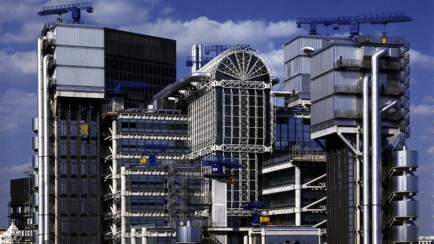
Continuing our high-tech architecture series, we take a look at the inside-out Lloyd's building in London, Richard Rogers' second major building following Centre Pompidou.
One of the 1980s most recognisable pieces of architecture, the Lloyd's building demonstrates many of the key traits of the high-tech architecture style that emerged in the UK in the late 1960s.
The building, which was built as the headquarters of Lloyd's of London – one of the world's largest insurance firms – is distinguished by its radical inside-out aesthetic that sees all its building services banished to its exterior in order to create uninterrupted spaces inside.
This is similar to the Centre Pompidou, which Rogers completed with Renzo Piano in the late 1970s, and has equally uncluttered and highly flexible internal spaces.
Located at 1 Lime Street in London's financial district, the Lloyd's building was completed in 1986 by Richard Rogers and Partners, now Rogers Stirk Harbour + Partners, in collaboration with engineers Ove Arup & Partners.
The radical design for the building was the winning entry of an international competition, held by Lloyd's of London in 1978, for a new headquarters to accommodate its recent and future growth.
It replaced Lloyd's of London's first headquarters, built in 1928, for which Rogers' preserved the entrance as part of the new building structure.
Richard Rogers and Partners' proposal was chosen over entries by the likes of IM Pei and fellow high-tech architect Norman Foster for its ambition to create an uninterrupted trading space that could expand or contract according to the needs of the market.
"[We] kept the floors clear because Lloyd's said they wanted two things," Rogers told Dezeen in an exclusive interview in 2013.
"They wanted a building that would last into the next century – we met that one – and they wanted a building that could meet their changing needs."
The studio designed a rectangular office block that rises at its highest point to 14 storeys wrapped around a 60-metre-high atrium called The Underwriting Room, otherwise known as The Room.
Externally, this regular, rectangular block is attached to six service towers that the fill the margins of the plot and host all of the building's services. These components are referred to by the studio as "Served and Servant" spaces.
Three of the building's service towers are dedicated to fire fighting and escape, while the remaining three contain the building's circulation, toilets and mechanical services. Each one is topped with blue-painted service cranes for maintenance, while four also have plant rooms expressed as giant steel boxes.
At the centre of the building The Room is a vast space toped with a large barrel-vaulted glass roof that brings natural light into the building.
The spaces surrounding the atrium are fitted with modular, open-plan offices, which can be quickly and easily reconfigured by the addition or removal of partitions and walls.
"The building has proved to be very flexible and is still a highly desirable office that has attained some of the best rents in the city and proved to be a fantastic commercial success," Rogers said of the building. "And we know that it will remain so."
The first four galleries of the Lloyd's building open out onto the atrium, and are connected by escalators through the middle of the structure. Below, there is a restaurant and coffee shop, a wine bar, library, meeting rooms and reception that is partially open to the public. Together this is designed to create a dynamic heart to the building.
The floors above are more private, encased by glass and accessible from 12 external lifts. These are all made from glass, and were the first of their kind in the UK.
On the 11th floor of the Lloyd's building is the Committee Room, an 18th century dining-room designed by Scottish neoclassical architect Robert Adam, which was transferred piece-by-piece from the previous Lloyd's building.
The Lloyd's building was originally designed in steel, however to meet fire safety standards it was built with a concrete frame. Steel is used as the prominent cladding material for the building instead, particularly in service towers.
Inside, structural grand concrete columns are visible in The Room and stand in contrast to the light-weight appearance of the building's steel and glass facade.
In 2011, Lloyd's building was granted Grade I listed status by English Heritage. At the time it was the youngest structure to be Grade I listed.
At the time the British charity said it was "universally recognised as one of the key buildings of the modern epoch".
In an interview with Dezeen in 2013, Rogers stated that the success of the project was largely down to Lloyd's of London, and that he was lucky to have been commissioned by such a "forward-thinking" client.
"We were again extremely fortunate, in the same way as we were with the Pompidou," Rogers said.
"The real critical thing in architecture is having a good client. A good client is not somebody who just says 'yes', it's a client that is engaged in the evolution of the building, who responds."
Led by architects Foster, Rogers, Nicholas Grimshaw, Michael and Patty Hopkins and Renzo Piano, high-tech architecture was the last major style of the 20th century and one of its most influential. Taking advantage of advances in structural engineering, high-tech architects emphasised structural elements as well as services and features such as lifts and stairs that are usually hidden within buildings.
Our high-tech series celebrates its architects and buildings ›
Illustration is by Jack Bedford and main image is by Richard Bryant, courtesy of arcaidimages.com

