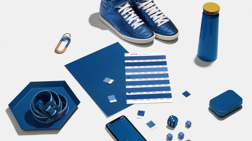
This week on Dezeen, Pantone announced Classic Blue as the colour of the coming year, while we looked back at 2019 with the launch of our year in review series.
A dark shade of blue, reminiscent of the evening sky, was chosen by the American colour company to best encapsulate 2020 – a calm and collected antidote to its predecessor, last year's energetic Living Coral.
The "solid and dependable" hue is already proving popular in interiors, where it is gracing everything from kitchen cabinets to shutters and a stairwell cum bookshelf.
Elsewhere on the site, we've started rounding up the best projects of the past 12 months, with Dezeen's editor Tom Ravenscroft picking his 10 favourite churches and chapels across nine different countries from Lebanon to South Korea.
We also reported on the biggest trends across design and technology, including the rise and rise of folding phones and designers' preoccupation with the right to privacy both on- and offline.
Dezeen's Semi Han meanwhile looked at the museums and galleries that opened their doors this year, designed by practices from BIG to David Chipperfield Architects.
In the design world, a number of studios turned their hand to gravity-defying clocks. Nendo released one that consists of a single aluminium cube, balanced on one of its corners with the hands formed by two shards that were cut from the original form.
Watch company Lorenz re-released the Static clock, which was famously created by German designer Richard Sapper from former military torpedoes. Its cylindrical shell is tilted precariously backwards and can right itself when tipped over.
As expected, Elon Musk's Cybertruck remains controversial, with the co-curator of the V&A's Cars exhibition calling it "a mutant vision of 1930s streamlining" in an opinion piece.
Meanwhile in architecture, Denmark's Louisiana Museum is giving visitors a behind the scenes look at the projects and processes of Tatiana Bilbao, with the help of original models, hand-drawn sketches and collages.
In an exclusive interview with Dezeen, the Mexican architect explained that she prefers these more associative visualisations to working with renders, which she calls "dangerous and damaging to the creative process".
Over in the Americas, wellness was on the agenda as Verona Carpenter Architects transformed a Brooklyn soda factory from the 1930s into a public bathhouse, complete with underground saunas, thermal pools and a sensory deprivation tank.
Meanwhile a Mexico beach house, designed by local studio Colectivo Lateral de Arquitectura, contains an indoor-outdoor mediation room that is exposed to the elements through a large, circular opening in the roof, with views of the L-shaped swimming pool and the ocean beyond.
Among the other most-read stories this week was Kengo Kuma's first footwear design for Asics, BIG's venture into smart door locks and a London house extension with a timber partition that doubles as a storage room and window seat.

