We continue or high-tech architecture series by looking at Foster Associates' Willis Faber & Dumas building, a revolutionary office block in Ipswich, which was completed in 1975.
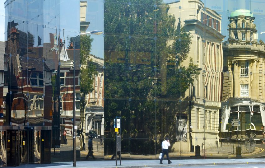
Built as the headquarters of insurance company Willis Faber & Dumas, the three-storey block occupies its entire site and is wrapped in a glass curtain wall that reflects the surrounding buildings.
As with other early high-tech buildings, such as the Centre Pompidou in Paris, the Willis Faber & Dumas building was designed to contain open and flexible internal spaces.
At this building, these spaces were used as open-plan offices, something that was rare at the time, according to Norman Foster.
"The traditional office was separation between those who managed and those who did the work," he told Dezeen.
"In an office, the head was isolated in his own room, with a space before it where you would go through a secretary before you could get into the inner sanctum."
The office was the first major commission won by Norman and Wendy Foster after they established Foster Associates following Team 4's breakup in 1967. Michael Hopkins, who would later go on to set up a practice with his wife Patty Hopkins, was project architect on the building.
Willis Faber & Dumas wanted "an office environment sympathetic to human values" in a building that was "neither over-ambitious nor pedestrian", according to the insurance broker's client statement.
The building stands at the edge of Ipswich. It was built on an irregularly shaped site determined by the medieval street layout of the historic town.
Its structure was designed by Anthony Hunt, the engineer of many high-tech buildings including Team 4's Reliance Controls factory, the Hopkins House, Foster Associates' Sainsbury Centre and the Grimshaw's Eden Project.
Although the building fills the irregular site, it was built with a regular grid of reinforced concrete columns, which are set 14 metres apart, giving the building flexible and open interior spaces.
Like with many high-tech buildings, the latest technology was used for the facade. The office block is wrapped in a curving, bronzed-glass curtain wall, which is hung from the building's frame and reflects the surrounding historic buildings. It was developed with the glazing manufacturer Pilkington.
Two-metre-square panels are connected with fittings in the corners and silicone jointed to create a glass wall that wraps around the entire building.
The offices for 1,350 of the insurance broker's employees are arranged around an atrium that has three pairs of escalators to bring people from the ground floor up to a restaurant in a pavilion on the third floor.
This was reportedly the first use of escalators in an office building.
According to the studio, the building was "conceived in a spirit of democratising the workplace and encouraging a greater sense of community".
Along with open office spaces, the building had a rooftop restaurant, a garden and a ground-floor swimming pool. This pool was covered over, but not filled in, to provide more floor space for the office in 1994.
The office was also built with raised floors, which meant that it could be easily fit with new technologies as they developed.
Although senior management at Willis Faber & Dumas were initially resistant to the idea of open-plan offices for all, when they moved into the building they changed their minds, according to Foster.
"I remember the opening day in Willis Faber. And I can even remember the guy who was running it, Ronnie Taylor – this is going back to the 1970s – he insisted on having his own enclosed office. On the first day, he instructed for it to be taken down," he said.
"The interesting thing is that when those boundaries were taken down, nobody wanted to put them up again."
The building was Grade I-listed in 1991. It was the forerunner of many offices designed by Foster's studio, including the Bloomberg building, which won the Stirling Prize in 2018.
"At that time is was really revolutionary," said Foster. "Willis Faber, which is the forerunner of Bloomberg, is a deep-plan building about lifestyle. A swimming pool, a roof garden, the integration of art. It is still quite revolutionary. Even now it's a talking point."
Led by architects Foster, Richard Rogers, Nicholas Grimshaw, Michael and Patty Hopkins and Renzo Piano, high-tech architecture was the last major style of the 20th century and one of its most influential.
High-tech is an architectural style that emerged in the UK in the late 1960s, which saw the expression of structural elements and building services often visible.
Our high-tech series celebrates its architects and buildings ›
Illustration is by Jack Bedford. Photography is by Nigel Young, unless stated.

