"How to not solve a non-existent problem"
In this week's comment update, readers share their thoughts on the feasibility of suspended shelving in a university library and question the aesthetics of an at-home insemination kit.
Novel idea: suspended shelving in this renovated library at Cornell University has Dezeen readers worrying about logistics and making comparisons to well-known retailers.
"I can't imagine how this could be anything but an acoustic nightmare," said Aaron, giving thought to the library's intended use. "A giant hard-surfaced void where every footfall strikes metal grating. Doesn't seem conducive to the quiet focus most strive for in a reading room."
Nivora had the same concern: "It's unfortunate they don't write anything about the acoustics, it's a vital aspect of the function and this building seems hard to create a good comfort for that."
"Imagine having to clean that floor underneath," pondered Sim. "Maybe they'll employ those robot hoovers for the floor."
The design reminded Ty-Phoo-Suk of a children's film: "They made the Monsters Inc-door storage scene into a library, even the curvy transport rail made it in."
Thisismattia's comparison, on the other hand, was less magical: "All the warmth of studying in an Amazon warehouse can be yours too at Cornell!"
"Looks like an IKEA warehouse," agreed John.
This reader felt the library's renovation missed its mark:
What does Wolfgang Tschapeller's renovation remind you of? Join the discussion ›

Baby making: an artificial insemination tool that doubles as a sex toy has commenters questioning whether such a design was necessary and pondering its materiality.
"Is it made of plasteline?" asked Donacio Cejas Acosta. While another commenter felt the product was more suited to the kitchen than bedroom: "It looks a lot like a roll of raw ham," fabian-k.-z. said.
"Why? Is there a shortage of children on the planet?" asked Pierre with a hint of sarcasm.
Other commenters were more complimentary.
"Thoughtful!" said LoveYourHairHopeYouWin, with trewus describing the tool as "stunning and brave!"
"You may think that pleasure can improve the success of insemination," said ARCHIPLAIN thoughtfully, adding: "Even if I do not know precise statistics or scientific studies on the subject."
This commenter felt the design tackled the wrong aspect of procreation:
What do you think of the design? Join the discussion ›

Beachside the point: BIG and landscape architecture firm James Corner Field Operations have revealed plans for a mixed-use development on the waterfront in Williamsburg, Brooklyn. Commenters are far from won over by the beach included in the proposal that the firms say could bolster the resiliency of the shoreline.
"Ocean rise equals future fish habitat," said Benny. "Nice to have an aquarium downstairs in one's own building."
Patrick Sardo expressed similar concerns: "This'll look really good underwater after another hurricane hits the city."
Other readers felt the additional housing, and therefore people, in the area will be unsustainable.
"Who's going to occupy these apartments, and how will the L train, already way overcrowded, handle these new residents?" asked Janice Kirkwood, adding: "Williamsburg on the weekend is already a traffic jam of Ubers."
"Will be interesting to see how these folks will fit onto the already packed L train," said Alon, in a similar vein.
Stuy guy offered some words of reassurance to those with transport concerns: "It's right by a ferry dock, Citi Bikes, and not too far from Marcy J train, so that should help."
"Sure sign your development is out of scale with the context when it can't even avoid casting a shadow on itself," commented HeywoodFloyd.
One reader felt the renderings looked familiar:
Will the development cause more problems than it solves? Join the discussion ›

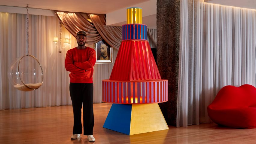
Deck the halls: commenters are lamenting Yinka Ilori's stylised Christmas tree designed for London's Sanderson hotel.
"Nothing says 'Christmas!' more strongly than the space capsule that sent John Glenn into orbit," chris_becket commented sarcastically.
LoveYourHairHopeYouWin felt similarly: "If he didn't say it's a Christmas tree, would you still call it a Christmas tree?"
"Nonsense," MarkR declared, adding: "Might as well call every triangular object a Christmas tree, and never have a dedicated proper Christmas tree ever again."
"This is not a Christmas tree," proclaimed Kadmos. "It is a pile of discarded samples of cloth material."
But the tree is not without fans.
"Playful, imaginative and avoids all that fey tat that has become associated with Christmas," described orangikaupapa in defence. "I like this man's work."
Geofbob also enjoyed the tree's deviation from the norm: "Eye-catching, playful change from the conventionally decorated fir tree - and no needles to hoover up daily!"
This reader couldn't decide what the tree looked like:
Is Yinka Ilori's tree a decoration too far? Join the discussion ›