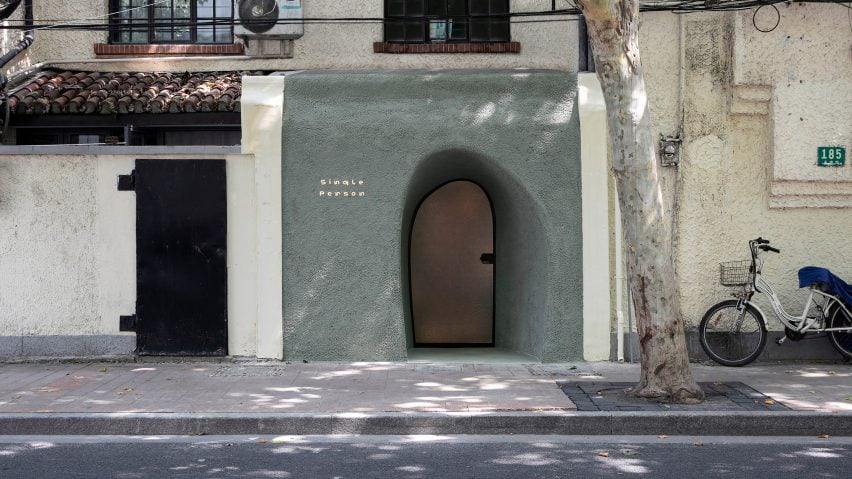
Architecture studio Offhand Practice created textured walls and faux skylights within this Shanghai design gallery to evoke the feeling of being inside a cave.
Situated along a main road in Shanghai's Xuhui district, the Single Person gallery is made up of a sequence of cave-like rooms.
When Offhand Practice first visited the site in November 2018, it was presented with a long and narrow interior that was divided into four rooms, each set at a different level. Formerly used as a diner, the only sources of natural light were from an entrance at the front and a courtyard space at the rear.
The studio was tasked with transforming the 60-square-metre space into a gallery to showcase vintage design objects.
"The word cave broke into our mind when we first sought to define the space as a whole," said the studio.
"And because the space shares similar physicality with a cave, while we were verifying this concept, we realised that cave is not an imposed concept but manifested by the nature of the site itself," it continued.
"Once the overall concept of the cave was established, other elements for this space that share the same design language naturally fell into place."
From the street, a deep-set archway that appears as if it were carved into the building's facade leads visitors into the space.
"It's very close to the cave entrance we have imagined," explained the studio, "the texture of the facade looks similar to stucco but is actually a result of pebble wash."
Inside, as visitors progress through the exhibition spaces, they step down into a central gallery before stepping up again to access spaces at the rear of the building.
The architects said that these levels help to reinforce the idea of descending into and emerging from a cave.
To emphasise the different levels, the surfaces of each space have been completed in subtly alternating earthy hues and textures.
The entrance area and side gallery are finished in white enamel, while the corridor is painted in an ochre shade. The room at the back of the gallery has then been painted an even darker sienna colour.
To combat the lack of natural light, the architects created a clear sightline from the front of the gallery to the back. The room that sits to the side of the entrance benefits from an irregularly shaped opening that allows daylight to filter through.
A line of skylights was punctuated at the back of the gallery to simulate the way light penetrates through thick cave walls, while a row of uneven, artificially lit niches in the wall of the central gallery provide a warm glow that recalls candlelight.
Curved plinths, shelves and platforms have additionally been built into the walls of the exhibition spaces to present design pieces.
Adding to the cave theme, pebble-shaped ceramic door handles that the studio sourced from an antique flea market in Berlin have been used throughout the space.
Other recent cave-like interiors include design brand Moustache's Paris store, which En Bande Organisée and Julien Dufresne finished with pale, polished-concrete walls and curved alcoves that double-up as display niches.

