Dezeen's top 10 interiors trends of 2019
As part of Dezeen's yearly review, reporter Natasha Levy has picked out the biggest interior design trends of 2019, including colour-block cabinetry, cave-style spaces and multi-use showrooms.
Illusory interiors
This year saw a number of designers employ visual trickery and trompe l'oeil in their projects.
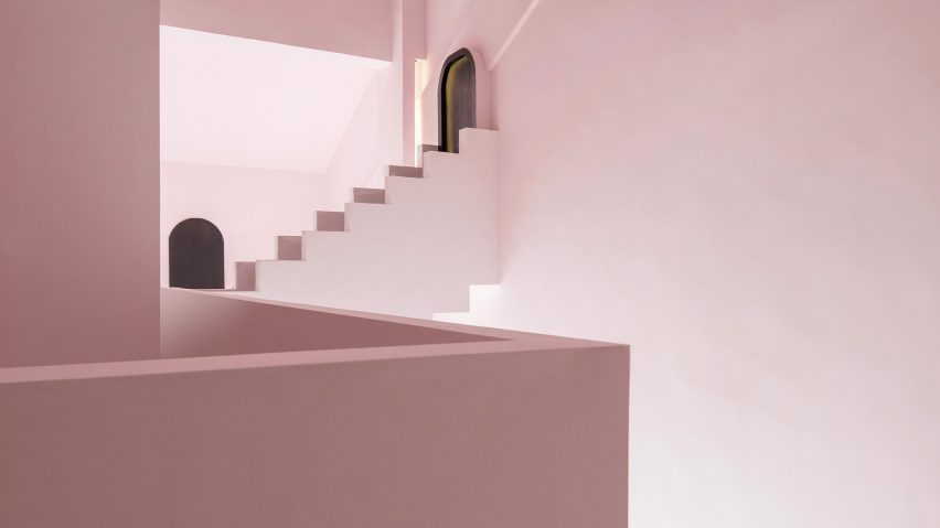
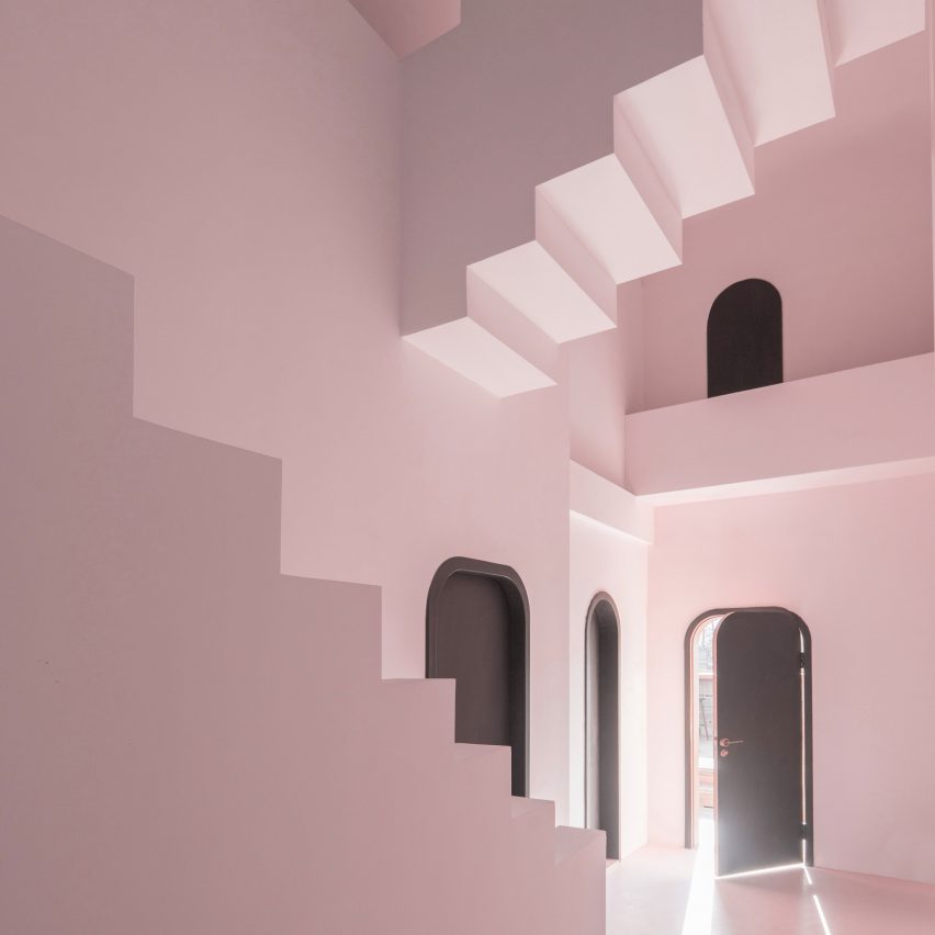
Studio 10 looked to puzzling illustrations by Dutch artist MC Escher to create a guesthouse in Guilin, China, which was highly commended in this year's Dezeen Awards. Inside, it features candy-coloured surfaces, a series of anti-gravitational staircases and a labyrinth of arched doorways.
Elsewhere in China, X+Living added mirrored ceilings to a Chongqing bookstore to create a maze of stairs and seemingly endless rows of novel-lined shelves.
Architecture studio Renesa chose to incorporate huge vaulted openings and relief walls in an Indian games cafe to "transport visitors to an uncertain realm".
English charm
A growing number of designers in 2019 have leaned towards a quintessentially English aesthetic, creating interiors with an extra dash of chintz.
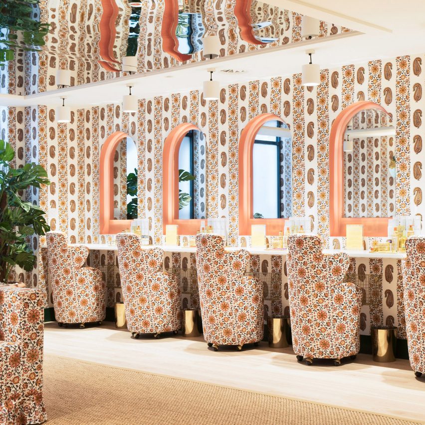
The most notable example was the inaugural London branch of women-focused co-working space The Wing, which opened in October. Almost every surface in its beauty room was upholstered in paisley-print fabric from British brand Soane, while its tea room was made to resemble an English country garden with trellis-like walls and wire-frame furniture.
Skincare brand Glossier then covered its London pop-up in floral wallpaper, in a nod to the ornate prints of textile designer William Morris. Designer Ben Thompson mixed Georgian grandeur with modern farmhouse-chic for the interior of Heckfield Place, a Hampshire hotel set at the heart of a 430-acre estate.
Colour-block cabinetry
Brightly hued cabinetry fast became designers' go-to technique for making a visual statement inside homes this year.
Colombo and Serboli Architecture brightened the blackened interior of a fire-damaged apartment in Barcelona by applying terracotta-orange paint across its kitchen cupboards, as well as the ceiling and floor.
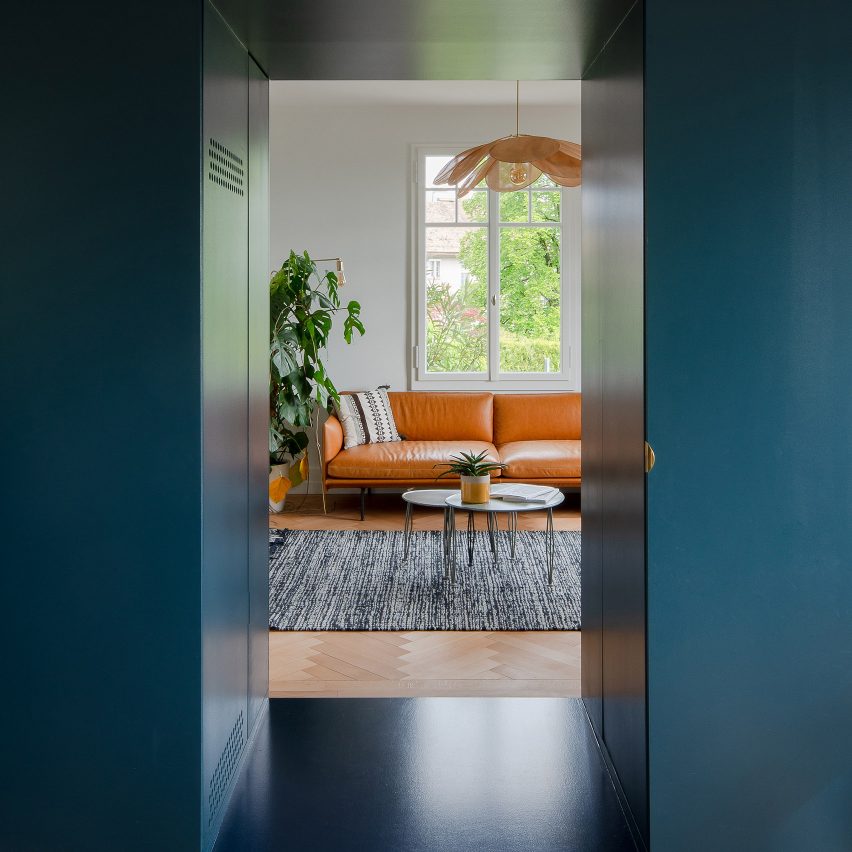
Bureau Brisson Architectes arranged the living spaces of a Swiss home around a deep-blue cabinet, subtly referencing the waters of Lake Geneva. Meanwhile, Lookofsky Architecture turned its back on the typical Scandinavian colour palette by inserting a sunshine-yellow storage wall to a Stockholm apartment.
However, not all designers went bold – Applied Studio added jet-black joinery to a house extension in east London's Hackney neighbourhood.
Mono-material
While some designers championed maximalism, others decided that just one material was enough to make an impactful interior.
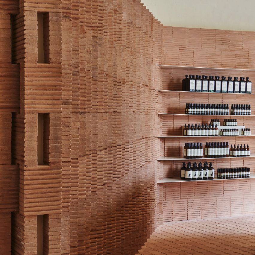
Mexican architect Frida Escobedo – who Dezeen spotlighted this year in a series of short films – used slim rammed-earth bricks to clad almost every surface of an Aesop store in New York, echoing the brownstone townhouses that line the city's streets.
Master Studio brought a sense of "stillness" to a bustling Cape Town coffee bar by blanketing it in sisal, while architecture studio Nudes strived to show the versatility of humble cardboard by using it to make the walls, furnishings and light fixtures of a Mumbai cafe.
The trend even touched residential projects –September of this year saw Coffey Architects cover a London apartment with 30,000 wooden blocks.
Multifunctional showrooms
Showrooms became more than just a place to show-off products in 2019.
British designer Tom Dixon threw open the doors to The Manzoni, a showroom-cum-restaurant in Milan where "everything is for sale". After polishing off a plate of food, diners could opt to purchase any of the furnishings, light fixtures or crockery that appears throughout the space.
Muuto also created a showroom within its newly expanded Copenhagen offices, allowing staff members to spill out and work amongst display areas.
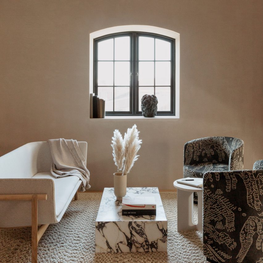
Elsewhere in the Danish capital, Norm Architects completed The Audo – a boutique hotel where guest suites double-up as show spaces for items by design brand Menu.
Digitised screens
Several designers set spaces into motion this year by trading standard walls for screens.
Carbondale incorporated giant monitors into the walls of Rome's Dolce & Gabanna boutique, forming a digitalised fresco that depicts cherubs and angry Greek gods.
Architecture studio Leong Leong also fronted display units inside a New York denim store with LED panels, which can be programmed to show footage suited to different clothing collections.
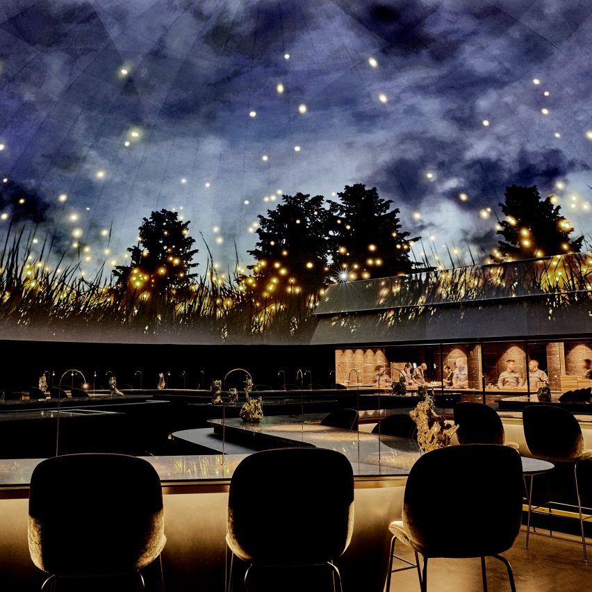
The most theatrical example can be seen inside Alchemist, an experimental Copenhagen eatery which was overhauled by Studio Duncalf. One of its dining rooms is topped by an 18-metre-wide dome, onto which moving images of a starry night sky or ghostly jellyfish floating through ocean waters could be projected.
Fashion designers doing interiors
Interiors became en-vogue for a number of fashion designers this year.
It kicked off with Hedi Slimane – creative director of Celine – revamping the brand's global roster of stores. Branches in New York, Paris, Tokyo and LA were redesigned to have "expansive, sculptural interiors" featuring natural stone surfaces and shiny fixtures.
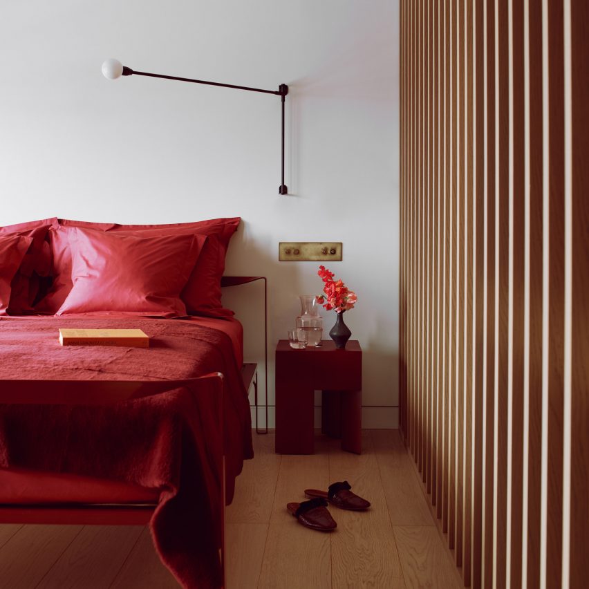
Roksanda Ilincic then overhauled an apartment in Kings Cross' Gasholders, using a colour palette similar to that of her ready-to-wear collections.
The eponymous founder of cult fashion label Jacquemus also developed the interior of Paris eatery Oursin.
Intended to capture the summery essence of a "house shimmering along the Mediterranean coast", the space was finished with whitewashed walls, rattan furniture and an array of colourful ceramics.
Cave-like interiors
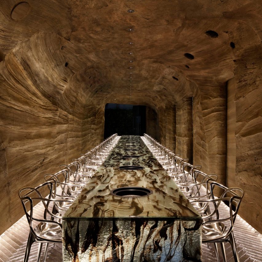
Designers seemed to go underground for inspiration this year, as an increasing amount of cave-like interiors sprung up.
Koichi Takada Architects staggered pieces of wood to create stalagmite-like display columns within the cavernous interior of a museum gift shop in Qatar, while En Bande Organisée and Julien Dufresne Architecte together used pale, polished concrete to make a Parisian design store look as if it had been carved out of stone.
Ryoji Iedokoro transformed Tokyo eatery Nikunotoriko into an indoor cave by introducing low lighting and craggy, rock-like walls – translucent tiles were even arranged across the floor to mimic pools of water.
Some studios took a less literal approach: Michan Architecture suspended two huge concrete lights over diners inside Mexico City's Oku restaurant to create a lowered, cave-style ceiling.
Instagram was the topic of two of Dezeen's most popular interior stories this year – but for very different reasons.
Design studio Formroom fashioned an Instagrammable store for ice-cream makers Milk Train, catering to the company's dedicated online following. Neon signage, a cloud-like ceiling and floors printed with quirky slogans helped make the space perfectly snappable.
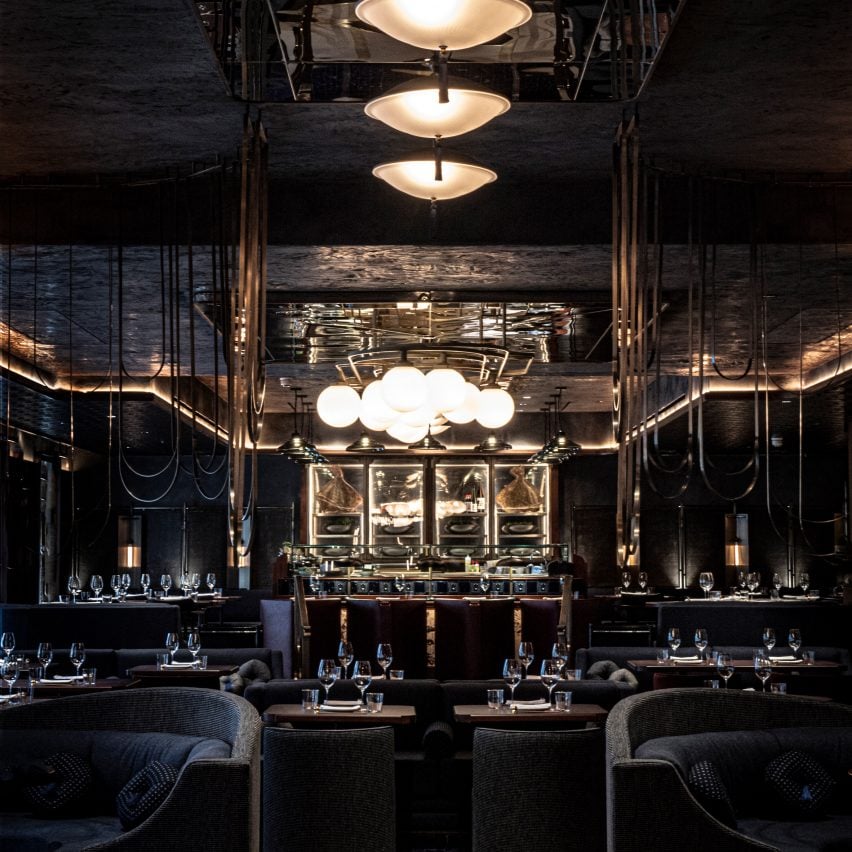
In contrast, Afroditi Krassa "deliberately went dark" for the interiors of high-end restaurant Lucky Cat to deter diners from sharing photos of the venue on the app.
"How many times do you visit a place because it looks great in a picture but disappoints in real life?" the designer questioned.
The new year will certainly see designers continue to debate how important it is for projects to be popular on social media.
Excessive opulence
Although the ever-popular minimalism trend may have proved that less is more, several designers went for all-out excess in 2019.
Decadence was epitomised in the $100,000-per night hotel suite that artist Damien Hirst created inside Las Vegas' Palms Casino Resort. Features include furniture upholstered in butterfly-print fabric, crystal-filled cabinets and a tank containing two sharks suspended in formaldehyde.
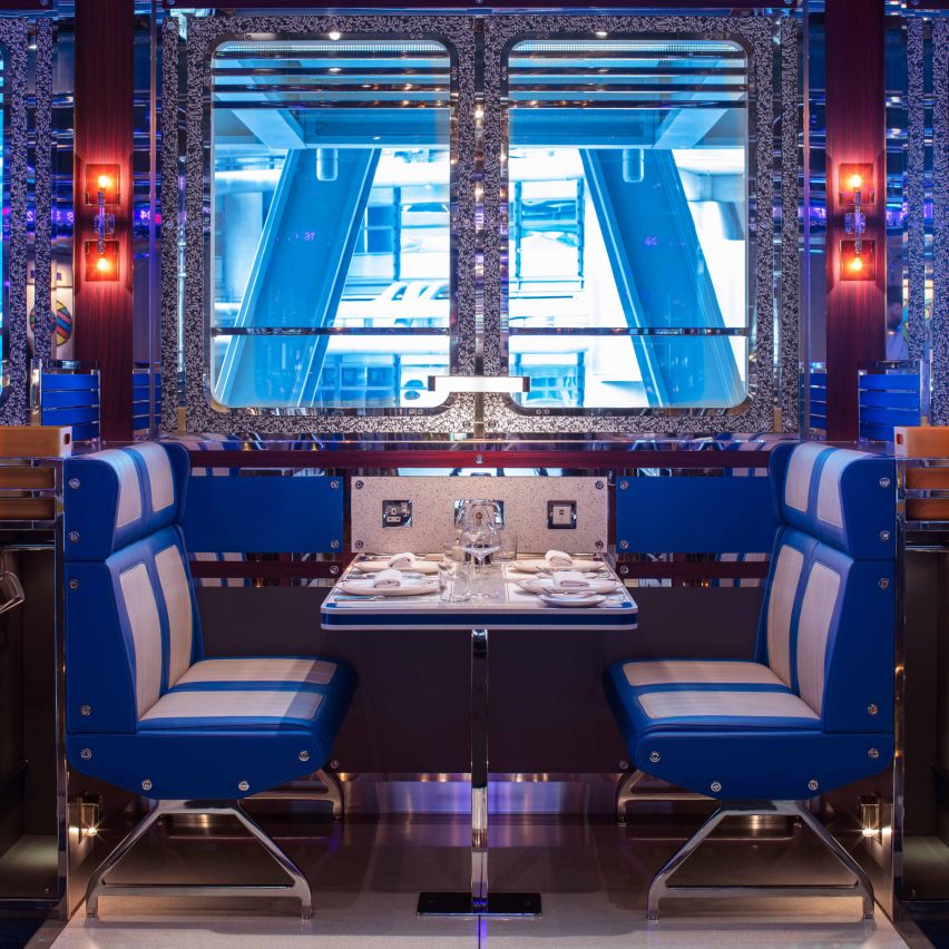
Design studio BradyWilliams used eight miles of mirror-polished steel to form the shiny, "ultra-camp" interior of London restaurant Bob Bob Cite, which even includes "press for champagne" buttons at each table.
Sydney restaurant The Imperial offered a faded take on opulence – designed by Alexander & Co to resemble a "lost palace", the venue boasts bare-brick walls, fringed furnishings and glass chandeliers.