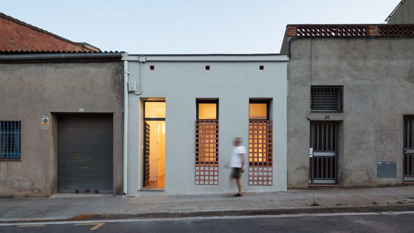
Hiha Studio breaks up linear apartment with curved corridor
A curved corridor with full-height doors slices through Hiha Studio's renovation of this ground floor home near Barcelona.
Local architects Hiha Studio renovated the space, which previously had no outdoor space and suffered from a lack of light and ventilation, for the house's owners.
Built in 1925 and refurbished into a two-bedroom home in the 1960s, the long and narrow 80-square-metre dwelling is sandwiched between two other buildings on a residential street in the municipality of Montcada i Reixac, just to the north of Barcelona.
The neighbourhood is made up of similar single-storey houses built in the first quarter of the 20th century. Typically, the ground floor houses are built on rectangular plots measuring four to five metres in width and 10 to 15 metres in length with a patio at the back of the house.
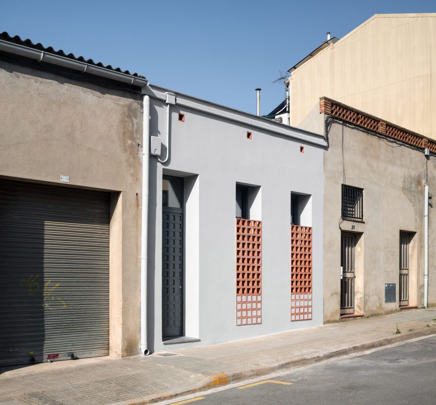
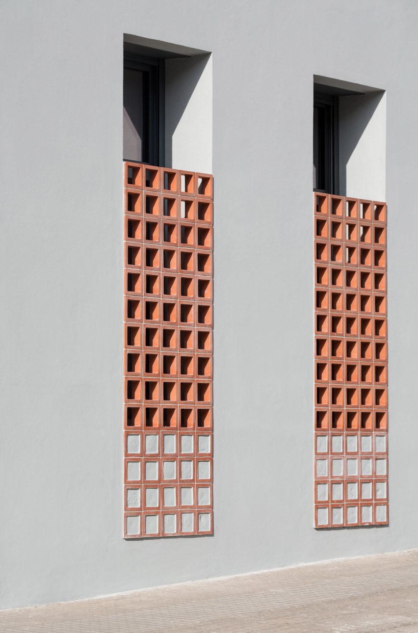
In keeping with the local housing typology, the renovated apartment's facade is defined by three narrow rectangular apertures – two windows and a door. The simple windows are partly covered by a grid of decorative terracotta bricks.
The hollow bricks, which are typical of the area and can be seen on the neighbouring buildings, provide a degree of privacy and shade within the apartment. The grid pattern is echoed across the apartment's dark grey door.
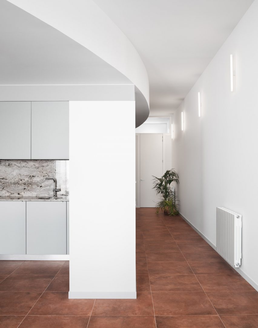
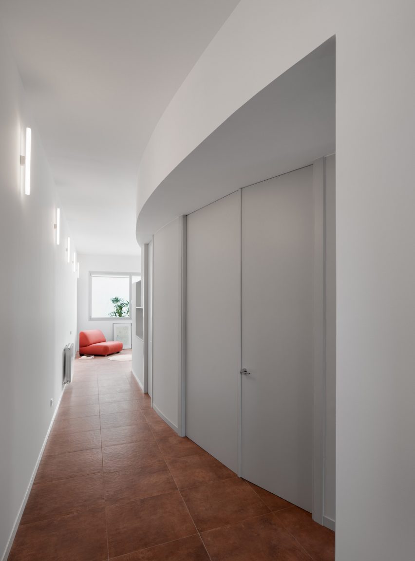
Inside, a long curved corridor guides guests from the entrance through to an open-plan kitchen and living area that looks out onto a rear patio.
The apartment's other rooms are distributed along the curved corridor with a bedroom at the front of the apartment followed by an office and a bathroom in the centre. A small patio in the centre of the apartment provides natural light into the bathroom and office.
The rooms all have a slightly lower ceiling than the corridor, a design feature that is intended to highlight the curve and the transition from the open corridor to these more private and intimate spaces. These rooms are accessed through tall doors that skim the lowered ceiling.
Hiha Studio explained that when opened, the doors' large, frameless design makes the space appear larger and more seamless, as if it were "a continuous space".
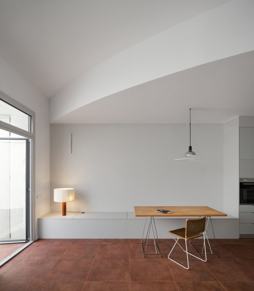
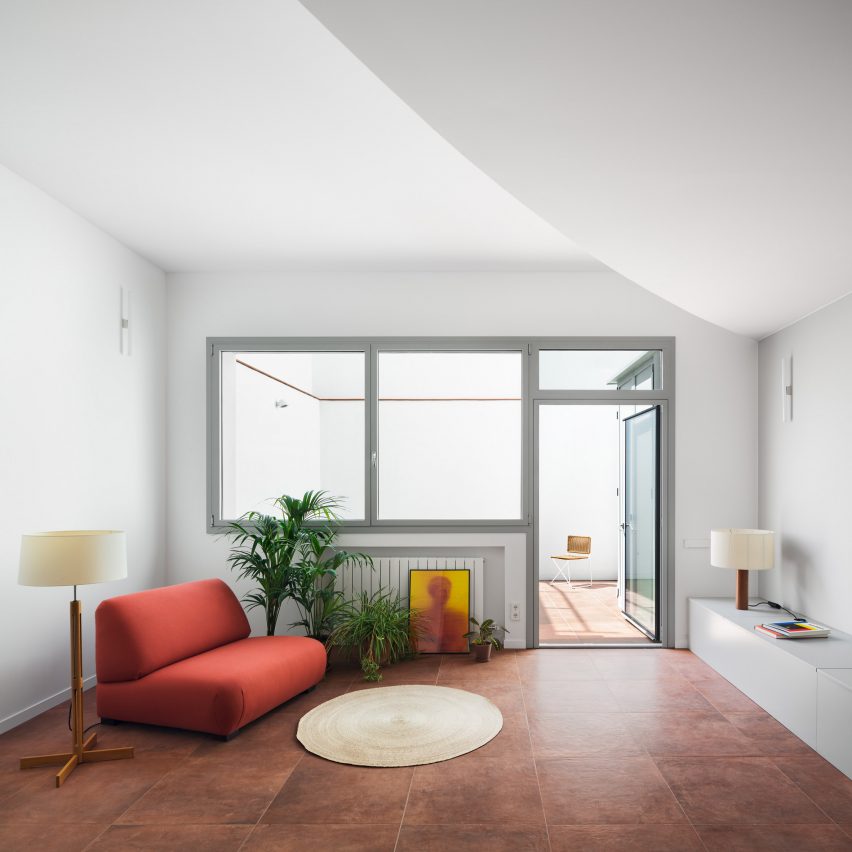
Where the curved wall stops and the corridor opens out into the living area, the curve of the wall is continued as a lowered ceiling that cuts diagonally across the room.
The curved wall along the corridor and all of the walls below the lowered curved ceiling in the living area are painted light grey, which the architects said was done in an attempt "to prolong the continuity and the weight of the curve".
The architecture studio said that this curved form is designed to break up the "linear and monotonous" layout which is typical of this type of dwelling. They said it also creates "an optimal light situation", allowing daylight to filter along the corridor from the patio.
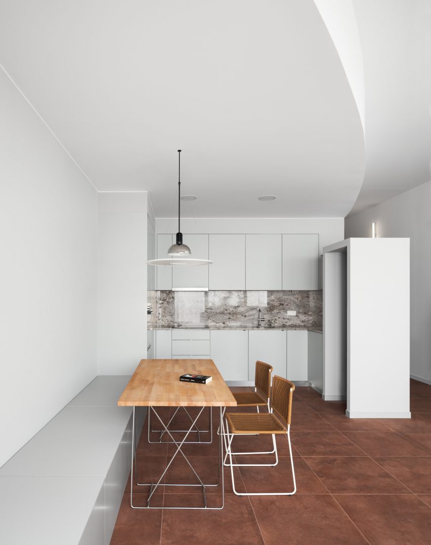
"Usually all the projects [in this housing typology] resolve this issue with a long corridor and we didn’t want it, we wanted to avoid the linear visuals," said Bernat Ardèvol, who runs the Hiha Studio alongside architects Jona Oliva and Genís Plassa.
"We thought in the movement and sensation that everyone have when gets into Richard Serra work's. And also this never ending internal corridors of the Colosseum."
Tthe architects chose to use terracotta-coloured porcelain tiles to create a dialogue between the inside and outside of the building.
These ceramic elements are designed to sit in contrast to the apartment's white walls and neutral carpentry and furniture. In the kitchen, a Corinto stone is used as a backsplash.
The architects installed a series of simple tubular LED wall lights called Linestra lights that were commonly used in the 1970s and 1980s in Catalonia.
"We usually use the same light in our projects," Ardèvol explained. "We like it because it is elegant and goes unnoticed. We usually use it as a position light, just to have the minimum light to recognise the space/room. We don't like to impose the lighting, we prefer that the client can decide what light and lamps they wants as a secondary lighting."
Earlier this year, the Barcelona-based studio removed floors and inserted lofty voids to create a light-filled family home in a northeastern Spanish village.
Photography is by Pol Viladoms.