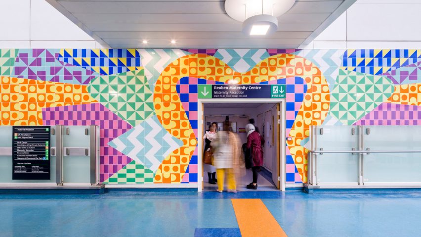
London designer Adam Nathaniel Furman has applied his signature colourful aesthetic to a tiled entrance and reception area for the maternity centre at the Chelsea and Westminster Hospital.
The London hospital received a donation from the Reuben Foundation to create an artwork for its new maternity centre and approached Furman to enhance its reception and entrances.
The hospital's official charity CW+ regularly commissions creative projects that combine digital, visual and performing arts with design to transform the hospital environment for patients, their families and staff.
"Our arts programme is about improving the environment for the patients that we're working with," said CW+ arts director, Trystan Hawkins, "but also the psychological, the physical and the clinical outcome within our hospitals."
Furman used colour and pattern to enliven the entrances and reception area, creating a more uplifting mood and aiding wayfinding for people moving around the building.
"I developed the idea of creating canvases out of certain wall areas and turning full surfaces into artworks," the designer told Dezeen.
"The tiled walls are made from robust, durable porcelain that is easy to clean and hand printed with chromatically deep and rich colours."
Furman explained that the project, titled Radiance, is based on the theme of birth and rebirth, which is "associated with the joy of spring" and the emergence of colourful flora.
"It is said that after birth there is a miraculous glow that immerses and then radiates from the mother and child, a flowering aura of newness and possibility and love," he added.
"Radiance fuses these themes; it is a colourful flowerburst of verdantly effusive happiness, an abstracted rush of elation."
Furman's designs for the tiled walls incorporate shapes evoking sunbursts and petals blooming. Framing the entrances in bursts of colour and pattern helps them to stand out in the large, white atrium.
The reception area inside the Reuben Maternity Centre features a simpler sunburst effect that ensures it becomes the focal point for activity and attention as patients and visitors enter the centre.
"The doors to the various wards inside the centre are framed by different coloured ceramic 'gateways'," added Furman. "This makes wayfinding easy, so that guests arriving to the reception can be told to go to the pink doors or the blue doors."
The tiles were manufactured in Stoke-on-Trent by The Surface Design Studio, using the company's digital printing technology.
The colours specified by Furman were screen printed onto the tiles, which were then cut using a water-jet machine to achieve the complex mosaic effect.
Furman trained in architecture and fine art at Central Saint Martins and the Architectural Association before founding his London-based studio.
His work is defined by his bold use of colour and playful approach to shape and ornament. His previous projects have included a furniture collection made from brightly coloured laminate and a pair of cabinets that mimic Japan's colourful Anime shops.
Photography is by Gareth Gardener.

