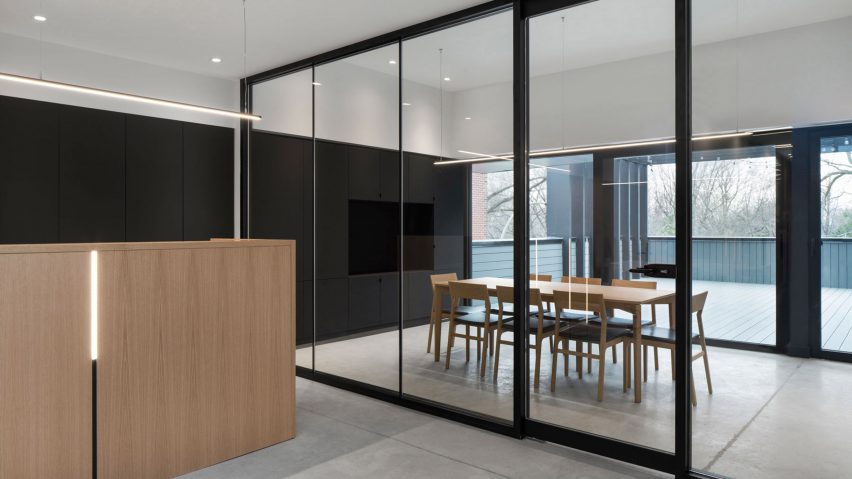
Oak walls partition offices in Montreal law firm by Naturehumaine
A lawyer's office occupies a contemporary extension to a commercial building in Montreal, which local studio Naturehumaine designed with a monochrome palette and wooden accents.
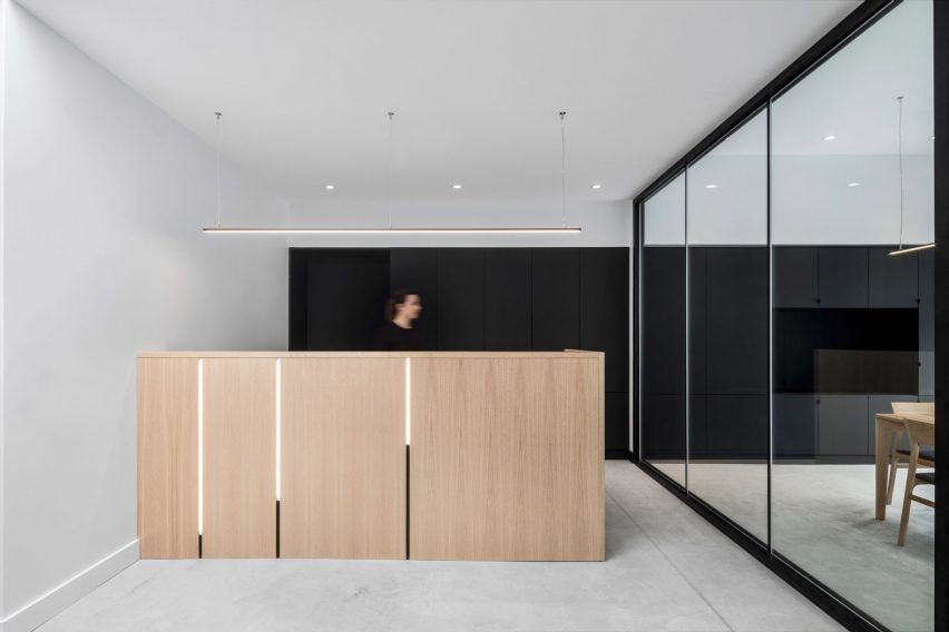
The Montreal firm designed the renovation for a two-storey commercial structure in residential neighbourhood Rosemont-La-Petite-Patrie.
In addition to renovating the existing building, which contains leasable commercial space on the lower floors, it also added another level that is entirely occupied by a law firm.
The longitudinal top floor was designed to provide private offices, while still bringing in plenty of natural light.
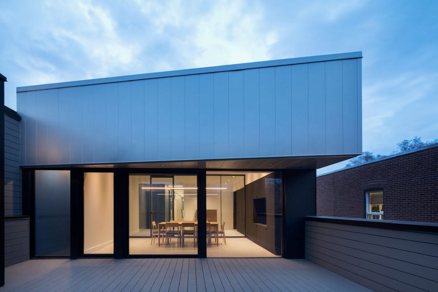
"The third-floor office is organised into a succession of plans; the conference room in front benefits from a visual continuity with the terrace, while the lobby and circulation areas are naturally lit through skylights," said Naturehumaine.
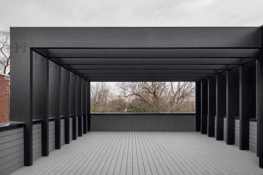
An outdoor patio at the front of the property overlooks Beaubien street and Molson Park. A heavy wooden trellis covers the terrace, and was inspired by the mechanisms of folding cameras, lending the project its name "Le Soufflet".
"This black structure allows the scale of the project to be aligned in continuity with its neighbours from the street, while reinterpreting the architecture of the pergolas in a contemporary way," said Naturehumaine.
The office's conference room is located inside this space and opens both to the outside and to the lobby.
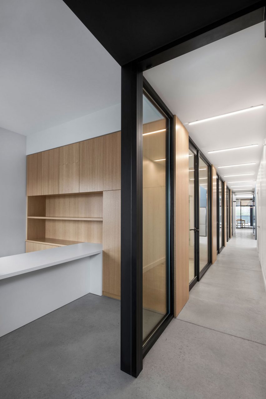
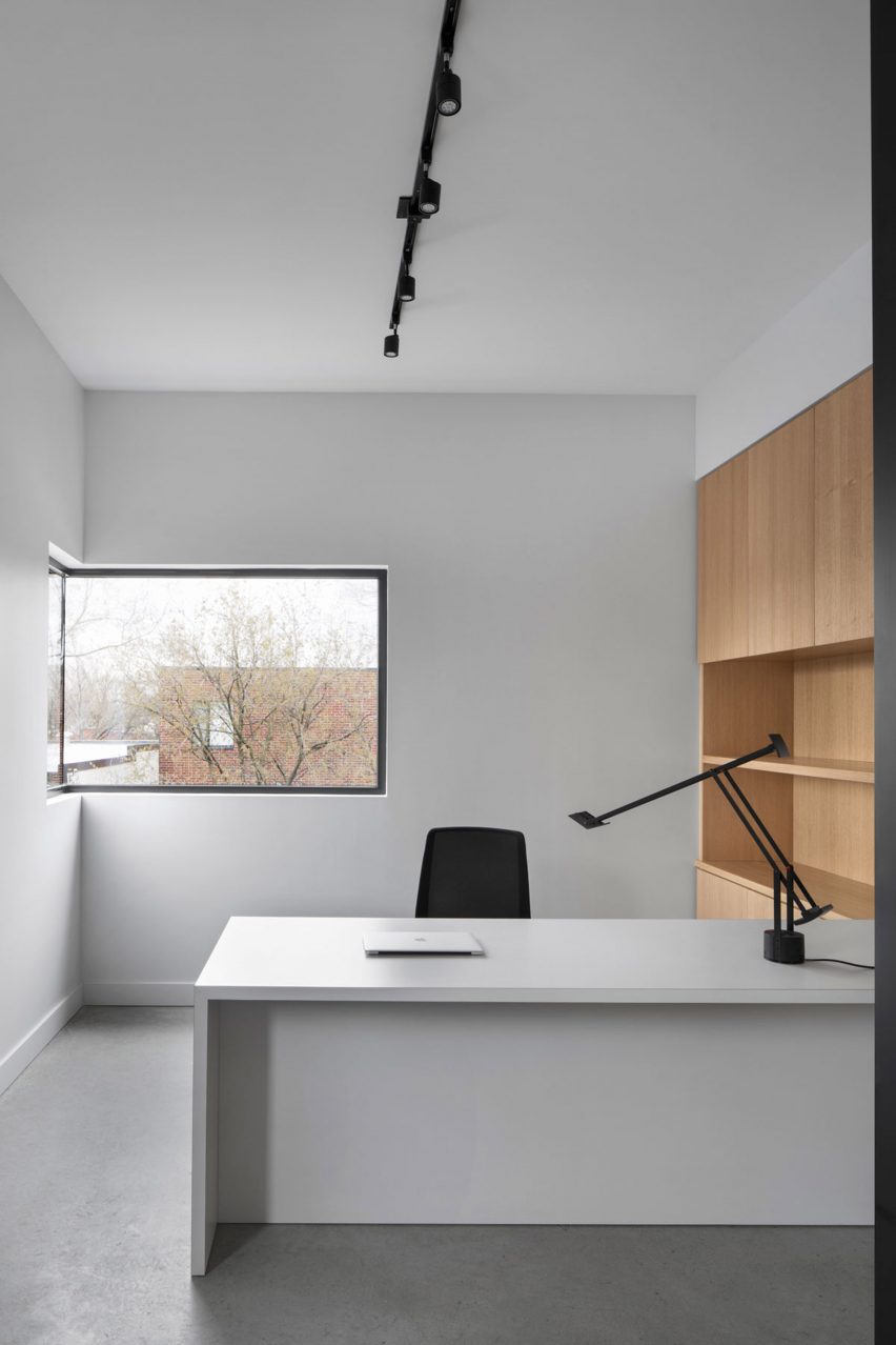
Five private offices are laid out along the corridor. Each one has a wall of bookshelves that separates it from the next, and full-height glass doors with black metal frames.
"The white oak storage units come through the glass partitions, revealing the perception of a regular space organisation from the corridor," said the firm.
Naturehumaine located secondary spaces, such as restrooms and a small kitchen, across the hallway from the offices. The team incorporated bright colours to help identify these spaces, painting the bathrooms in blue and the fire exit stair bright red.
"The monochrome tones of the overall project are enhanced with bright colours; the blue block contains the services, while the bright red radiates from the exit staircase," it said.
In the bathroom, the firm was able to reuse hanging light fixtures salvaged from the original building. "As a hint of the old building, several original lamps are reintroduced in the layout, contrasting with the new minimalist suspensions," said Naturehumaine.
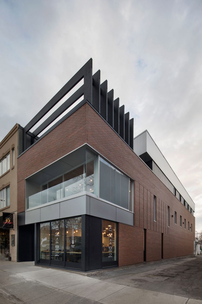
The extension is clad in zinc panels with either black of metallic finishes, while the rest of the building is wrapped with brick, which matches the surrounding buildings of Beaubien Street.
Also in Montreal, Naturehumaine extended a residence from the 1920s with an angular white volume that contrasts the original structure's brickwork and added a double-height living space to an apartment building to combine two previously separate flats.
Photography is by Adrien Williams.